So hopefully you have read Part 1 of When The Tech Titans Top. Click Here to read the article.
So now lets roll forward to 2007 when I got my wake up call on owning great tech stocks.
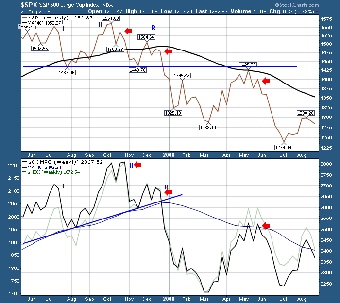
The banking stocks primarily reside on the NYSE and make up a significant portion of the $SPX. With a financial based crisis, rather than a tech based crisis like 2000, we would expect indexes to behave differently.The $SPX was starting to break down in July 2007, shown as a steep pullback into August and then a solid surge into the October 9 top. The Nasdaq was following a similar flight path, but you can see it continued to surge much higher relative to the left shoulder. The late October retest of the high actually created a double top with the right side slightly higher than the left side (based on a weekly close). The $SPX made a significantly lower top. This is what technicians like to call non-confirmation. When one market makes a new high and the other does not. Then the markets pulled back sharply in November and had trouble breaking out in December. The $COMPQ never pulled back as hard as the $SPX compared to the previous low. That is it found support well above the dotted line level on the chart.
The upsloping trendline on the $COMPQ made an upsloping H/S top. When that level was broken on the tech index, it was confirmation of broader storms ahead. The neckline became resistance.
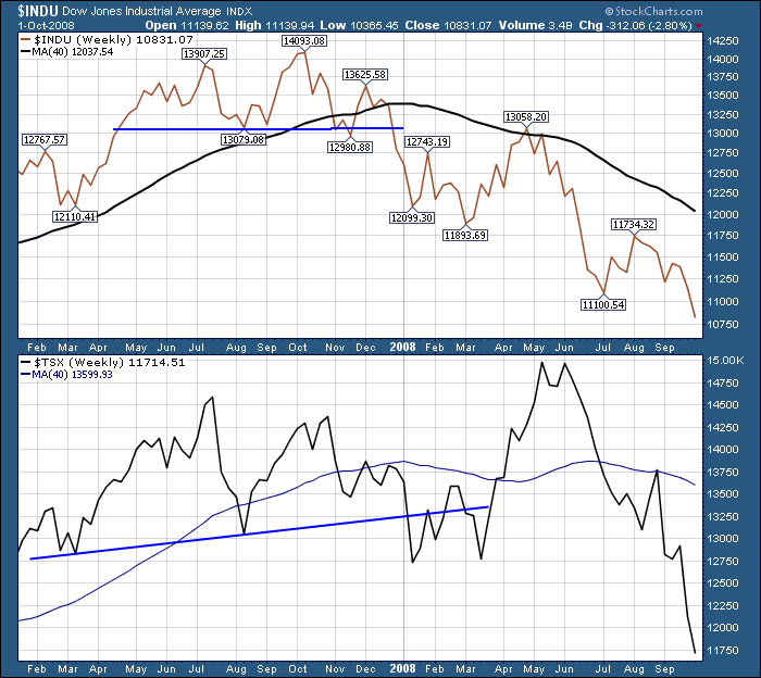
We need to add another chart here. The $TSX. Why? Well, the commodities went on a final historic run taking crude to $147.90 along with Gold, Copper and others.
The $TSX had larger swings compared to the $INDU. The Dow was swinging 1000 points but the $TSX was swinging 1500 while both were trading in the 14000 range. It is very important for all of us to notice how the $TSX went on a huge bull market run even though the US indexes were trapped below the 40 WMA. In one of the wildest markets with huge intraday volatility, you had to have the courage to ride a 2000 point run in 2 months. While all the markets started rallying at the same time, holding for an extra 1000 points was courageous when all the US markets were trapped under the 40 WMA. Even being short had to be very selective. It makes you wonder why tech didn't rally more.
Well, let's go review technology. The nickname for the following group of Stocks was the 4 Horsemen. This would be similar to the leaders Jim Cramer talked about in February 2000 where there were a great group of stocks surging.
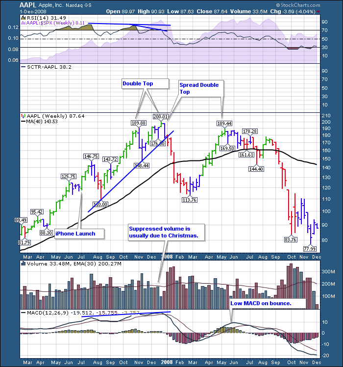
Here is the chart of the leader at the time. Apple had launched the iPhone July 2007. You might not remember. It changed the way we thought of phones. Until the iPhone, the Blackberry was considered great. In hindsight, what a change. A real browser that would allow you to see native web pages and pinch technology came surging into the fore. So the company that created another world changing product was on an awesome run. (iPod was the previous world changing product that buried Sony Corp's Walkman) All of a sudden, the Apple stock tanked.
A few things to note on the chart. No MACD divergence. RSI had some noticeable divergence. The double top was noticeable. Barely a couple of months apart, it really highlights how important it is for an investor to be aware of how strong stocks can still be stalled at previous highs. Seeing some divergence on either the MACD or the RSI is not wise for investors to ignore. How could such a great stock, with a fabulous product, with awesome sales in December, sell off 40%? Why?
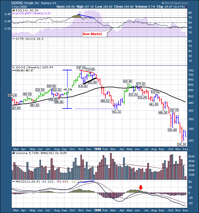
Google is a fascinating stock at this point. MSFT is virtually eliminated as a search software supplier and Google becomes a verb. To Google something means you are searching for something on the web. The Google Chart forms a pennant in late 2008. An absolute classic pennant. A textbook pennant. Precise in its formation. It makes a high, pulls back hard and in two weeks makes a low, rallies back up, falls back down in a narrowing pattern. All four of the points are labelled by the Stockcharts software. The fifth move reaches the end of the red down trendline, fails and makes a hard exit right after Christmas. Pennants are usually considered a continuation pattern, but in this case, it was a reversal. Pennants mark indecision and usually take 5 waves to resolve. Just an interesting pattern that shows up so often in charts. Now clearly GOOG and AAPL had nothing to do with subprime. But having these two leadership stocks undergo 40% corrections in a few weeks starting after Christmas was amazing.
There was a little divergence on the RSI as all the readings are based on the close of the week, not the high. So most of the price action closed around $700 in Google each week while the RSI was clearly declining during the late October, November, December price action. The MACD was actually still rising even though price was changing very little.
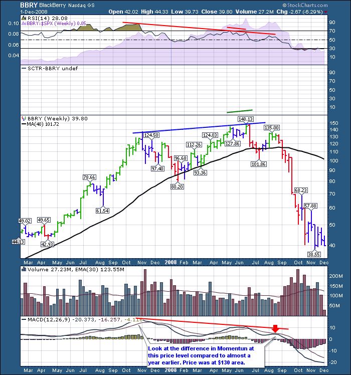
Blackberry (formerly RIMM)
The Blackberry was in every senators hand. Candidate Obama was seen holding his Blackberry during the campaign. The stock pulled back, found support at the 40 WMA and the RSI held up above 40 on the first pullback in January. RIMM never tested the October high in December. It just kept going down. The March rally happened in every stock, but BBRY - A Canadian Company - continued to follow the Canadian market higher unlike the three American companies. I have no other explanation for it running up into June with more power than the others. That ended up being the final top for BBRY in June 2008.
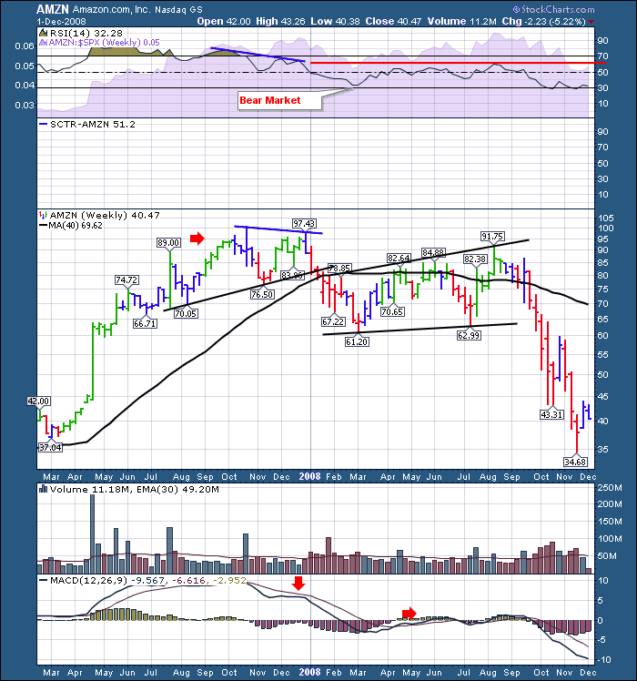
Amazon.
Amazon got the run up into the October high and like the other stocks clearly outpaced the July highs where the $SPX stopped. Again going through the Christmas period, AMZN could not make new highs in December. AMZN joined the rest on the big pullback. In this way, this market top was different. All of the stocks pulled back significantly at the same time but each stock marked a top at a different time. The cracking of the foundation of the Four Horseman was an important event.
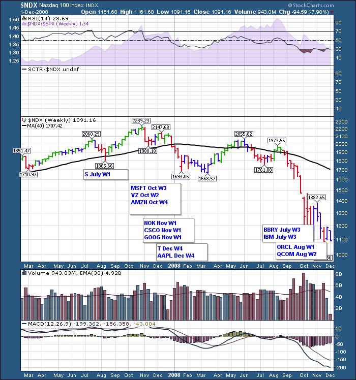
Here is the chart of how the Tech companies started to break down.
So as you can see, the major pullback in the large tech stocks was more coincidental with each other during this market pullback. But even then, it was over a 3 month period. Once again, the investors were surprised by sudden pullbacks in the tech stocks. We might use the word 'unexplicable' again. I think that the significant breakdown with such significant products being launched is very important in the interpretation of this market top. Essentially, the mutual fund and large investor community was moving to risk off and Apple was one of the most profitable companies. By taking the profits and banking them, they had free cash for buying up stocks near the lows in other damaged sectors like the housing market that was falling off a cliff. Just an guess of what might have been going on. Also, mutual funds don't like to let a given stock or sector take up too much of a portfolio. They tend to sell when they get too large. In this case, they sold all four. Once the charts were damaged, nobody had the courage to jump in front of a falling train wreck. Does this sound similar to AAPL now?
Notice the low elevation of the MACD on the $NDX chart and how it was important to heed that warning even in May June 2008.
Tomorrow, I'll illustrate the current market and draw the analogies between the market participants and the indexes together in a final article.
Good Trading,
Greg Schnell, CMT.

