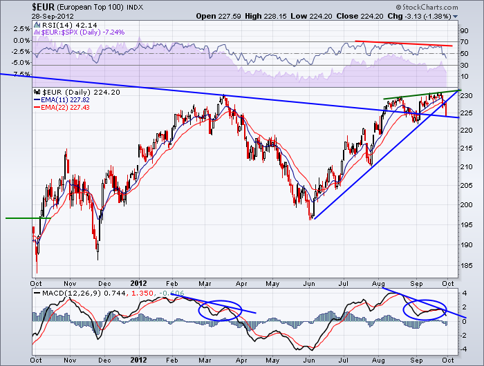
Here is a good example of pattern recognition in my mind. Notice the similarities of the indicators at the March highs and the current highs. This chart is the index for the top 100 Euro companies.
Compare the March MACD pattern to the current MACD pattern. It looks very similar to me. You may remember the article on Fedex. (Fedex). Funny title, but it hasn't been able to rebound since. When these MACD's make significant divergent highs, its an important piece of information for me.
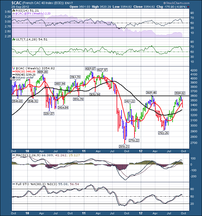
So that is the top 100. Look at how the indexes are behaving. Below is France.
This horizontal resistance line is critical. You may remember the blog about the commodities. $AORD, $TSX, $COPPER, $GOLD all up against horizontal resistance. Here you see $CAC fade at resistance. It is making 8 week lows or almost 2 month lows. Ths could happen anywhere on the chart but this level has been important on the chart for 3 years. When can we get through it if the 4 central banks announcing stimulus was not enough? A MACD rising from the bottom and failing just above zero is a classic bear market wave style. Look at the RSI. It has not been able to get above 65 for 3 years. A bear market pattern.
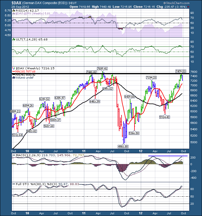
Here is Germany.
Horizontal resistance still sits here. The good news is Germany was able to make it above 80 on the full Sto's. The RSI looks ok, but the MACD has a divergence so far.
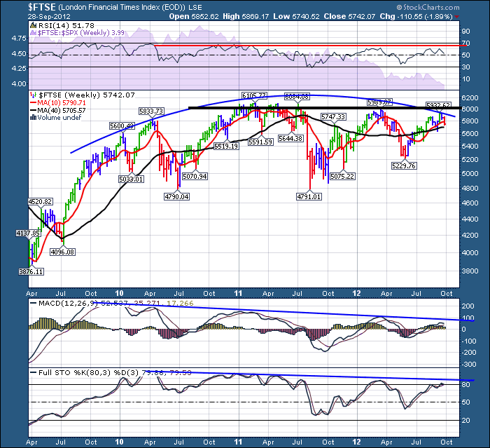
Here is England.
You can see the declining Full sto's and the MACD. RSI has not reached overbought since 2010. Look at the price chart. I do not like the horizontal resistance denoted by the black line. Also note the rounding top. Usually this is a daily chart style. Seeing it on a weekly is interesting. It is just a simple picture of investor sentiment getting weaker as the right side develops. So that concerns me.
Reviewing the various positions relative to the 10 and 40 week is important. But look how they are positioned compared to the Fed announcement. They have all fallen below the start of the week of the Fed. They have all been rejected at the horizontal resistance line. The spanish bond yields are rising again. Europe looks to me like it is back on the table in the 'situation' room. As a friend mentioned today, puts are cheap. We need the price to break above. Should it fail, this could be an important long term top.
Good Trading,
Greg Schnell, CMT.


