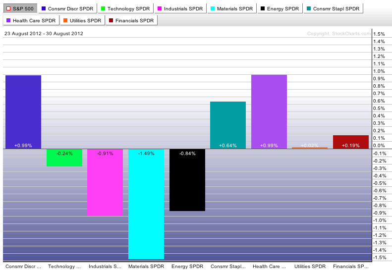
At the recent Chartcon event in Seattle, John Murphy spoke on how he follows the markets. One of his favorite charts is the sector perf chart.
It can tell you a lot about how the sector rotation is moving in the market. In July, the market had swung from defensive to a little bit more optimism.
I just generated this chart at noon Friday. So it does not include Friday's rally.
Some great wisdom in John's setup. Let's work through some of it.
If the cyclicals and industrials are strong, that is a very important clue to be more bullish. When the defensive sectors are stronger, it is not a time to press the gas pedal.
All the sectors except consumer discretionary are aligning in a defensive posture. This does not include Bernanke's Jackson Hole speech influence yet. We'll have that tomorrow.
Usually, when the Nasdaq is outperforming, it is a very important clue.
The two weakest performers by % are the Russell and the Nasdaq. When the Dow is the strongest, I usually find that is money moving to safety. When the dow is the weakest of the groups, money is usually moving towards risk on.
So on this big bullish day, new risk positions are not being added to. One day does not make a trend. But is is interesting that both the perf chart sector map for the week before Bernanke's influence and a scan of the index performance after his speech shows caution invading the tape.
Arthur wrote a great 'Don't ignore this Chart' article taking about the Summation index and the Momentum oscillator today.
Have a safe holiday weekend.
Good trading,
Greg Schnell, CMT

