Very interesting quarter, let's do a review.
While watching the US markets powering higher to the tune of 12%, the $TSX is up 1%. If you were in the strong stocks the pullbacks have been jarring like 20% in a week in WPT.TO. If you were in the banks you have found a bit of a safe harbour.
Let's look at the $TSX over multiple time frames.
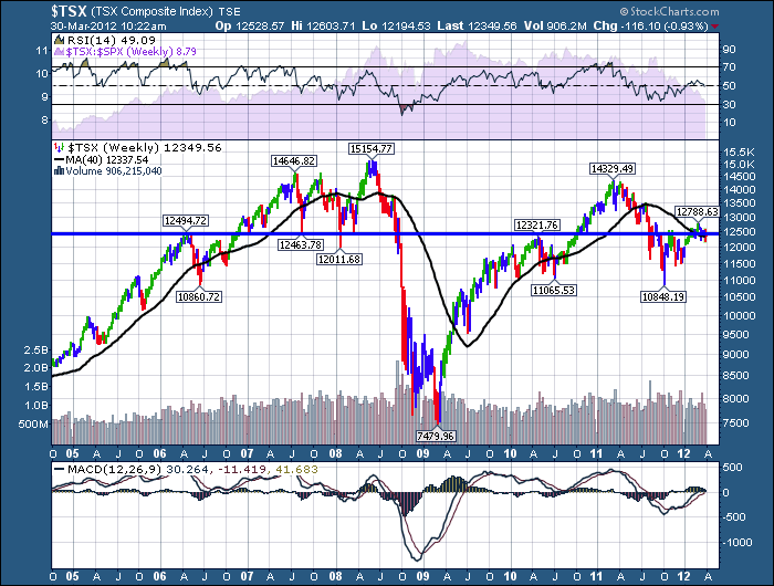
FIrst of all...here is the TSX - 7 year picture.
Starting at the top. We do not want the RSI to stop under 65. This is a problem after going below 40 on the previous dip. It usually indicates a significant top on the next rally. Let's hope that doesn't work out, but as technicans that is what we use indicators for.
Lets skip the actual price chart. I'll go into too much detail farther down! The volume has not improved as the market tried to rally. You can see the gentle decline in volume interest on the right hand side since last July.
But what I really don't like on this chart is the MACD. When the MACD is above zero on a weekly chart, it is a better place to be. Feel free to click on the chart and change the settings to see how the $TSX behaved after the 1990's. I'll zoom in later on the 2000 top. Notice when the MACD went subzero on the chart in both 2007 and 2011. Well, here we are at the zero line after being below it. Is the next move surging above or below? That is the question. It could be forewarning of a longer term decline in the commodity dominated markets in Canada. What makes the quarterly review important is the MACD is threatening to cross below the red signal line which is considered a sell signal. But to me it is the relative position. Weekly MACD's rolling over around or below zero are real caution points.
Let's look in depth at the 7 year price action. What can we learn from the price? Check out the price action at the horizontal blue line. Let me not understate the importance of this line. This line has been SO SO SO SO SO, VERY, SO SO important! OK. You get the point. I think this line matters. For rookie chart readers lets go into the detail.
In April 2006, the market let go and pulled back 1600 TSX points. It came back up in August 2006 and stopped under but near the line again. The market would be trying to get above a previous significant high, so not surprising but it makes the line more important each time it tests. Then in October it broke through. ( I am eyeballing the month off the chart above.) In January 2007 it pulled back, see the red candle, but stopped above that line. The $TSX surged and went on to new highs.. Excellent price action. In August 2007, the market plummeted down to a low. Guess where it found support..the blue line. Bounced nicely and took off to the upside. Lets use the label on that bounce point at 12463 so you can follow my thoughts here. It rallied up, failed at a double top and rolled over. In 2008, January had a negative start and the market pulled way back. (Giant down spike). It briefly pulled down below the line, but bounced back above by the end of the week. On the next bounce up, the 200 DMA became a hurdle. It was rejected and the market pulled back to...the line. Remember, the US market was making lower highs by now. So then oil went on and created a blow off top. The oil stocks stopped rising about 6 weeks before even as oil continued up to it's $149 high. When it finished its run,the $TSX failed massively and plummeted through the blue line. This line would be considered resistance for any move up after this point.
Sure enough, in MAY 2010, the $TSX rallies after a year back up to this line and finds...resistance. It stops and rolls over. I am at point 12321. The market rallies on QE2 and surges on to make new highs. Where does it stop? Within a few 100 points of where the market stopped twice before. Another support and resistance line. It never did reach the blowoff euphoria of 2008. The market pulled back and fell through the 200 DMA. It tried to rally and the 200 DMA became topside resistance. That is July 2011. The market pulled back and oscillated around the blue line through August 2011. After hitting the October lows of 2011, it surged up and stopped at the end of October 2011 at the blue line. How significant would this resistance be? The Canadian market stayed below the blue line for 2 months and moderately bounced on the Central Banks flood of Liquidity in November 2011. It did finally break through when the Eurozone came up with the LTRO solution. We have hugged the blue line and the 200 DMA for the entire first quarter.
We have recapped 7 years of history relative to a blue line. Newcomers should understand we are talking about a level on the chart. It is a zone where the market seems to reach extremes of sentiment and reverse. The price levels in this example are about +/- 200 points either way. This could be as small as 50 or 250. The chart tells you how wide the range is. There is no textbook of .75 % as an example. But identifying these zones is very significant. Look horizontally on a chart for these support and resistance levels.
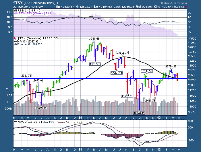
So lets zoom in on a shorter time line to see this level closeup.
We can see that the recent rally jumped up 400 points above the blue line. This would be the 12788. Only to pull back. Yesterday, we made lower lows from this recent high. We also made higher highs than the previous two weeks. We touched into 2 month lows yeaterday. The market is currently supported by both the 40 week and the blue line. So after wearing out your reading skills above with how important this line is, let's add significance to make the point that this zone on the chart is even more important right here and right now because of both lines trying to suport the price here. The good news is it is still above the 200 DMA and the blue line. But no one wants a blog two years from now reminding you why this is important. We need to prepare for the upside or the downside should it start to show up.
The rolling over of the MACD and the divergence to the US market is very concerning. Last year we topped in March while the US topped in May. We are following the $SSEC chart or the $BSE chart more than the $SPX. It is interesting as a US neighbor that we haven't been able to rally with the USA.
So let me just dump all the concerns into one paragraph. They can all reverse higher and I would be thrilled. The sooner the better. We need the bond market to let go of safety and the money to rotate out of bonds and into commodities. So if we could get yields rising, stocks rising and commodities rising, we would be in a new bull market. Until that starts to show up, I'm parking my bullish enthusiasm above the recent highs and hopefully get waved in as the market surges. I'm watching the TCK/B.TO, RIO, VALE, BHP, FCX stocks to see when they start believing a rally in minerals. They all trade below their 200 DMAs.
My grief paragraph.
Things that make me worry right here. Dow Theory non-confirmation, the TSX hugging a 200 DMA, the $SPTEN staying below the 200 DMA, the $SPTMN staying below the 200 DMA, the $CDNX small cap index on a sell signal, very cautious MACD's (rolling over the zero line), the price of oil breaking down to multi month lows, $GOLD having trouble staying above its 200 DMA, Dr. Copper trying to stay above the 200 DMA but continuing to dip below and make lower lows.
Needless to day, I'm looking for some love in our Canadian Charts.
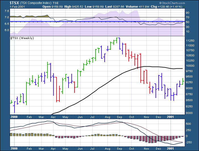
Here is a look at the 2000 Top on the TSX.
While the $TSX 2000 top took 13 months to play out it was a significant top. Your only real clue on the chart above was the RSI signal and the MACD had dipped below zero and couldn't make it back above. I think the $SPX and $COMPQ topped earlier in March and the Dow in January. The $TSX topped out 8 months later after the $INDU. The $INDU just traded flat while the $TSX, $COMPQ, and $SPX all fell hard.
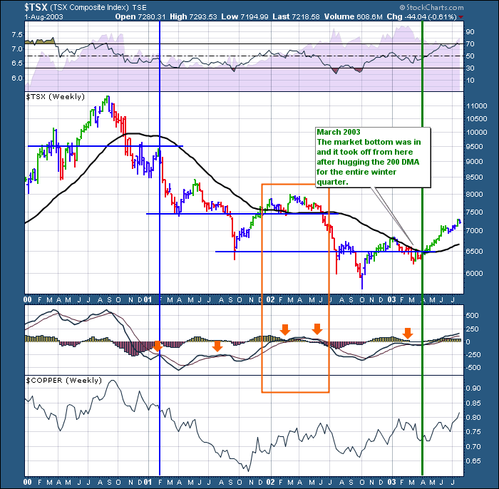
The vertical blue line below is the result when the MACD couldn't swing above zero. The current question is, are we at the blue line in the spring of 2001, are we at the point like 2002 just after the October to March rally, or are we in the early innings of 2003 where we started a 4 year rally after an October to March run. The blue line is where the chart above stopped.
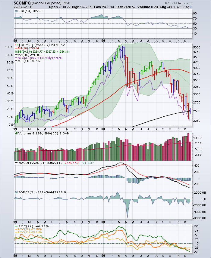
One more view of the MACD just so I am clear that it matters on every chart. Look below at the $COMPQ MACD for the year 2000. The danger point was when it couldn't make it back above zero and stay there. It also came after an unrelenting October 1999 to March 2000 run. While it is always easy to point out things in hindsight, a great clue on any long term weekly chart is when the MACD can not get back above zero.
OK, so that is what I am afraid of. What would really help is if we could see the money rotate out of bonds and into commodities. That would be the bullish signal of onwards and upwards to me. We would see the mineral and oil stocks start to bounce, global growth pick up and the Canadian market would start to run. If it doesn't happen, at least you have a signal to look for the exits before the losses mount. What I really hope, is that we are positioned at the vertical green line on the 2000-2003 $TSX chart.
Good Trading,
Greg Schnell, CMT

