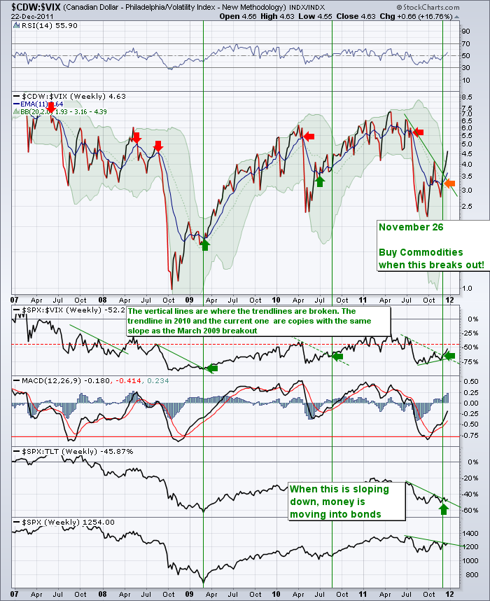
Sometimes Brevity makes a point. We'll try that tonight in one chart. A weekly chart. 4 years of data.
Notice the SPX : VIX chart has broken out as well. The vertical green lines are placed where the dotted lines were broken by the chart action. Is this denoting a major breakout like 2009 and 2010? Sure looks like it here.
It looks like the SPX:TLT chart is breaking out too. This should make the TBT trade (Buy the TBT, as prices in bonds fall, it drives up the yield) In 2009, the move was over 50% in a month. Could this be another? Look at the TBT chart. We tried this trade earlier in the fall and got stopped out.
It also looks like the SPX is testing the trendline. A breakout on a weekly chart is always significant.
Lastly, this will be my final blog until I am back from vacation in January, 2012. Probably the 2nd week.
Thanks for reading the blog. I enjoy writing it and I look forward to writing it for 2012.
To Subscribe, follow the 'blogs' tab, click on 'the Canadian Technician' on the right side.
Look up in the top right and you can find different methods to connect.
Have a great holiday season!
Good Trading,
Greg Schnell, CMT

