Nothng is ever 'A sure bet' but some indicators can really help.
This indicator and how it was displayed was on the Public Chartlist from Yong Pan or 'Cobra' years back.
I encourage you to make your own version of it.
Stockcharts.com has some excellent indicators. Sometimes the only way you find out about them is reading through the Public Chartlist under links on the home page. Here is one of my favorites. It won't mean anything till we put it into context.
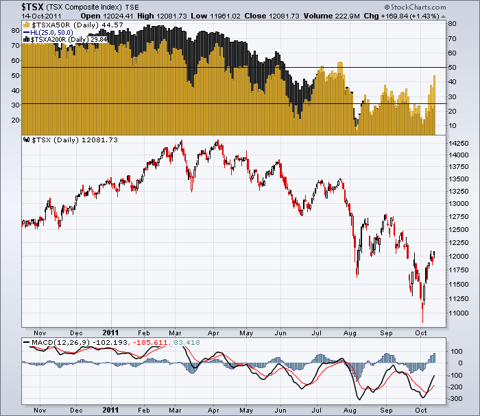
I want to focus on the chartbox at the top.
You will see two different colours of Histograms.
1) $TSXA50R - the percentage of TSX stocks trading above the 50 dma (Daily moving average) - Gold
2) $TSXA200R - The percentage of TSX stocks trading above the 200 dma. - Black
When you are seeing the gold bars declining, it means fewer and fewer stocks are trading above their 50 day moving average. When the black histograms start to show up behind the gold histograms, it means a higher percentage of stocks are trading above their 200 dma but below the 50 dma. In the area where both are present, it makes the gold histograms darker so that is the level of the 200 dma. You can see the bright histograms on the top, stretching above the black.
In a bull market cycle high, they will start to trade below their 50 dma before the 200 dma. In a market cycle low, they will start to trade above their 50 dma before they start to trade above the 200 dma.
In July, more stocks traded above the 50 day then above the 200 day. could that be the buy signal?
Well obviously not, as the market made new lows. So how do we use this information.
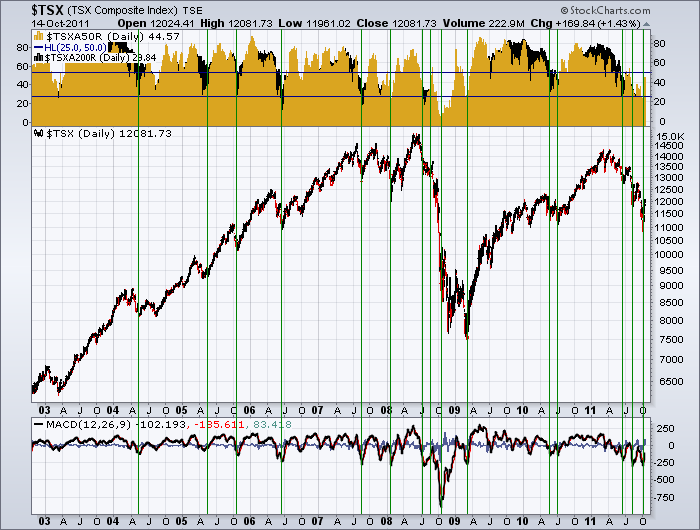
Well lets pull up 9 years of data and see if there is a trend that could help us see how to use it.
You really must click on these charts to see the large view.
A couple of things are really important.
1) When the number of stocks trading above the 50 DMA gets lower than 25% on the right hand scale, look for a rally.
2) When the number of stocks above the 50 DMA takes off and far exceeds the number of stocks above their 200 DMA, that is very encouraging and you should be trying to participate with stops in place.(bright gold histograms following a major period of black histogram bars showing)
3) When the $TSXA50R stays above 50 % stay long.....Accelerate in the zone.
4) When the percentage of stocks on a rally can't get above 50%, exit.
5) When bull market rallies are interrupted and the percentage of stocks staying above the 50 dma gets less every time, you have to be prepared that a top is in. That is the black candles start to show through at lower levels each time. Also notice that the % of stocks staying above 50 DMA gets less with each rally.
Also, if the MACD on the TSX (shown at the bottom) can not stay above zero....you are probably making lower lows. If the MACD is Nice and high, each subsequent rally will maintain that height or hold it above zero. When it starts rolling over near zero, and your % of stocks can't stay above 60% or 70%, it is time to get defensive.
Does this really work?
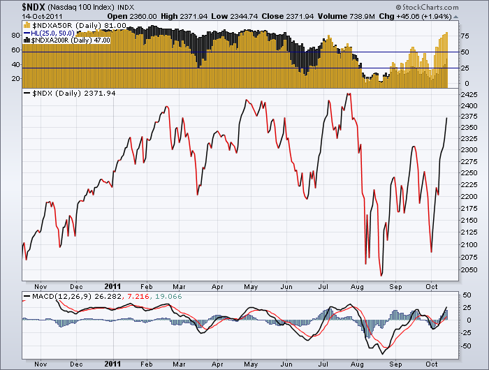
Well, the true "RISK ON" market is the Nasdaq.
Here is the short term, and currently $NDXA50R is over 80%. That is huge momentum. That bodes well for our TSX.
Look at the market peaks. The $NDXA50R topped out around 75%. At the final peak, it was barely 60%.
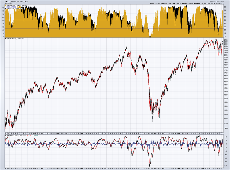
Here is the long term $NDXA50R. You can see we have had spires before that shot up and reversed immediately. It could happen again. What this chart tells you is the world is trying to get bullish on risk. The question is can it continue to support it? That is why we trade with stops. The MACD is in Positive Territory on the $NDX (Nasdaq 100) and is trying to go positive on the $TSX. That's about as bullish a signal as we can get historically speaking. We still need stops (Mental or hard stops). As I wrote in the Pedal to the Metal, It's Earnings season..., I am watching closely how the market behaves after option expiration this week into early next week. That will be very telling.
Good Trading,
Greg Schnell, CMT


