Wow what a week for Precious metals. Tremendous move through significant MA's.
So is the mammoth trend over?
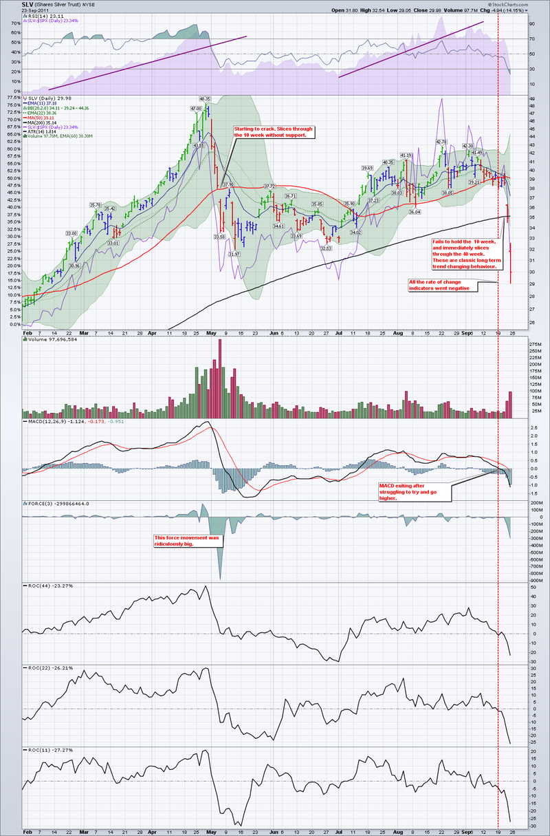
Well, let's analyze Silver to see what we can learn. One of the best ways to analyze charts is historically. You are always right! Actually, old charts can teach us what to look for on current charts. Slicing right through significant moving averages is not good. Usually institutions will support a stock or commodity at a price level. That support broke in Silver and it is important to watch for these trends in other commodities when they have massive runs.
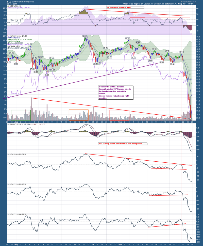
Let's start with the 60 minute charts to see if there were any clues. Then we'll expand out to the Daily and Weekly charts to see what is going on in the big, bigger and biggest picture. We'll look at the multi year Silver to get the biggest picture. We'll use the ETF's so we have a volume as well as intraday analysis.
SIlver 60 minute
On this daily chart, I would consider the breakdown in the SPURS as a major indicator. I would consider the volume depravation to be another significant indicator.
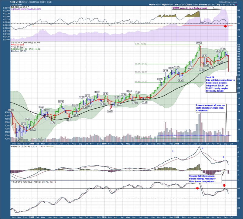
Here is the Weekly:
There were many signs of weakness, including the stocks performing less well than the commodity.
We'll analyze Gold next to see if we can learn anything there.
Greg Schnell - CMT


