Market Recap for Thursday, June 30, 2016
Over the past week - since Brexit - the S&P 500 has lost a mere 15 points because of the sizable rally enjoyed over the past three trading days. That's roughly a 0.75% loss. The NASDAQ, on the other hand, remains approximately 1.5% below its closing level before Brexit. If we review the sectors, the lack of leadership among aggressive areas of the market is even more apparent. Here are the latest one week returns by sector:
 Seriously, how can you get excited by that? The four aggressive sectors - industrials, consumer discretionary, technology and financials - are all positioned in the bottom half of this leaderboard. In essence, the S&P 500 is taking another stab at its all-time high close of 2131 without leadership from any of its key sectors. None. I'm sorry, but I'll pass.
The strength in treasuries has sent the 10 year treasury yield ($TNX) tumbling over the past week from 1.58% to 1.49%. Money flowing into treasuries represents cautious money. And those falling yields are sending utilities and other high-yielding stocks like consumer staples much higher. There's where your strength is coming from. I have rarely seen "sustainable" S&P 500 rallies led by defensive areas of the market, making it very difficult to participate in this week's strength.
Pre-Market Action
Futures this morning, like yesterday morning, are flat. Asian markets have been rallying and the Hang Seng ($HSI) is one of the few major global markets that has pushed back above its declining 20 day EMA. The same cannot be said for its Tokyo counterpart, the Nikkei ($NIKK), which bounced off major price support at 15000, but has been stymied as it approaches its declining 20 day EMA at 15912.
In Europe, the German DAX ($DAX) has rallied strongly from 9250, but also is now struggling a bit more as it approaches its declining 20 day EMA at 9791. The S&P 500 was able to close back above its 20 day EMA rather easily, which surprised me.
Current Outlook
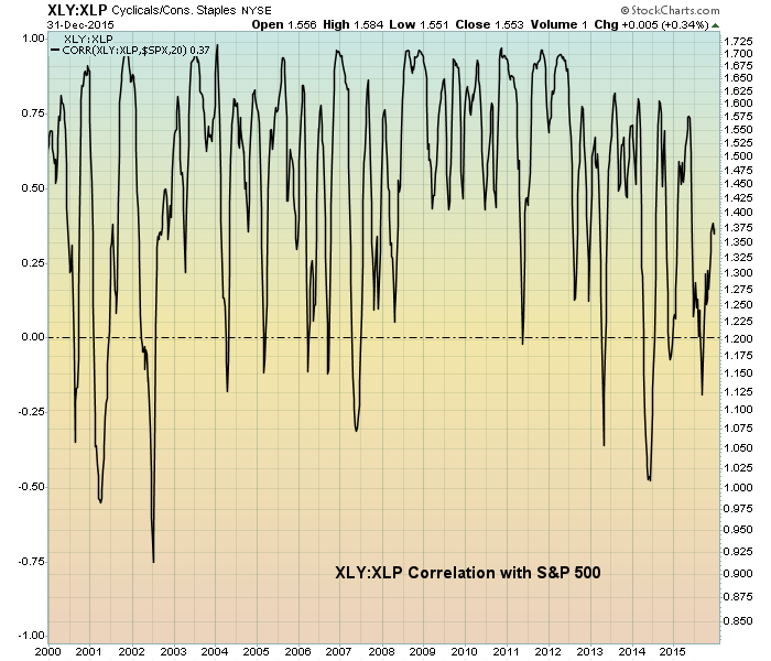
One of my favorite relative ratios to follow is the XLY (consumer discretionary) vs. the XLP (consumer staples) as it provides us a very quick analysis of whether traders are willing to commit capital to the more volatile and aggressive discretionary stocks that perform well during economic expansion or if they are more interested in staples stocks that hold up better during economic downturns. Before I show you the current relationship, take a look at how this ratio has stacked up vs. the S&P 500 from 2000 to 2015:
 First, note that this is simply a correlation chart between the XLY:XLP and the S&P 500. In other words, do they move in the same direction generally (positive readings between 0 and 1 on left side of chart) or in opposite directions (negative readings between -1 and 0 on left side of chart)? Throughout the decade and a half shown above, this correlation factor is almost always above 0, which is what I would expect. When the discretionary vs. staples ratio is rising, it's a good sign that the stock market is anticipating economic strength and that strength would benefit discretionary stocks over staples stocks - at least in theory. If you review the end of the 2002-2007 bull market, you'll find that this XLY:XLP ratio began declining late in that bull market as market participants began to anticipate a slowing economy and, ultimately, a deep recession.
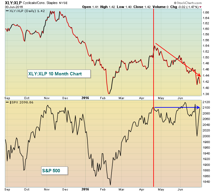
With that in mind, let's turn our attention to the current XLY:XLP relationship and where the S&P 500 stands:
 For whatever reason, traders have approached the market much differently since mid-April. Yes, on the surface, the S&P 500 looks as if it's right back where it was in mid-April, but the "beneath the surface" action has changed dramatically with money rotating significantly towards the defensive staples sector. Let me emphasize that this chart guarantees us NOTHING. The stock market can do whatever it wants to do and maybe defensive stocks lead a continuing rally for another year or two. But I use technical analysis to manage my risk and this is one chart that's telling me to ignore what the S&P 500 is doing and instead focus on what the subtleties beneath the surface are telling me. And those subtleties are saying GET OUT.
Sector/Industry Watch
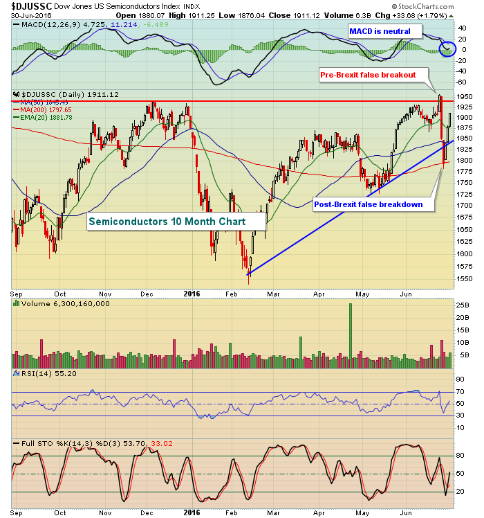
Semiconductors ($DJUSSC) represent a very aggressive part of the technology sector so I review it often. Just before Brexit, the DJUSSC broke out to fresh highs only to see a swift correction the ensuing two days. The group is rallying again and a breakout would be a bullish development. Check out the chart:
 Would the real semiconductor group please stand up? A false breakout followed by a false breakdown. Now the DJUSSC is trading in a range that's been highlighted by a very strong rally the past few trading sessions. But can we make the breakout? If yes, that's bullish. If no, be very, very careful.
Historical Tendencies
Since closing beneath 1090 for the first time in three months on Monday, the Russell 2000 has rallied strongly the past three days gaining 5.7% in the process. This strength parallels historical strength as the Russell 2000 typically performs exceptionally well the last few days of June. The first week of July is not generally kind to small caps, however, as the Russell 2000 has produced annualized returns of -20.65% over this period since 1987.
Key Earnings Reports
None
Key Economic Reports
June ISM manufacturing index to be released at 10:00am EST: 51.5 (estimate)
May construction spending to be released at 10:00am EST: +0.6% (estimate)
Happy trading!
Tom
