I have four paper charts hanging in my office. I use these as the background for most of my videos, and you can usually see one in the background when we shoot The Final Bar every afternoon.
I was recently asked why these four charts were worthy of display -- and why I would bother hanging paper charts in my office in the first place! As I began to answer this question, I reflected on times in the legendary Fidelity Chart Room, on conversations with Ralph Acampora and meeting him in his old chart room at Prudential, on discussions with Louise Yamada and Bruce Kamich and Steve Suttmeier and others, where I was just taken aback at the beauty of seeing long-term charts on big pieces of paper.
In a time when we can bring up pretty much anything electronically, on all sorts of screens and mobile devices, charts that stand the test of time, on paper, are the ones that deserve our attention. It's like reading timeless works of literature and human wisdom, as opposed to reading blog posts. Sure, blogs can help inform you and nudge your thinking, but if you really want to upgrade your thinking I would lean more on timeless writings.
I recorded a brief video with a "behind the scenes" look at my office and a discussion of key lessons from each of the four charts hanging in my office. Here's a quick preview of the four charts, including charts from the StockCharts Historical Chart Gallery, which provides an excellent resource if you don't happen to have beautiful paper charts on your own office walls!
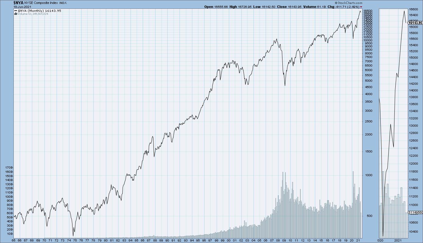
This first chart shows the major US equity market indexes, from the secular bear market of the 1970s to the current bullish phase.

This one reminds me to think about the bull and bear phases in the markets. The 1970s were a painful stretch where it took the Dow 16 years from first reaching 1000 to actually breaking above 1000 in 1983. But even that bear phase had short-term bull cycles within the longer-term consolidation pattern. It's all about understanding the bias of the broader market.
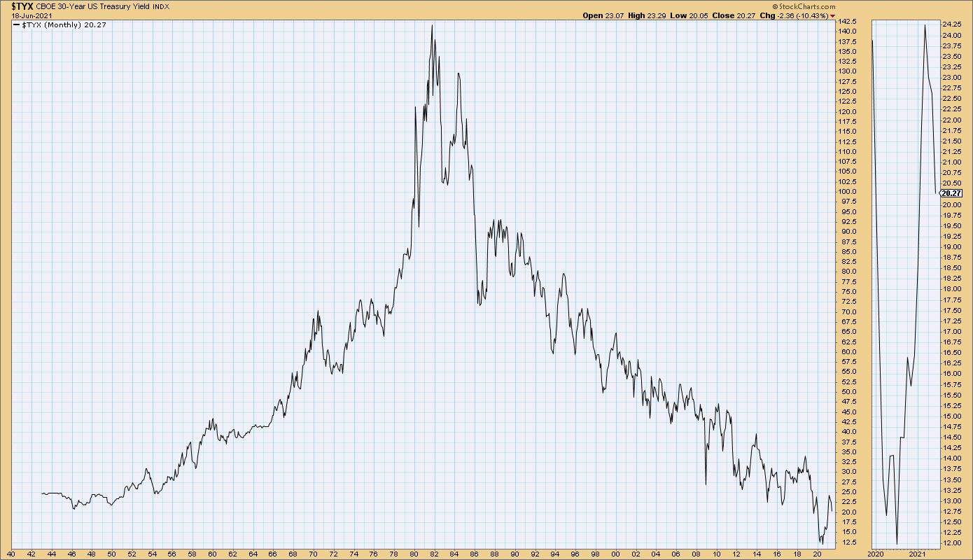
The second chart illustrates the long-term trend in interest rates, plotting the 30-year Treasury yield back to the early 20th century.

Here, I'm reminded that, for anyone who started investing after the year 1980 (which is most of us at this point), we've known nothing but a falling rate environment. A rising rate environment is a very different experience, and it may be worth studying the 1950s and 1960s to see what sectors and themes emerged during this period.
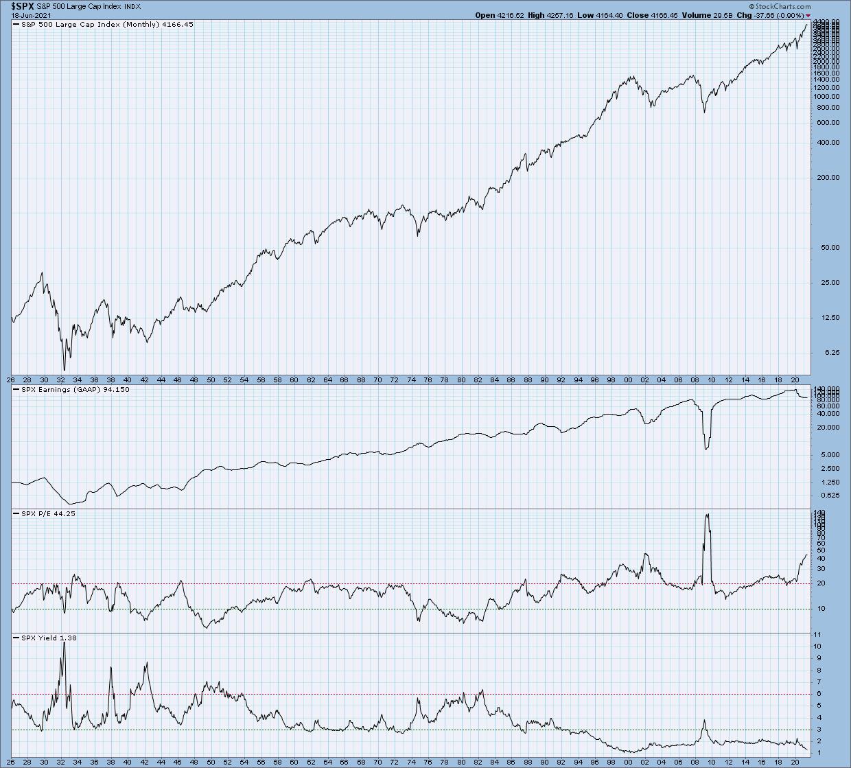
Next, we have the 100-year chart of economic growth. This chart tells the story of price versus earnings.

Most of the portfolio managers I worked with over the years were fundamentally-oriented, and their goal was to focus on company earnings. If you can get the earnings right, then price will surely follow.
The long-term chart of these factors shows that price and earnings have both increased over the long-term. But here's the thing: if you focus on a shorter time frame within that trend, you'll find plenty of times where price goes higher but earnings are falling. You'll also see times where price goes down even though earnings are rising.
The lesson here is that, in the short-term, the markets are a voting machine, but in the long-term they are a weighing machine (to paraphrase market behaviorist Benjamin Graham). Charts and technical analysis can be incredibly helpful on managing the short-term trends.
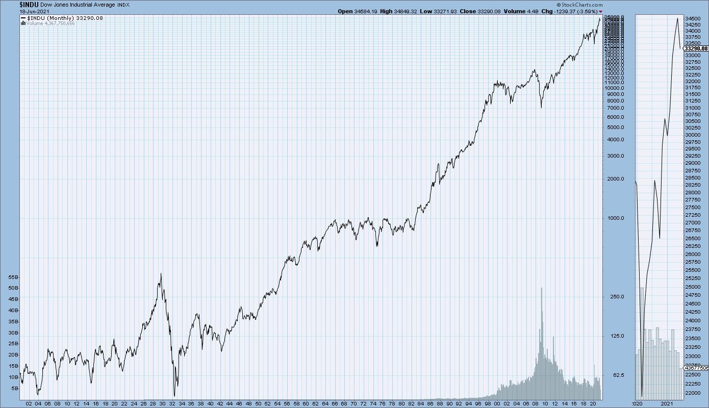
Finally, we have the deepest history represented in the form of the major equity indexes back to 1906. This chart shows the long-term uptrend in pretty much everything.

This chart reminds me that it's okay to be bearish when the evidence suggests doing so. It's even okay to short stocks when you feel that the charts are supportive of that action. But, more importantly, it reminds me that, in doing so, I am fighting against over a century of bull market behavior. The markets can and do go down in the short-term, but, for the entirety of the financial markets, equities have been a story of long-term growth and capital appreciation.
I hope you found this virtual walk through my office to be interesting and illuminating, and that you now see why I remind myself of these four lessons every time I come into my home office!
To see the actual charts and experience my home office in all its imperfect and disorganized but illuminating form, check out the video below.
For deeper dives into market awareness, investor psychology and routines, check out my YouTube channel!
RR#6,
Dave
P.S. Ready to upgrade your investment process? Check out my free course on behavioral investing!

David Keller, CMT
Chief Market Strategist
StockCharts.com
Disclaimer: This blog is for educational purposes only and should not be construed as financial advice. The ideas and strategies should never be used without first assessing your own personal and financial situation, or without consulting a financial professional.
The author does not have a position in mentioned securities at the time of publication. Any opinions expressed herein are solely those of the author, and do not in any way represent the views or opinions of any other person or entity.
