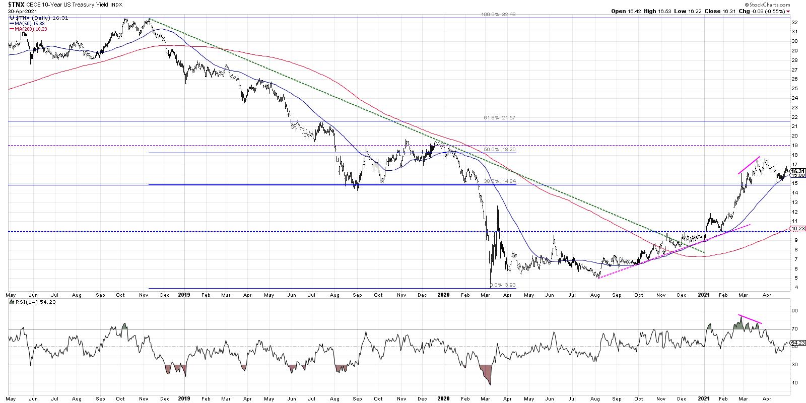
 Last month, we recognized a bearish divergence on the chart of the 10-year Treasury Yield ($TNX). Soon after, bond prices rallied, pushing interest rates down to an ascending 50-day moving average. Now that this pullback has completed, we're seeing signs of rising rates, which has ripple effects for financial stocks as well as other value-oriented sectors.
Today, we'll review the chart of $TNX, focus on key "lines in the sand" to determine the overall trend and what a return to rising rates could mean for various portions of the equity markets. Many stocks in the financial sector, along with the $XLF, indicated a bearish momentum divergence in late March. This indicated that banks and asset managers had experienced a significant run to the upside and the momentum was beginning to wane.
A couple weeks ago, we focused on the pullback in interest rates and the ripple effects of this move. That included a discussion not just of financial stocks but more broadly on things like growth vs. value and the return of the FAANG trade. Let's review the latest chart of the ten-year and see where things stand now.

Here, we can see the move higher in rates to a peak just below 1.8% in mid-to-late March. If you're not familiar with the CBOE 10-Year Treasury Yield index, just remember that it's basically the yield on the ten-year treasury note multiplied by ten. Then, in April, we see the pullback down to around 1.55% as the index tested its 50-day moving average, which often serves as support in a long-term uptrend. The RSI value remained above the key 40 level here, which indicates that the trend remains long-term bullish.
This week saw a bounce higher in the ten-year yield, fueled by the Fed Chairman's implication that the Fed was not concerned with inflation and that higher rates were an acceptable outcome. As long as the $TNX remains above its 50-day moving average and further down the 1.5% level, which is a Fibonacci 38.2% line, this higher rates thesis appears to remain intact.
So, if rates do continue higher and the 10-Year approaches 2%, what stocks will stand to outperform?
Basically, growth would most likely underperform value. Higher rates tend to be positive for value sectors like Financials and Industrials and less ideal for growth sectors like Technology.
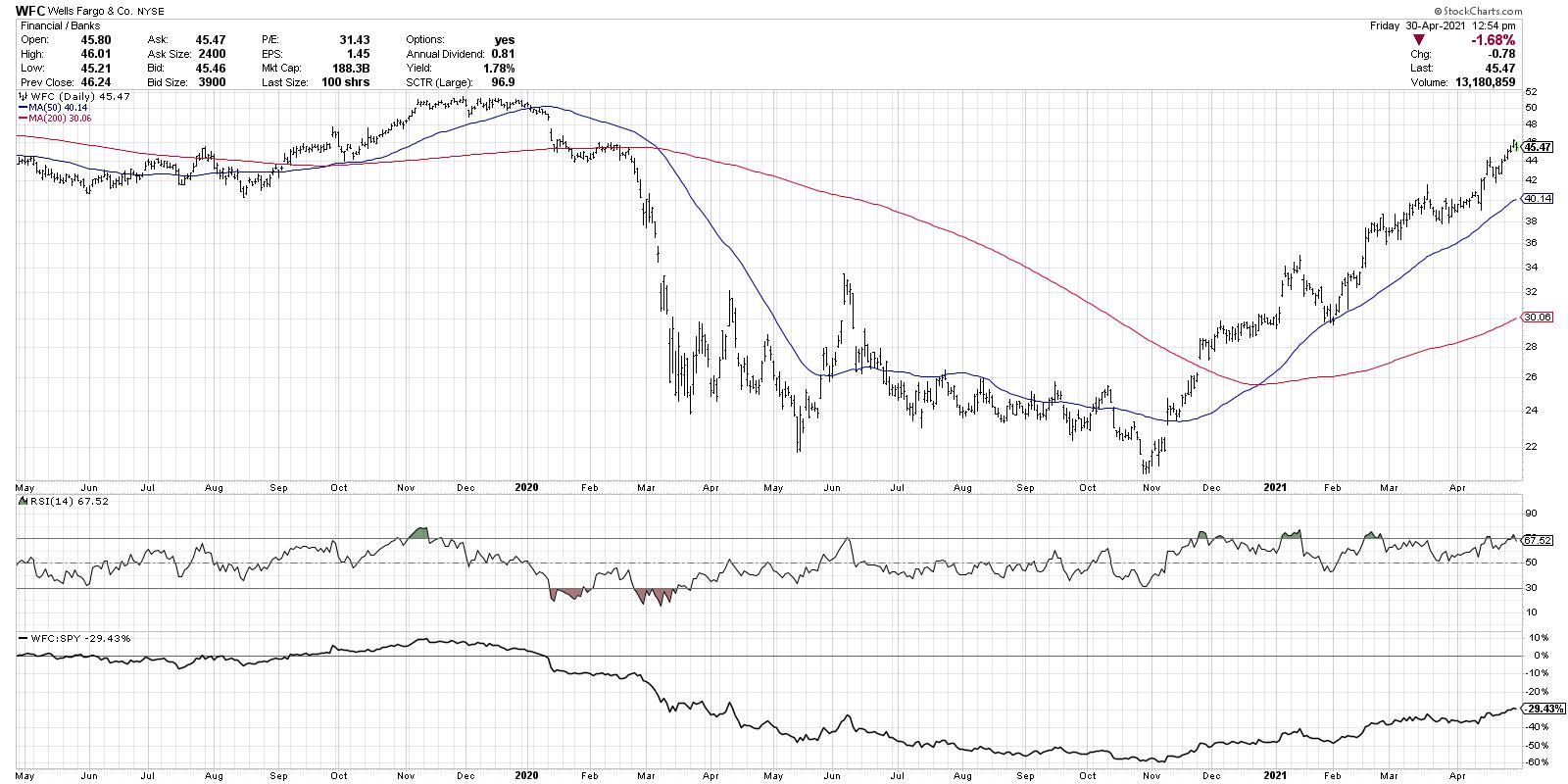
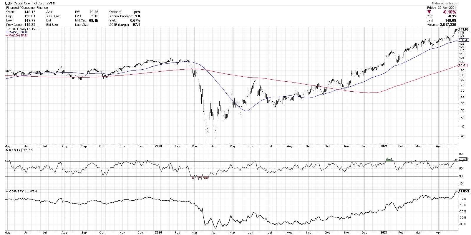
As I scanned for stocks making new three-month highs earlier this week, I was struck by the number of financial stocks that appeared on the list. Banks like Keycorp (KEY) and Wells Fargo (WFC), asset managers such as Charles Schwab (SCHW) and even consumer finance names like Capital One (COF) all made new 52-week highs this week.


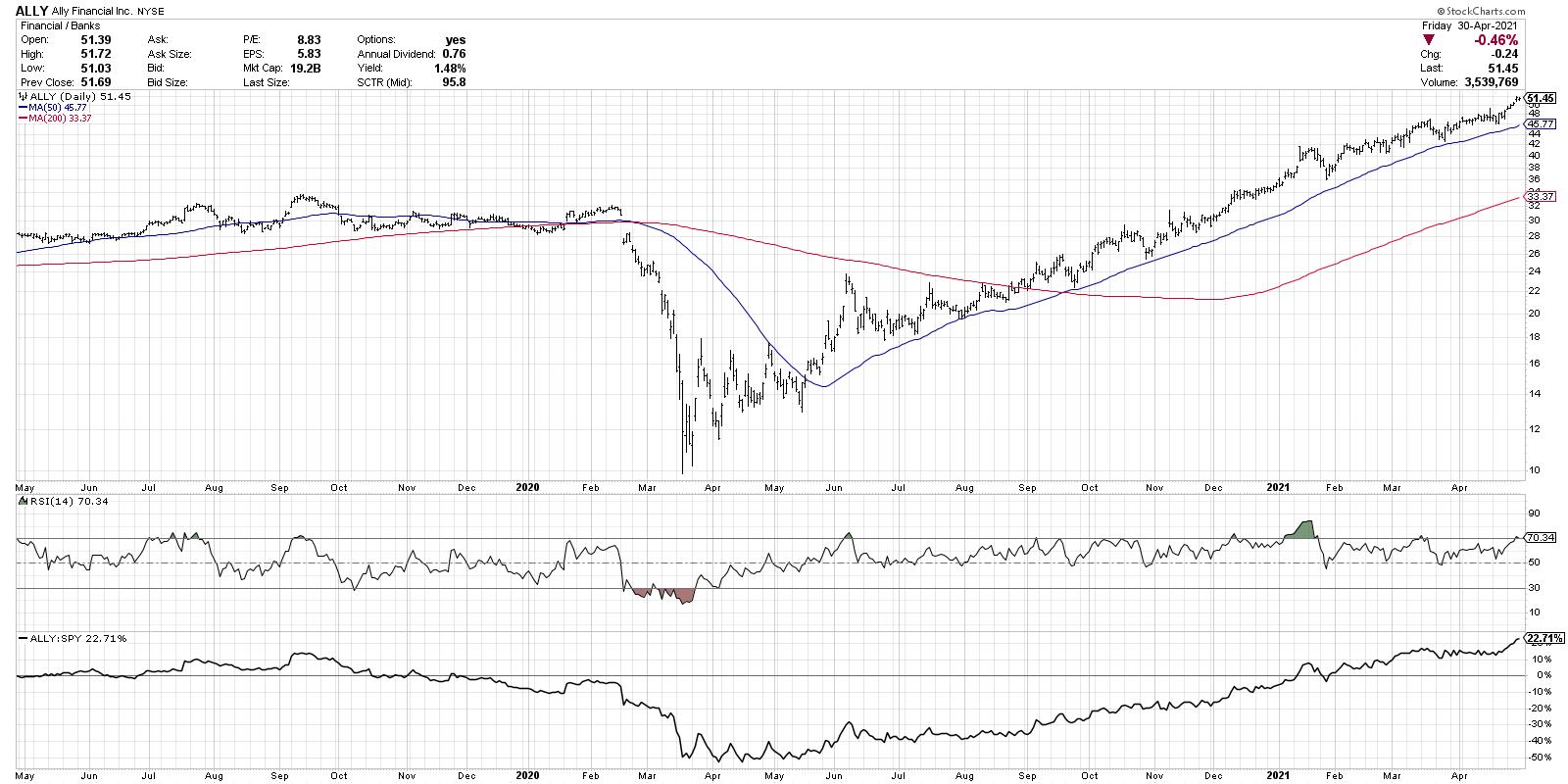
All of the above charts feature long-term uptrends, improving relative strength profiles and ascending moving averages. What's most impressive is that the pullbacks along the way have continued to establish higher lows, confirming a Dow Theory uptrend of higher highs and higher lows.
Want to digest this article in video form? Here you go:
RR#6,
Dave
P.S. Ready to upgrade your investment process? Check out my free course on behavioral investing!

David Keller, CMT
Chief Market Strategist
StockCharts.com
Disclaimer: This blog is for educational purposes only and should not be construed as financial advice. The ideas and strategies should never be used without first assessing your own personal and financial situation, or without consulting a financial professional.
The author does not have a position in mentioned securities at the time of publication. Any opinions expressed herein are solely those of the author, and do not in any way represent the views or opinions of any other person or entity.
