 So, how did you stack up the equities of the Dow 30 based on Money Flow in Action Practice #17?
The first question you should have asked yourself is “what is my personal investing timeframe?” Clearly, a day trader would not analyze money flow the same as a position trader or as an intermediate-to-long term investor. The second suggestion I would make is to revisit your own knowledge set about Money Flow. An ideal place to start is the StockCharts glossary.
http://stockcharts.com/school/doku.php?id=chart_school:technical_indicators:chaikin_money_flow_cmf
http://stockcharts.com/school/doku.php?id=chart_school:technical_indicators:on_balance_volume_obv
You’ll notice that I gave you a chart format with four different graphs from Chaikin Money Flow (CMF) because it is an indicator that’s sensitive to the different ‘look back’ periods used. It also is very different from Joe Granville’s On-Balance Volume (OBV) because it applies a multiplier to the day’s volume based upon the closing price relative to the range of the day’s high and low. OBV is all or nothing. On up days, all the volume gets added; on down days, all the volume is subtracted.
This is why I like the combination of the two when analyzing money flow. It is also the reason I prefer to use only OBV on one minute charts, since I find it to be more accurate. If the period is up, it takes 100% of volume as bullish, and vice versa. While Chaikin Money Flow does indicate the market’s bias being either under accumulation or distribution, it gets a bit quirky if price gaps appear.
OBV is simply a running total of buying volume and selling volume. It provides wonderful insights on those one-minute charts I mentioned. For example, when a dichotomy appears between price action moving lower while OBV is moving higher, I will widen my stops. Conversely, when OBV is trending down and the prices are moving higher, I’ll be very suspect of the price appreciation and tighten up my stops.
Divergences matter. Confirmations matter. It’s all about probabilities. Having said all that, here is how I stacked up equities at both ends of the probability spectrum. I had American Express (AXP) and United Health Group (UNH) as my buy candidates, and Apple (AAPL) and Visa (V) as my sell candidates based on my Money Flow analysis. What were your bullish and bearish picks?
There are no explicit right or wrong choices in this exercise. It’s all about assigning an equity either a bullish or bearish tag based upon what you see with the money flow. On the other hand, if you saw Apple’s money flow as bullish, we need to talk!
This Week’s Action Practice:
As you know, the market is divided into ten sector funds by S&P. We strongly believe that profitable market analysis needs to start here. Having said that, we also believe that investors must understand the nature and composition of these crucial ETFs. The stockcharts.com website uses the Select Sector SPDRs because they are the most widely traded. We’ve written before that simply trading amongst these sector funds using momentum or money flow strategies can be a very profitable investment strategy for a portion of your portfolio. However, it would be silly to implement such a strategy without an intimate knowledge of the key equities that comprise the specific sector ETF of choice.
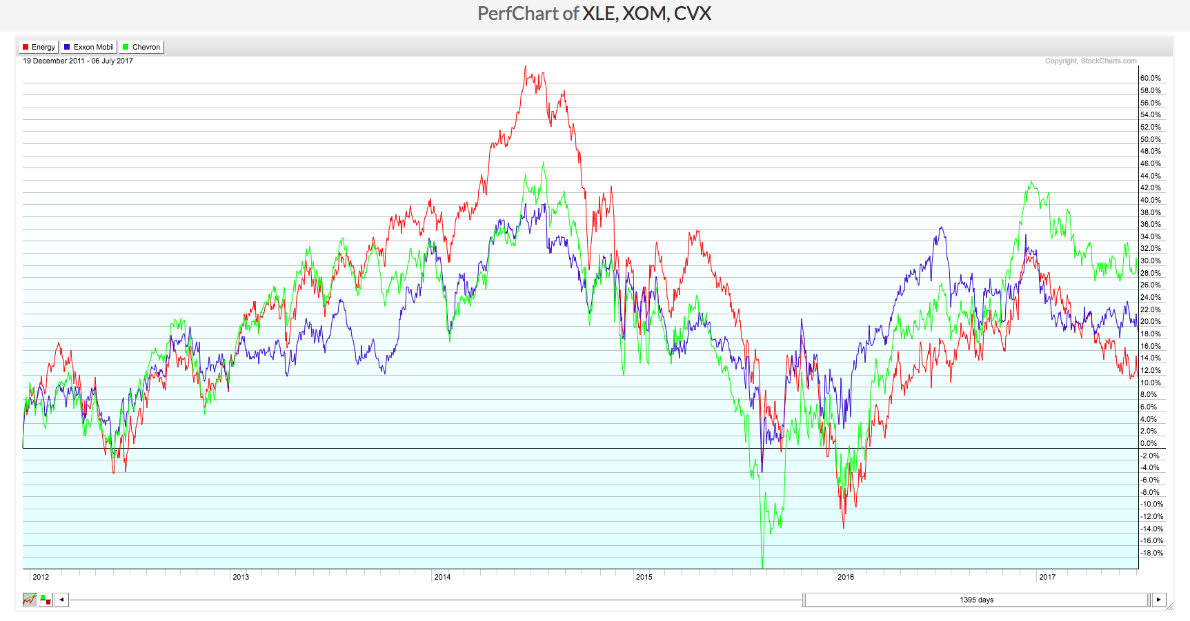
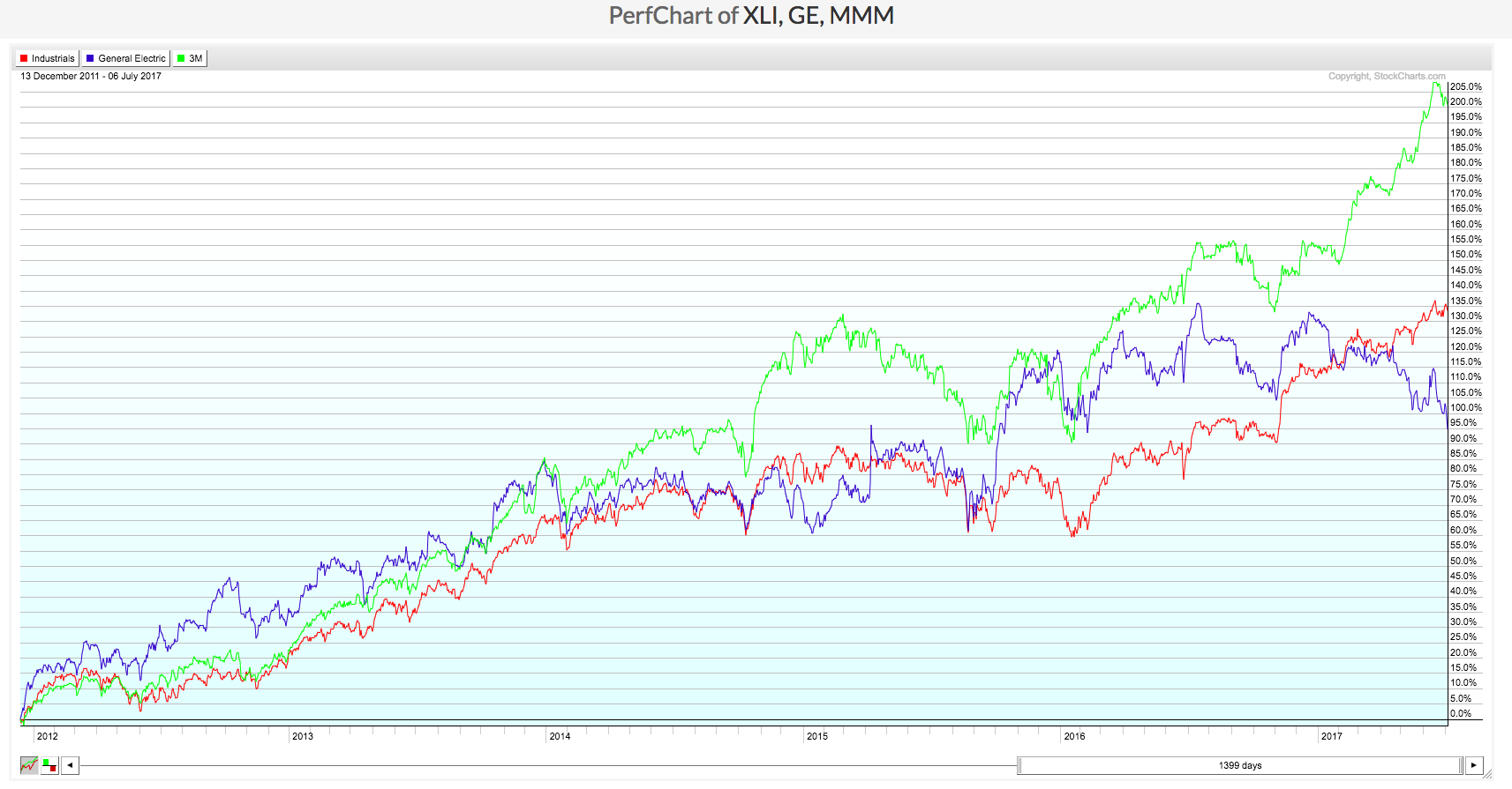
This week’s exercise is to analyze the Energy Sector (XLE) and the Industrials Sector (XLI). The PerfCharts show each of the sector funds as well as their two largest equity holdings which make up the fund. Your assignment is to draw what conclusions you deem appropriate from these two charts in the analysis of the Energy and Industrials Sectors.


Trade well; trade with discipline!
- Gatis Roze, MBA, CMT
- Author, Tensile Trading: The 10 Essential Stages of Stock Market Mastery (Wiley, 2016)
- Presenter of the best-selling Tensile Trading DVD seminar
- Presenter of the How to Master Your Asset Allocation Profile DVD seminar
- Developer of the StockCharts.com Tensile Trading ChartPack
