 I have three objectives for this blog. First, to invite and encourage fundamental investors to embrace the value of visualized dividends which can now be plotted on a chart along with price. Secondly, to nudge all investors to consider allocating a percentage of their portfolios to dividend yielding stocks, both domestic and international. And finally, to compare three dividend yielding options, ETFs, individual stocks and mutual funds and to consider which might be the best option for you.
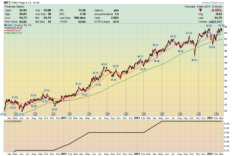
The first objective is to show fundamentalists how they benefit in four distinct ways by bravely wading their big toe into the visual investor pool. As an example, I’ll use Wells Fargo (WFC) which is one of the “dividend darlings” in my ChartPack (ChartList 640).

The first thing to notice is that when you check off the “Detailed Quote” box, you generate both the actual annual dividend paid listed in dollars and cents, along with the present yield showing below. Then beneath this on the price chart, you see that 35 cents is currently paid by WFC every three months. Please note this is the ex-dividend date and not the payable date. Shareholders of record on the company’s books on or before this date get the dividend. Simply use the overlay pull-down menu – labeled “events” – and these dividends are clearly plotted for you.
The fourth visual benefit is that investors can specifically see that WFC has consistently raised its dividend three times in the past three years. Under the indicators table, pull down the “Dividends” menu to produce this graph.
The bottom line here is that, using this clear simple layout, Mr. Fundamentalist could bring 100 equities of his choice to the table for consideration and be able to winnow the list down to a few select dividend darlings – with this visual winnowing process achieved in under ten minutes. So rise above all the noise and clutter of data overload, and start seeing the full picture with plotted dividends and your equity’s price trend all in one picture.
The second objective is to encourage all investors to allocate a percentage of their portfolios to dividend yielding stocks. One convincing example I can present is for those of you who have downloaded my ChartPack HERE.
Please refer to ChartList 640 – Institutional Dividend Darlings. Here, you’ll find a collection of 22 stocks that I gleaned from the holdings of the top four ETFs (such as VIG), as well as gold-rated mutual funds (such as Vanguard’s Dividend Growth Fund VDIGX). Over the past three years, all the equities in this ChartList without exception (a) have appreciated in price, (b) have paid an average dividend of over 3%, and (c) have increased their dividends over the past three years. Pretty impressive!
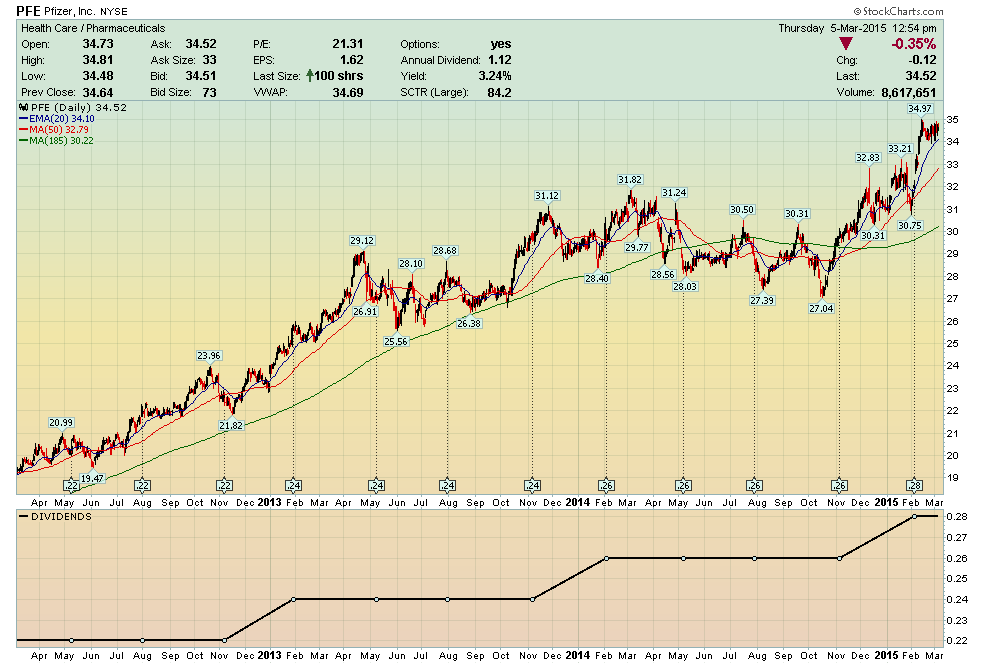
A typical example is Pfizer (PFE) which is paying $1.12 a year in dividends, yielding 3.23% and has appreciated 80% in price over these past three years. Remember, the price chart does not reflect reinvested dividends – Pfizer’s price rose from $19 to $34. The dividends are an added payoff on top of the price appreciation.

If I’ve succeeded in capturing your attention with the first two objectives, then the third part of the sales pitch is to encourage you to consider your participation via either ETFs, individual equities, indexes or mutual funds and show you how charts facilitate this selection process.

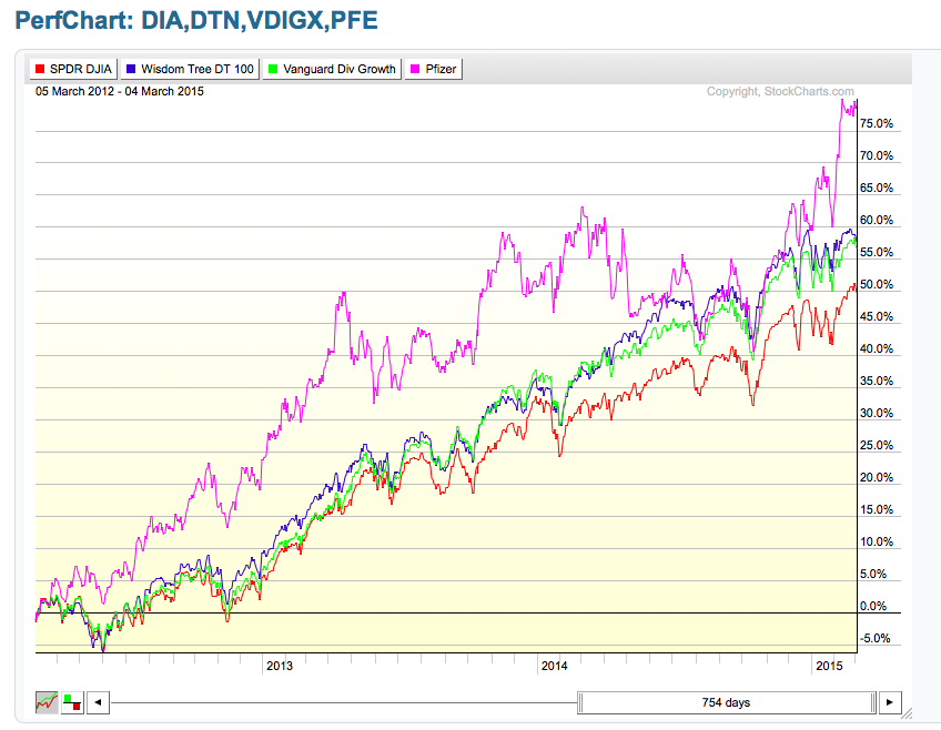
You’ll notice that Pfizer (PFE), our “average” equity from the 22 Dividend Darlings ChartList outperforms our three other options. But don’t overlook the added volatility involved in the ride. Also note that both our ETF and mutual fund DTN and VDIGX outperform the Dow Jones Industrials Index by a significant percentage.
This focus on the tradeoffs between ETFs, individual equities, mutual funds and indexes will be the subject of my seminar on March 28, 2015 (click on the link below for further details).
A personal note and corollary to this is that I also use this dividend yielding principle when investing overseas. For the portion of my asset allocation that I invest in the more volatile Asian markets, I use the Matthews Asia Dividend Investor Fund (MAPIX) which is a diversified fund holding equities from dividend paying companies in China, Japan, India, Indonesia and Singapore. Matthews looks for equities committed to growing their dividends, and by default, it thereby avoids most of the trendy red-hot growth equities and has achieved a superior long term risk-adjusted performance record. This shows another benefit of investing in dividend paying equities even within a fund structure.
In closing, let me simply say that the antiquated ways of consuming traditional stock market data, such as dividends and other fundamentals, are history. Today’s reality is that fundamentals are best analyzed and digested on charts – side-by-side with their volume and stock prices.
Trade well; trade with discipline!
-- Gatis Roze
