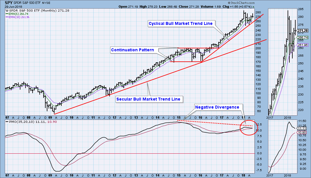
Monthly charts were finalized on Friday, so we can get an up-to-date assessment of the very long-term. On the SPY monthly chart below, note that the cyclical bull market up trend has taken price on a very wide departure from the secular bull market rising trend line. The monthly PMO topped earlier this year, creating a negative divergence against price, and this could be a precursor to more of a correction than we have already experienced. While a further correction is not inevitable, it could be accomplished by price simply moving sideways until it gets back to the secular trend line, as it did in 2015 (the continuation pattern). A more aggressive outcome would be for price to move down to the the secular trend line. This would require a decline of about 25% from the January high, and that would be a cyclical bear market. Certainly, other outcomes are possible, one of which is that the market doesn't correct any more and just keeps moving higher. My preference would be that we see some kind of price action that helps to digest the steep advance the market has experienced since the 2016 low.
The DecisionPoint Weekly Wrap presents an end-of-week assessment of the trend and condition of the stock market (S&P 500), the U.S. Dollar, Gold, Crude Oil, and Bonds.
SECTORS
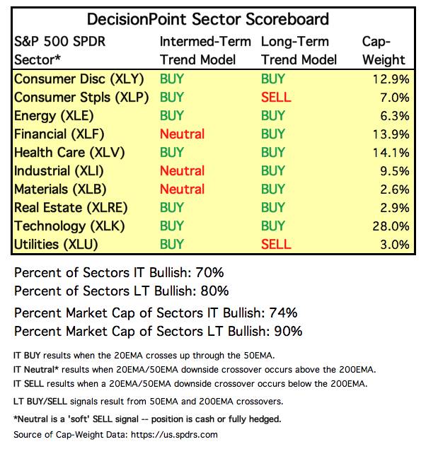
Each S&P 500 Index component stock is assigned to one, and only one, of 10 major sectors. This is a snapshot of the Intermediate-Term and Long-Term Trend Model signal status for those sectors.
STOCKS
IT Trend Model: BUY as of 5/11/2018
LT Trend Model: BUY as of 4/1/2016
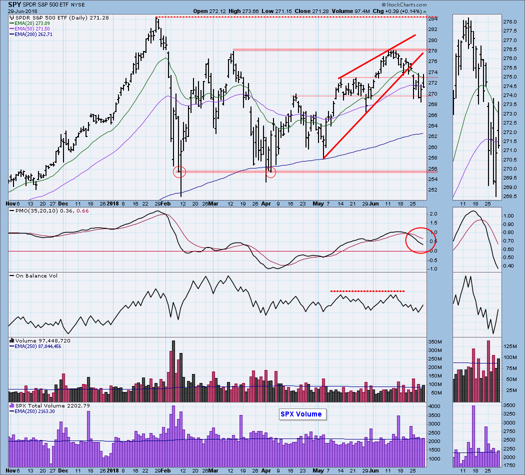
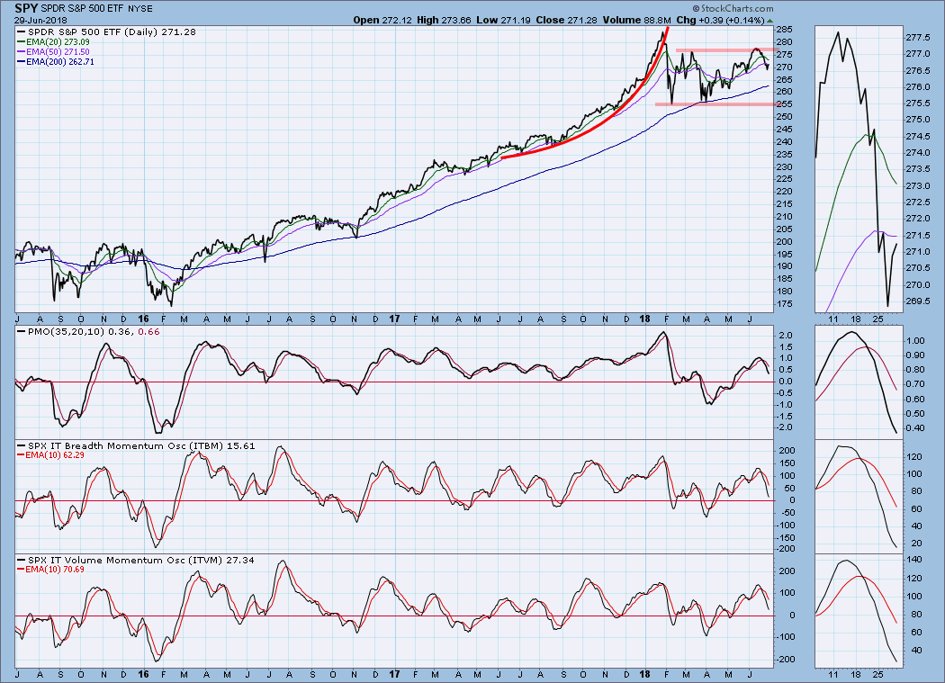
SPY Daily Chart: Last week I said I expected the rising wedge formation to break down, and that expectation was fulfilled on Monday. The rest of the week the market chopped around within the range set by Monday's price bar. In the bigger picture, a trading range has been established that is looking like a high-level consolidation. The top of the range is drawn across the March and June tops, and the bottom of the range is drawn across the closing lows in February and April. This could be the beginning of the continuation pattern that I mentioned in the opening paragraph.
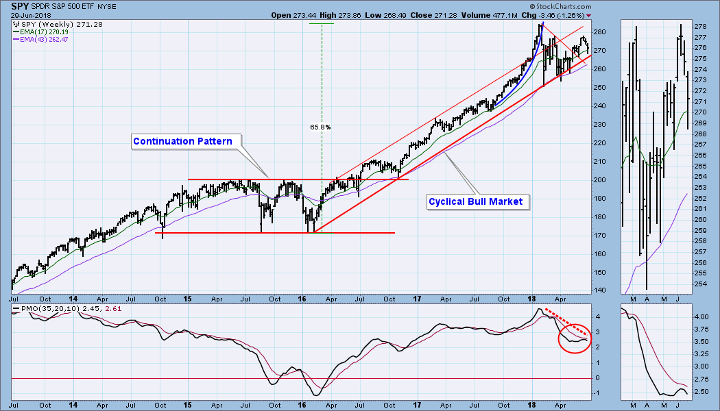
SPY Weekly Chart: The weekly PMO has turned down below the signal line, and it has also formed a negative divergence.
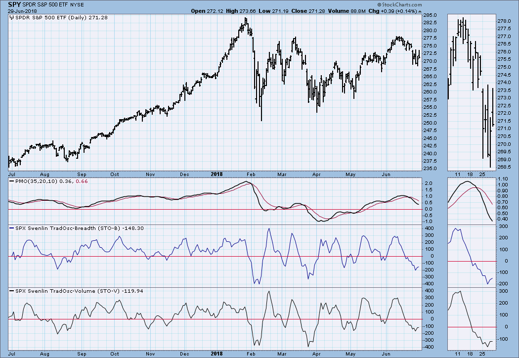
Short-Term Market Indicators: The STO-B and STO-V are modestly oversold. While they have turned up, they have been a bit wobbly for about two weeks, and they might reverse next week.
Intermediate-Term Market Indicators: These indicators are moving down through the neutral zone, and they have plenty of room to go lower before they are oversold.
Conclusion: A little over two weeks ago the market was turned back from a line of resistance drawn across the March price top. In doing so it defined the top of a four-month trading range. Now it seems to be headed down to the bottom of the range. Currently, the pattern looks like a high-level consolidation, which would be a relatively harmless way to work off the excesses of the advance from the 2016 low; although, such sideways movement will generate plenty of whipsaw signals. Overhanging this relatively benign outlook are the weekly and monthly PMOs, which are falling and creating concern that the bottom of the trading range may not hold.
DOLLAR (UUP)
IT Trend Model: BUY as of 4/24/2018
LT Trend Model: BUY as of 5/25/2018
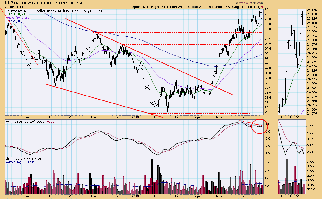
UUP Daily Chart: The daily PMO has formed a negative divergence against rising price tops, evidence of fading upside momentum.
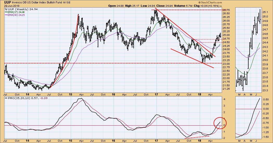
UUP Weekly Chart: A weekly PMO positive divergence and a bullish falling wedge provided early signs that an upside resolution was likely. All indicators are positive in this time frame.
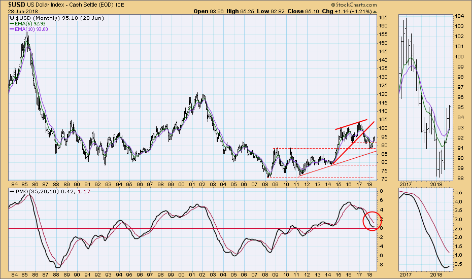
$USD Monthly Chart: For the long-term view I am using the U.S. Dollar index ($USD). It has been moving higher since the 2011 low. After the top in 2015 it corrected until early this year. The monthly PMO has turned up, which suggests that the current rally will continue.
GOLD
IT Trend Model: NEUTRAL as of 5/2/2018
LT Trend Model: SELL as of 6/22/2018
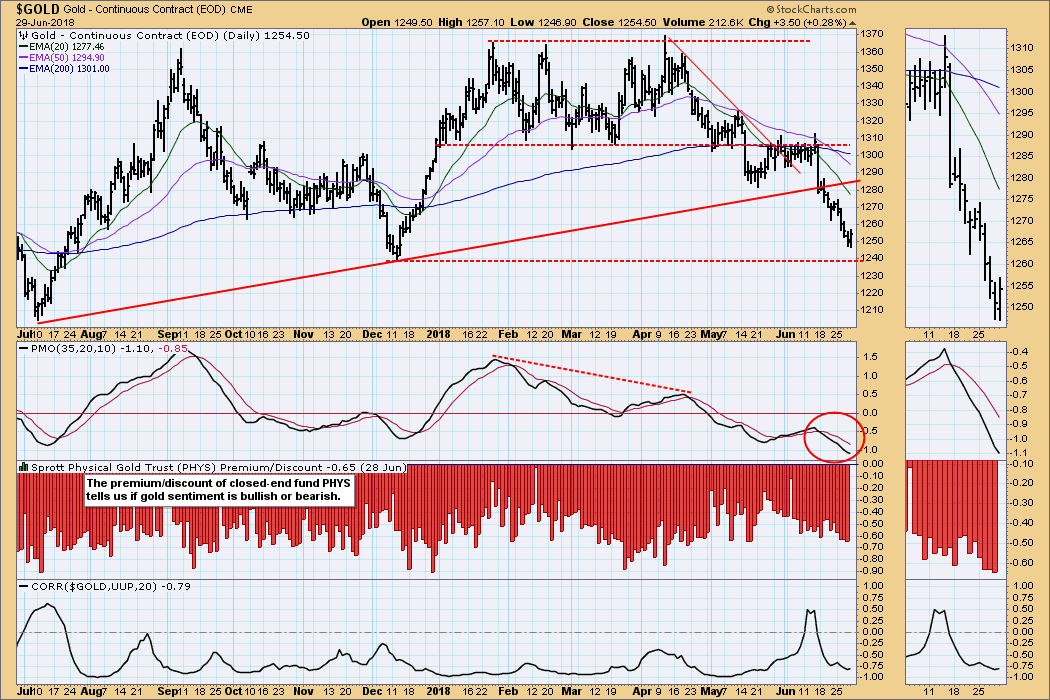
GOLD Daily Chart: Gold potentially found a bottom on Friday as the dollar began a pullback. Watch for a daily PMO bottom to signal a short-term entry point. Sentiment is still bearish, and it needs to turn bullish before we can assume that any rally has longer-term potential.
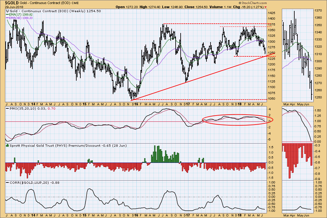
GOLD Weekly Chart: The only hope offered on this chart is the potential support where the rising trend line and horizontal support intersect. Bearish signs: the 17EMA will cross down through the 43EMA next week, and the weekly PMO is about to cross down through the zero line.
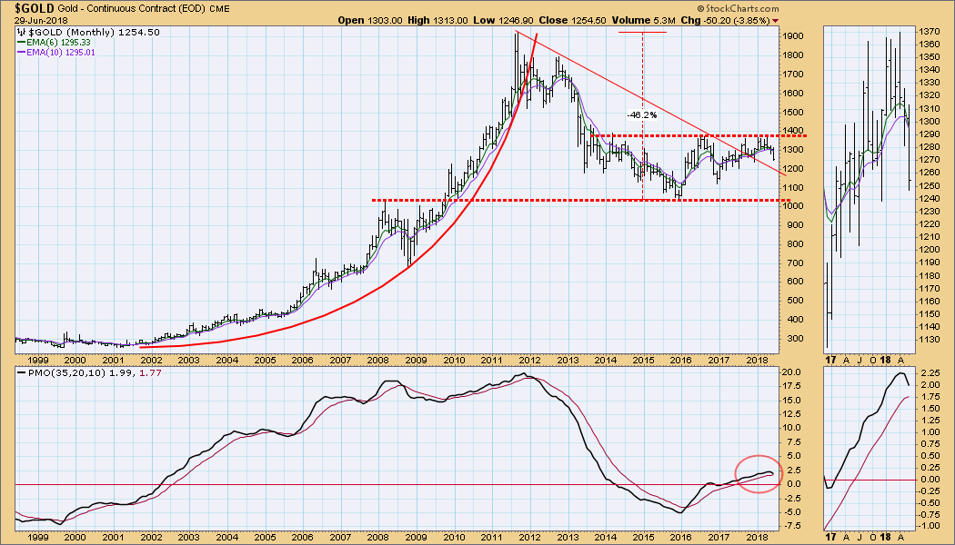
GOLD Monthly Chart: I have been following a declining tops line drawn from the 2011 top, but gold has failed to rally above the 2016 top and establish a bull market rising trend. Now I'm beginning to focus on a trading range defined by the 2015 low and the 2016 top. The monthly PMO has turned down, and that is a strong signal that the bottom of the trading range may be tested.
CRUDE OIL (USO)
IT Trend Model: BUY as of 6/26/2018
LT Trend Model: BUY as of 11/2/2017
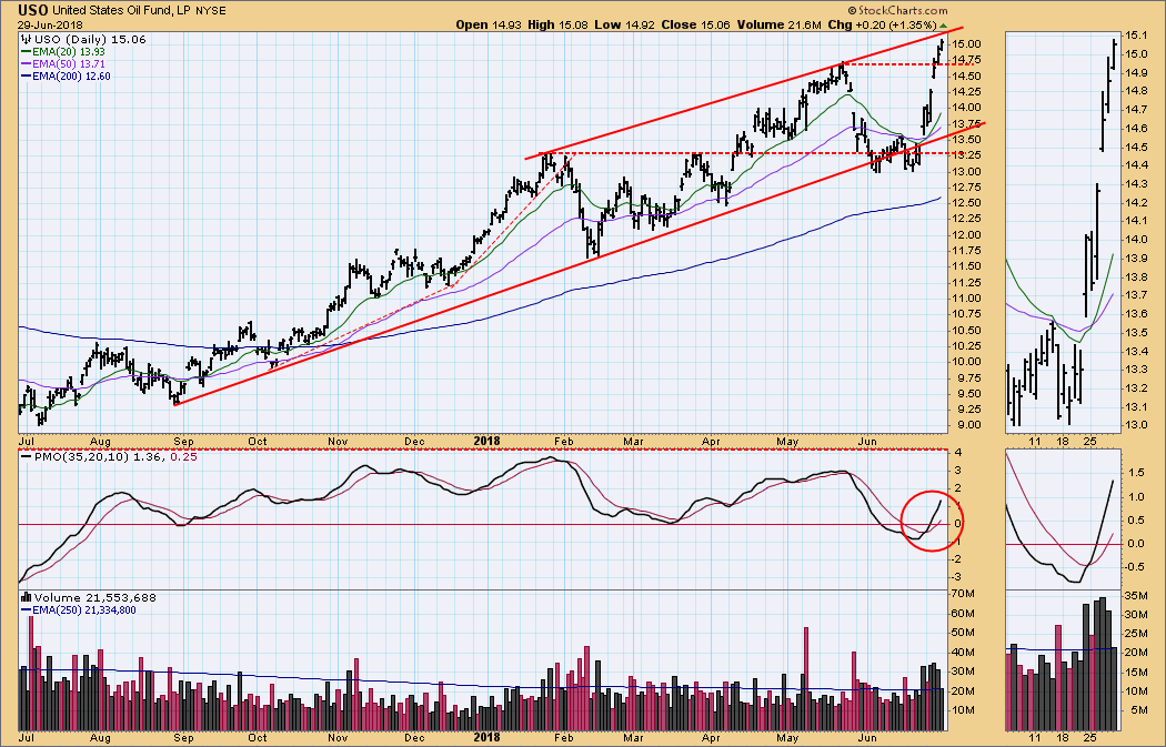
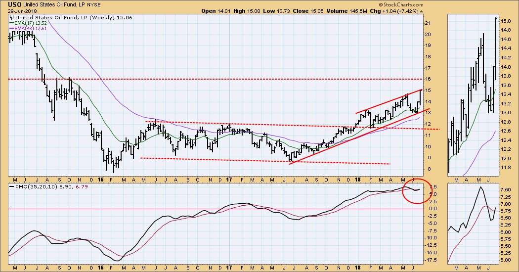
USO Daily Chart: USO has gone from the bottom to the top of the rising trend channel in about two weeks. Compare that with the three-month journey from the February low to the May top. The daily PMO is not yet overbought relative to the one-year range shown.
USO Weekly Chart: The weekly PMO is overbought, but it has crossed up through the signal line, indicating a potential for price to break out of the rising trend channel. The next level of resistance is at 16.00, which is equivalent to about $78/bbl for crude.
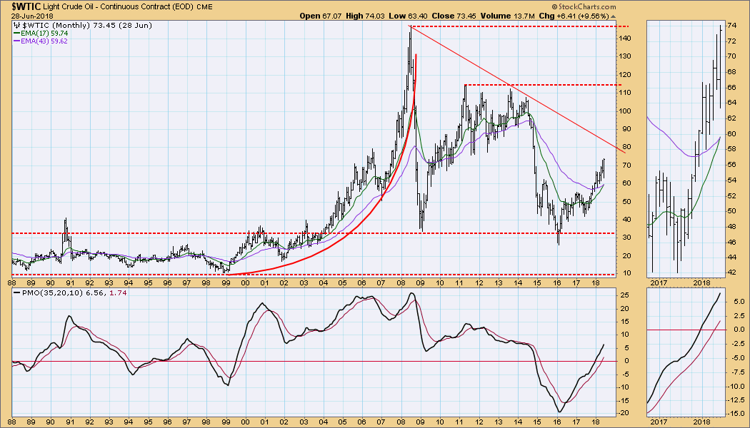
$WTIC Monthly Chart: The 30-year chart of the West Texas Intermediate Crude ($WTIC) shows the extremes to which crude prices have gone. The current rally will run into resistance of the declining tops line at about $80, and there is a wide range of congestion to the left that will also come into play at about the same time. There has been a 17/43EMA upside crossover, and the monthly PMO has a long way to go before it is historically overbought.
BONDS (TLT)
IT Trend Model: BUY as of 6/1/2018
LT Trend Model: SELL as of 2/8/2018
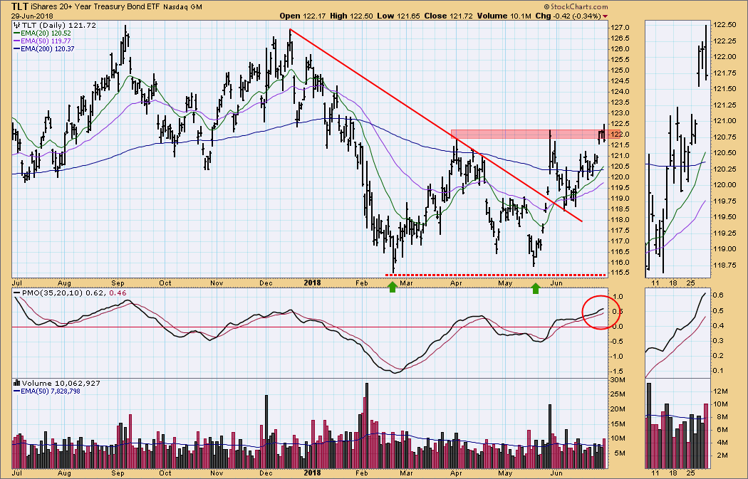
TLT Daily Chart: Price gapped up on Wednesday and is currently trapped in a zone of resistance.
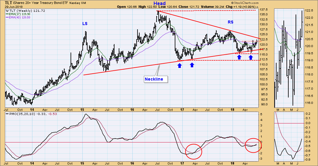
TLT Weekly Chart: The head and shoulders pattern is still viable, but the double bottom and weekly PMO favor a continuation of the current rally, which could dissolve the larger bearish pattern.
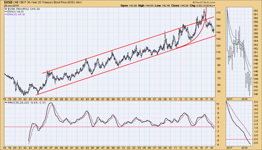
$USB Monthly Chart: For the longest-term view I'm switching to a chart of the 30-Year Bond ($USB), which shows price correcting back to the 34-year rising trend line. The parabolic advance to the all-time high in 2016 implies that the current correction will take price below the rising trend line, finally breaking the trend of a multi-decade bull market for bonds.
**Don't miss any of the DecisionPoint commentaries! Go to the "Notify Me" box toward the end of this blog page to be notified as soon as they are published.**
Technical Analysis is a windsock, not a crystal ball.
Happy Charting!
- Carl
NOTE: The signal status reported herein is based upon mechanical trading model signals, specifically, the DecisionPoint Trend Model. They define the implied bias of the price index based upon moving average relationships, but they do not necessarily call for a specific action. They are information flags that should prompt chart review. Further, they do not call for continuous buying or selling during the life of the signal. For example, a BUY signal will probably (but not necessarily) return the best results if action is taken soon after the signal is generated. Additional opportunities for buying may be found as price zigzags higher, but the trader must look for optimum entry points. Conversely, exit points to preserve gains (or minimize losses) may be evident before the model mechanically closes the signal.
Helpful DecisionPoint Links:
DecisionPoint Shared ChartList and DecisionPoint Chart Gallery
Price Momentum Oscillator (PMO)
Swenlin Trading Oscillators (STO-B and STO-V)

