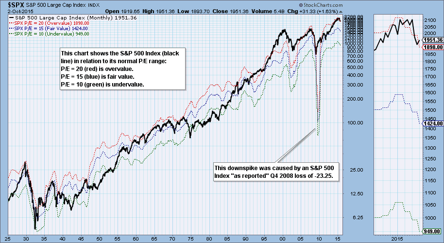
This is one of my favorite charts, although I look at it infrequently because it's a little like watching grass grow. Instead just showing a graph of earnings, it puts earnings in a different context by presenting a set of bands that show where the S&P 500 Index would be if its P/E was 20 (red line), 15 (blue line), or 10 (green line). And the position of the S&P 500 within those value bands tells us where the index is in relation to being overvalued (red) or undervalued (green). (This chart is not "live.")

Generally speaking, the Index meanders back and forth between overvalue and undervalue, and occasionally it exceeds the normal range. Currently the S&P 500 has a P/E of 20.56 and has slightly exceeded the overvalue limit. But of particular interest is the fact that earnings have declined for three quarters in a row (see the range bands on the thumbnail chart). In order to reach the undervalue level the S&P 500 would have to drop about 1000 points. To be clear, I am not forecasting a drop of that magnitude, just pointing out where the normal undervalue is currently located. This can change as earnings improve or deteriorate.
CONCLUSION: Our technical assessment for some time is that we are in a bear market. To make matters worse, fundamentally the market is overvalued and earnings are declining. This reinforces our belief that the bear market is far from over.
Technical analysis is a windsock, not a crystal ball.
