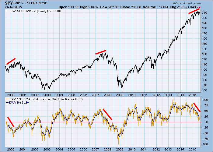
The price index on the chart below has continued to edge higher, but we can see that pattern is becoming congested. The lower panel shows the 1% EMA of the Advance-Decline Ratio* and its 50EMA. The daily data is pretty volatile, so the 50EMA is easier to interpret. Also, when the 50EMA passes below the zero line, it is considered to be a bear market signal.
The major points of interest on this 16-year chart are the three prominent negative divergences, which is where price is trending upward and the indicator is trending downward. The first two (1999-2000 and 2007) were precursors to two major bear markets, and I have little doubt that the current divergence will lead to a similar disaster.
You will notice that there was a relatively flat section on the indicator in 2013 and 2014, while price kept going higher. Is this a negative divergence? I wouldn't call it such. The flat patch was well up in positive territory and indicates that breadth was very positive during that period. Remember, indicator ranges are usually finite, whereas price potential, while not infinite, is not constrained by a range scale.
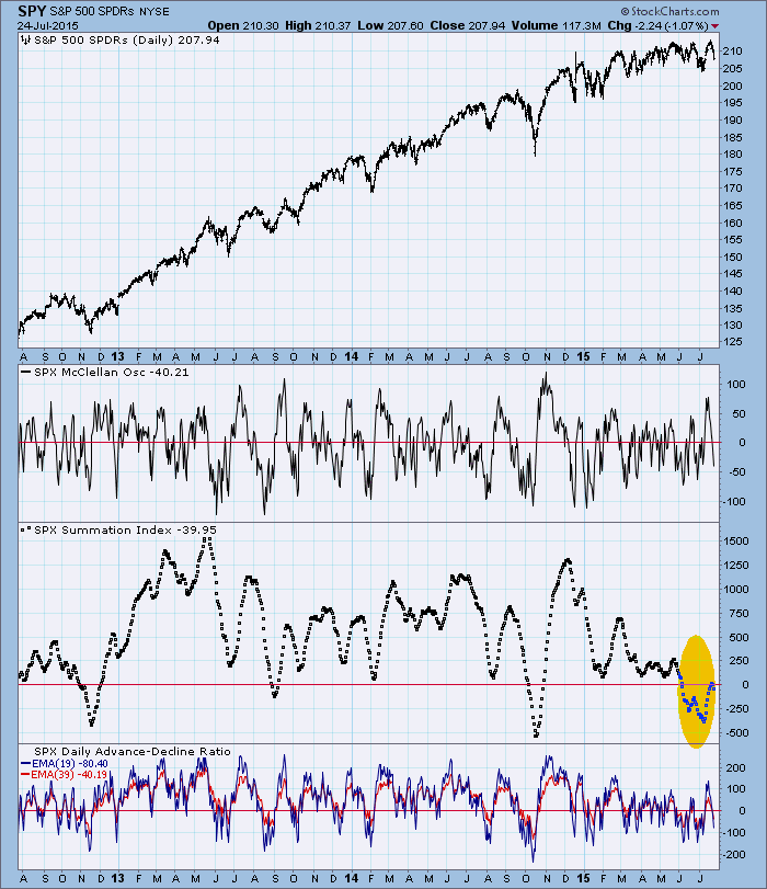
The chart below is the McClellan Oscillator for the S&P 500 Index. Of particular interest is the Summation Index (the middle panel with the dots). While it is not as long-term as the 1% EMA, it is the longest-term component of the Oscillator group. It is calculated by simply keeping a cumulative total of the McClellan Oscillator. We use dots because the relative spacing between the dots shows how strong breadth really is. The point of interest is that the Summation Index is below the zero line. When this happens, the market should be considered especially vulnerable.
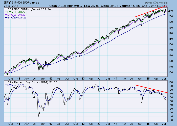
This last chart of the Percent Buy Index (PBI) shows that only 51% of S&P 500 stocks are on Price Momentum Model BUY signals. This is really thin.
You might ask why the price index is able to hold up while internals are unwinding so badly. This miracle is accomplished through cap-weighting the stocks in the index--while money is leaving the smaller-cap stocks in the index, it flows into the larger-cap stocks, keeping them in what seems like perpetual levitation. However, this kind of situation usually comes to a bad end.
*Note: The title "1% EMA of the Advance-Decline Ratio" is another way of saying "200EMA of Advances minus Declines divided by Advances plus declines."
Subscribe to Carl's free blog and receive email whenever a new article is posted. See subscription links at the upper right corner of this page.
Technical analysis is a windsock, not a crystal ball.


