I recently received a question from one of the attendees of yesterday's webinar (recording available here). I was reviewing the charts in our DP Chart Gallery as well as symbol requests and often referred to ascending triangle patterns and ascending wedge patterns. Here is the question:
"Erin..... Paradoxical situation: I can't count the times over the years that I have seen first, Carl, and now you, identify a "rising wedge" pattern and then say the odds are that the expected outcome is a break DOWN from this pattern. Tonight, you show a "bullish rising triangle"....which, visually appears to be the same as a "rising wedge" yet you say the expected out come is a break UP. This seems to be inconsistent. What specific graphic/geometrical characteristics specifically define and separate the two formations?"
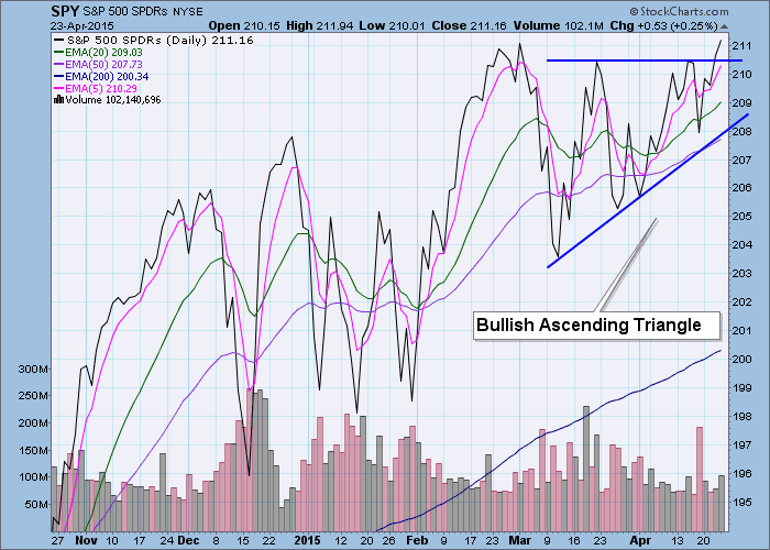
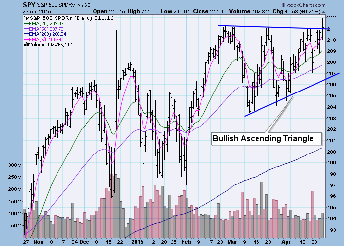
First, let's look at two examples of a rising/ascending triangle in the sister charts (SPY/$SPX) below. Notice that the top line is either horizontal or a slightly declining trendline. This is the fundamental difference between a triangle pattern (symmetrical or ascending) and a wedge. These patterns are bullish with an expectation of a breakout. We see the execution of both in the example charts below.
According to Thomas Bulkowski in his book, "Visual Guide to Chart Patterns" (A great addition to your technical analysis library that you can purchase in the StockCharts.com Store here.), the psychology behind a rising triangle is like that of the rectangle or trading range only bulls start to win the power struggle. Imagine this scenario, those who bought at the bottom of the pattern have a target price at overhead resistance and when reached, they will sell, bringing price back down. Buyers start to see an opportunity to take advantage of 'knowing' the price target at overhead resistance and get in before price goes all the way back to the original start price. This forms a higher low and the rising bottoms trendline. When overhead resistance is again met, they sell bringing the price back down but not all the way because others begin to jump in. This continues until price is squeezed toward the apex of the triangle. Bulls now press their advantage and price breaks out. A breakout signals more traders to jump in and price continues to rise. In simple terms, the bulls overpower the bears.
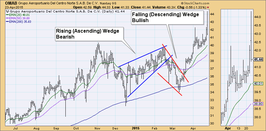
Now let's look at the bearish ascending wedge. Note that the top trendline is rising. Additionally the bottom trendline (rising bottoms) is rising. It's another battle between bulls and bears. The pattern is formed as each high is higher than previous and each low is successively higher as well. The difference being, the angle of ascent is steeper on the rising bottoms line. The steeper of the two trendlines in both the rising and falling wedge patterns will generally not hold because it becomes harder for bulls (bears) to sustain that acceleration (deceleration) in price. Though the highs are successively higher, their angle of ascent is less steep which implies bulls are not able to push prices high enough to maintain a complete rising trend channel. That is bearish. Selling pressure mounts until finally price breaks down from the steep rising bottoms trendline which executes the pattern.
The chart below is a great example of both types of wedges executing with near perfection.
Thank you to my webinar friend for bringing up this question and allowing me to elaborate. I hope it clears up any confusion between the two patterns.
Happy Charting!
Erin


