 I thoroughly enjoyed speaking at ChartCon 2014 and meeting so many that were thirsty to learn more about DecisionPoint indicators, charts and reports. At the end of my presentation, I briefly demonstrated how the DecisionPoint Tracker reports can be used to "bottom fish". It appears there are quite a few crustaceans out there as that part of my talk, even though it was at the very end, grabbed everyone's attention. Be aware that you must be at least a BASIC subscriber to access Tracker reports. You'll find them in the "DP Trackers" blog.
The Tracker Reports are chockfull of information on the various stock, ETF or mutual fund groupings they cover. Not only can you review something as simple as percent change in comparison to the other group members, you can also review something as complicated as PMO strength rankings and signal changes. To "bottom fish", I use the third table in the report. (All of the reports are structured the same way and spreadsheets are available for Extra and Pro members to download and manipulate).
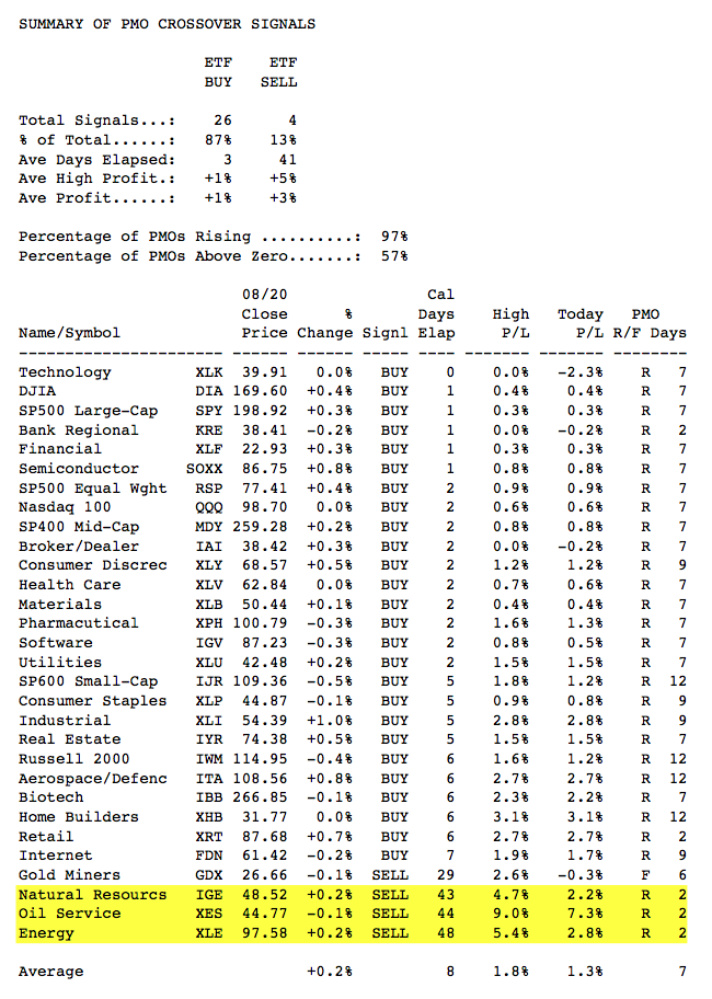
In general terms, what I am looking for are ETFs, stocks and mutual funds that are on PMO SELL signals but have a PMO that has bottomed and has been rising 3 days or more. Let's use the ETF Lite Tracker Report from today for our example. The third portion of the report sorts by PMO signal with new PMO BUY signals at the top, moving lower to longer BUY signals, and then into SELL signals new to old.
Looking at the spreadsheet below, I have pulled out the third section of the report and highlighted three ETFs that have been on long-time SELL signals, but have PMOs that have been rising for 2 days. Normally I prefer a PMO that has been rising longer, but for the purposes of this exercise, this is fine.

The critical part of this process is not finding these candidates on the table, the most important part of this process is looking at the chart. I cannot stress this enough. BUY/SELL signals and the PMO in general should be used to alert you to possible trading opportunities not used as a mechanical trading model. Always check out the stock charts to verify the price pattern and the configuration of the PMO. Signals are best when price appears extended, is near support or resistance, and the PMO is very overbought or oversold.
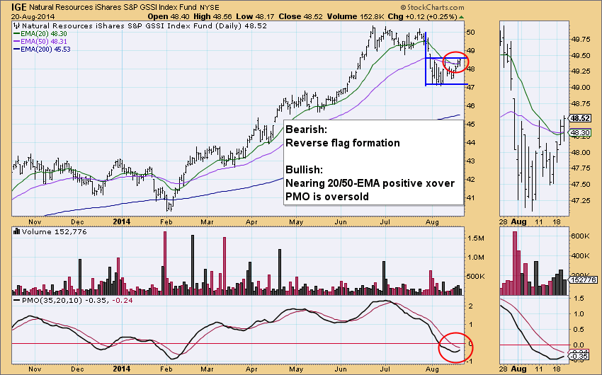
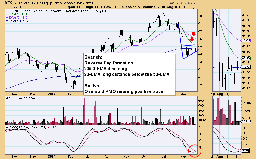
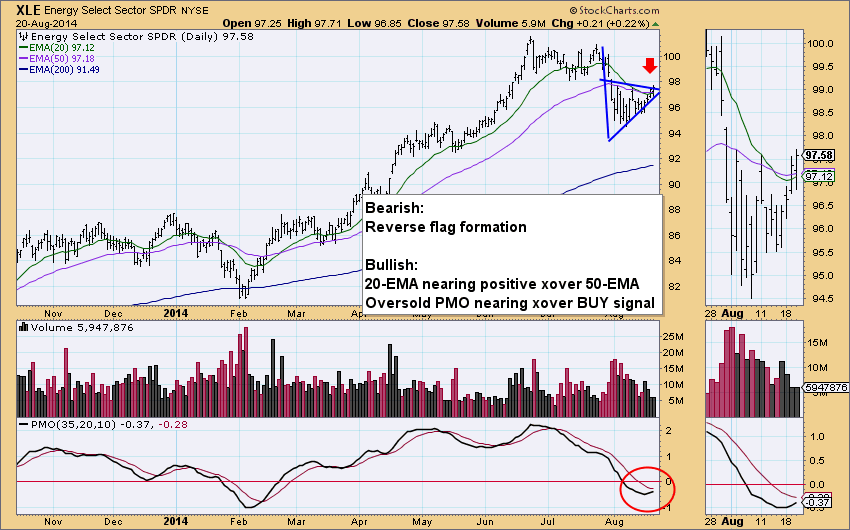
Here is a review of the three charts we identified from the ETF Lite Report today.
IGE shows a 20/50-EMA nearing a positive crossover for a Trend Model BUY signal. Additionally, the PMO is oversold and nearing a positive crossover that would generate a PMO crossover BUY signal. I don't like the bearish reverse flag formation, especially given the steady climb of the general market. But, price is attempting a breakout above the flag which would be bullish.
XES has the same characteristics of IGE, but the 20-EMA is not nearing a positive crossover the 50-EMA, both are actually falling. Price is also sitting on the support line at the bottom of the flag, not the top like IGE.
XLE is mostly the same configuration as IGE. A bearish reverse flag with price testing resistance at the top of the flag and a 20/50-EMA positive crossover nearing which would generate a Trend Model BUY signal. The PMO is oversold and it is nearing a positive crossover.
The DP Tracker blog has Tracker reports for the SPX, SPX-Plus (includes 64 top stocks in addition to SPX members, the PMO Signal table is on page 4), ETF Tracker, Fidelity Select Funds, Rydex Funds, DP 152 Blue Chip, Dow Jones US Sector, Dow Jones 65, NDX, OEX and Dow 30. Here is a quick link to the DP Tracker Blog.
Happy Charting!
Erin


