The new DecisionPoint Gallery on StockCharts.com offers you the ability to quickly assess market trends and conditions. I look at the Gallery every afternoon after the indicators have updated. DecisionPoint.com subscribers should recognize the charts on Gallery page as the same ones that are reviewed daily in the DP Daily Blog on the DP website with some excellent additions.
If you are not familiar with it, you can get to the DP Gallery using the link in the middle of the StockCharts.com homepage. The link is directly underneath all of the big ticker symbols in the middle of that page. Or click here.
Today I'd like to take you through the Trend and Condition charts in the Gallery and give you my analytical review and commentary based on today's (Feb. 26th) close. All the charts are clickable and will bring up a live version that you can save and/or annotate.
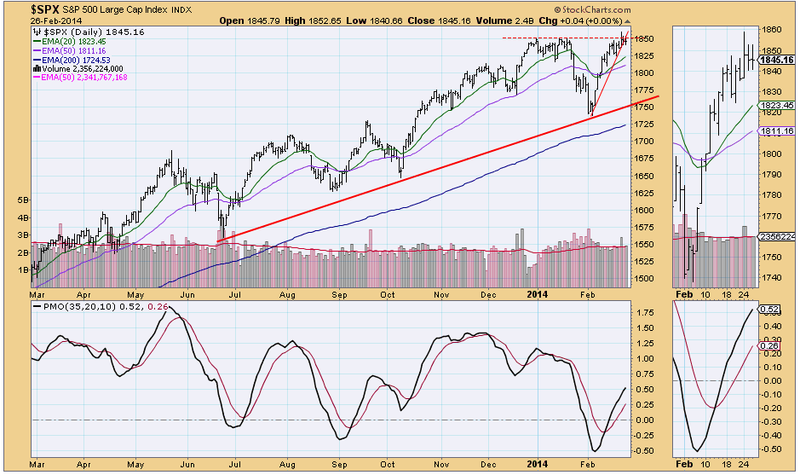
First, we look at the daily chart. Overhead resistance is still holding around 1850 with today's high not exceeding yesterday's. While price has passed through the steep short-term rising trend line, I wouldn't call it significant as price basically drifted through it, rather than breaking down in a deliberate fashion. The PMO is still rising without much deceleration given the price consolidation which attests a continuation of positive momentum. The configuration of the EMAs is bullish: the 20-EMA above the 50-EMA is intermediate-term bullish and the 50-EMA above the 200-EMA is long-term bullish.
The next Trend charts in the DP Gallery are the weekly and monthly charts. I review these at the end of the week and month when they "go final". So let's proceed to the market condition charts.
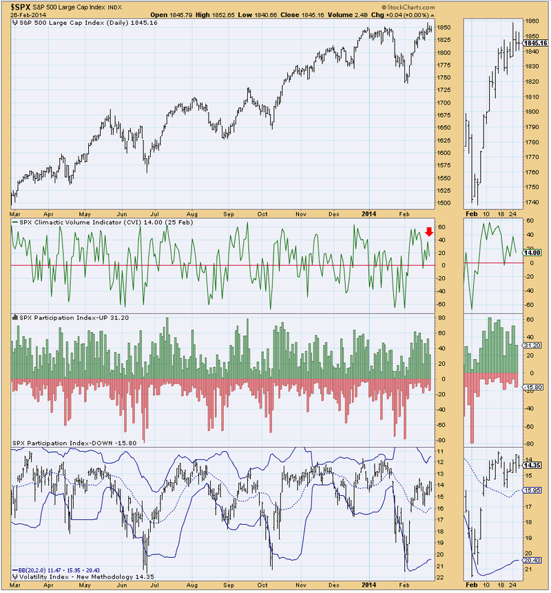
The volatile or ultra-short-term condition chart shows the CVI is staying rather static. This isn't surprising given the current price consolidation. It has been oscillating above zero since the beginning of February, this tells us the market is showing strength in the ultra-short-term. The other two indicators aren't saying much as they are both neutral.
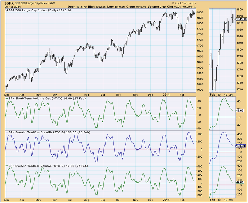
The short-term indicator charts are next. All three indicators are mirroring each other. While some may see falling indicators as a sign of weakness, I think in this context it is positive. These indicators are unwinding, moving out of overbought territory without the necessity of a price decline. This often happens in a persistent bull market. Oscillators by their very nature, must oscillate. Many times it only takes a price consolidation to offer them the opportunity to clear overbought conditions.
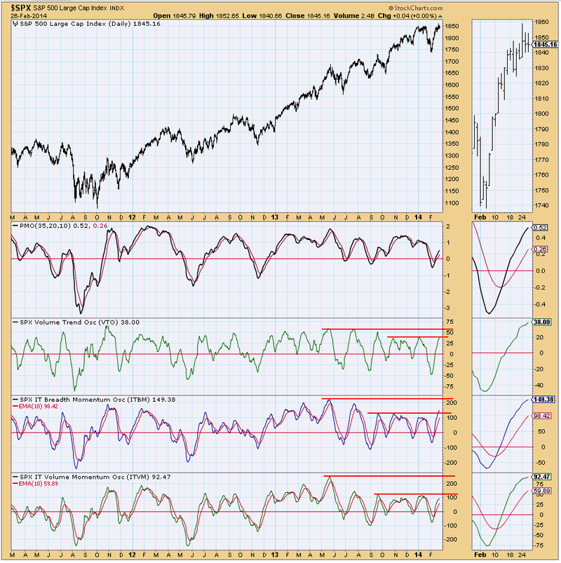
Next up, intermediate-term condition charts. There are three charts in this section. For brevity, I will only analyze chart one. We can look at the others in a future article.
All three indicators are hovering in near-term overbought territory and in the case of the ITBM it has broken above the range. Yet, we see when we expand our view that while these readings may appear overbought, they actually have some ground to cover to reach the top of their range. I'm still concerned about near-term overbought readings because when you look in the thumbnail, we see that all three indicators are beginning to decelerate. If the indicators top here, it could mean price will pullback after consolidating.
In conclusion, overhead resistance at around 1850 is holding. Although short-term indicators are unwinding and clearing overbought, intermediate-term indicators are decelerating and have reached somewhat overbought territory. That is not the best set-up for a breakout from this continuation pattern; more likely, it is the prelude to a pullback.
I challenge you to click on some of these charts, annotate and add your favorite indicators to see if they confirm what I see. Look for a walk through of the Breadth and Sentiment charts next time in the DecisionPoint Blog.
Happy Charting!
Erin


