Long-Term Gold Charts Give Perspective
Gold broke out to a new recovery high on Tuesday and looks set to gain more ground, all with a favorable background from the long-term trend.
Chart 1 compares the quarterly gold price to a Coppock indicator and its 9-quarter moving average. This is not a chart for short-term traders, but it does offer the perspective of ten previous signals, nine of which were accurate. These were generated by a reversal in direction of the Coppock indicator itself. The only failure since 1975 was triggered in 2008. The latest 2016 upside reversal is still in force.
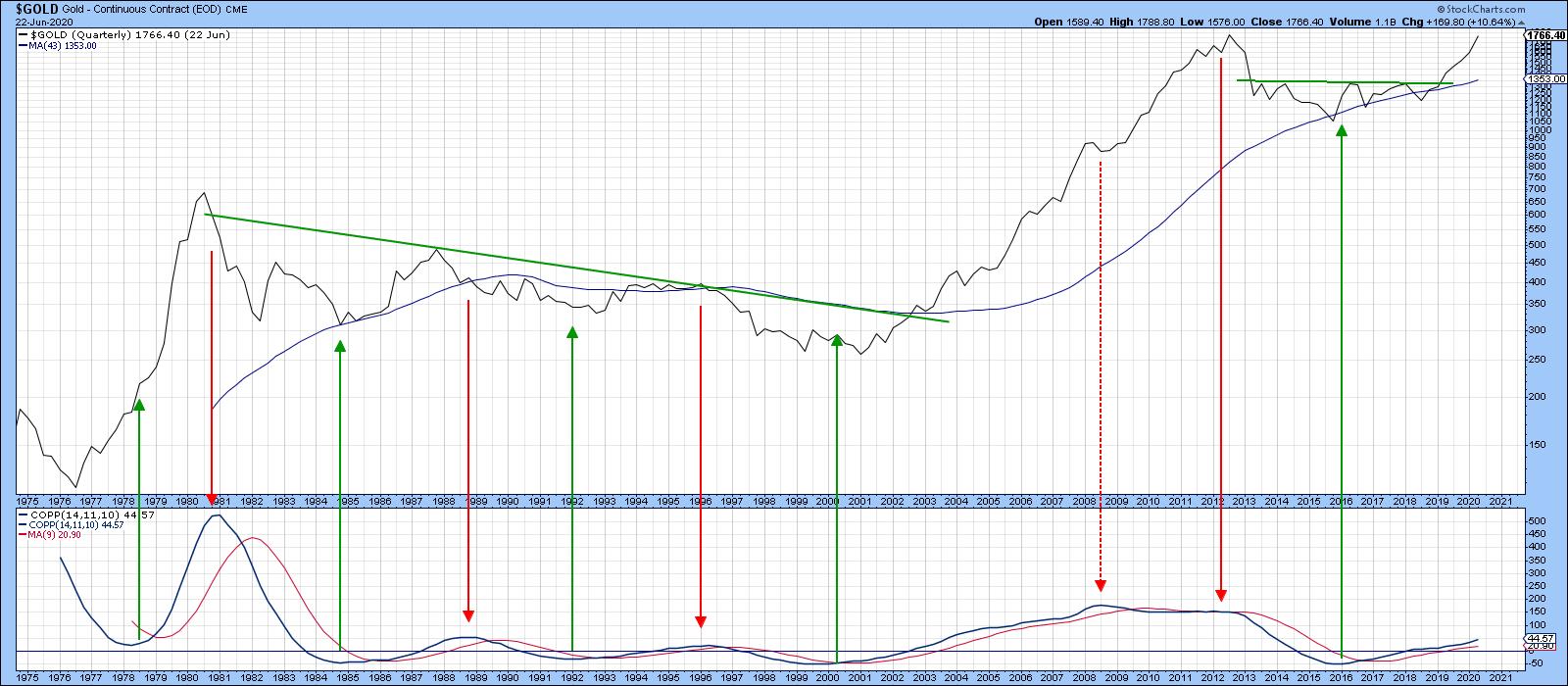 Chart 1
Chart 2 features my Gold PPO model. Using the 6- and 15- month EMAs as parameters, it signals buy and sell signals as it crosses through zero; in other words, as the 6-month EMA crosses its 15-month counterpart. The green-shaded areas reflect bullish periods, while white areas reflect negative ones. The three arrows, two red and one green, highlight the fact that only three whipsaws have taken place in the 45-or-so years covered by the chart. At the moment, the indicator is rallying and is therefore moving away from a sell signal. It won't come at the very top, of course; nevertheless, if past is prologue, it will likely come fairly close to it.
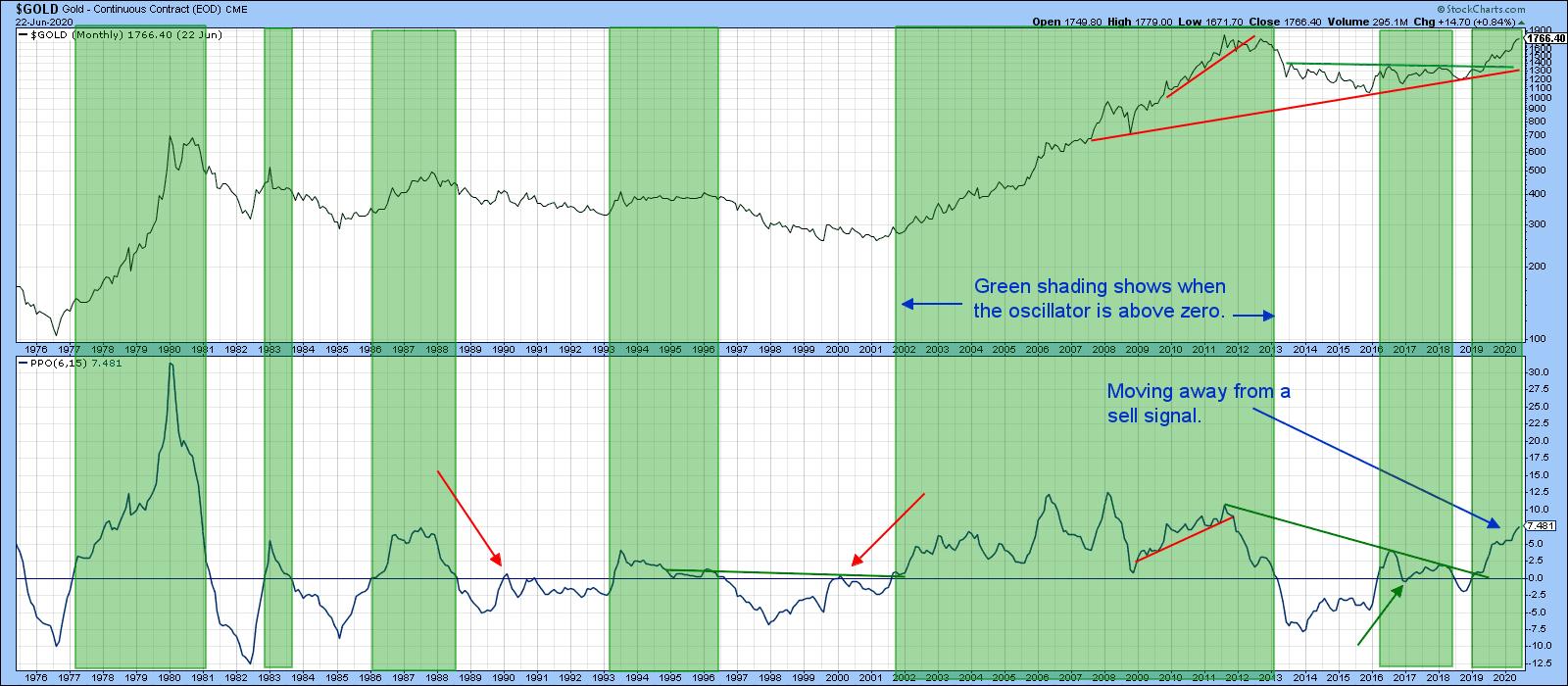 Chart 2
Gold vs. the Dollar
Most of the time gold moves inversely with the dollar, though the last few months have seen them rise in tandem. Chart 3 suggests that the price of the yellow metal will probably get a shot in the arm from this source, as the inversely plotted PPO for the Dollar Index has crossed above the equilibrium level, meaning that the Dollar Index itself is below its 12-month EMA. The green-shaded areas indicate that, when this condition has been in force for an extended period, the price of gold has typically risen. One of the problems of the current situation is that the June crossover has been preceded by a couple of recent false signals.
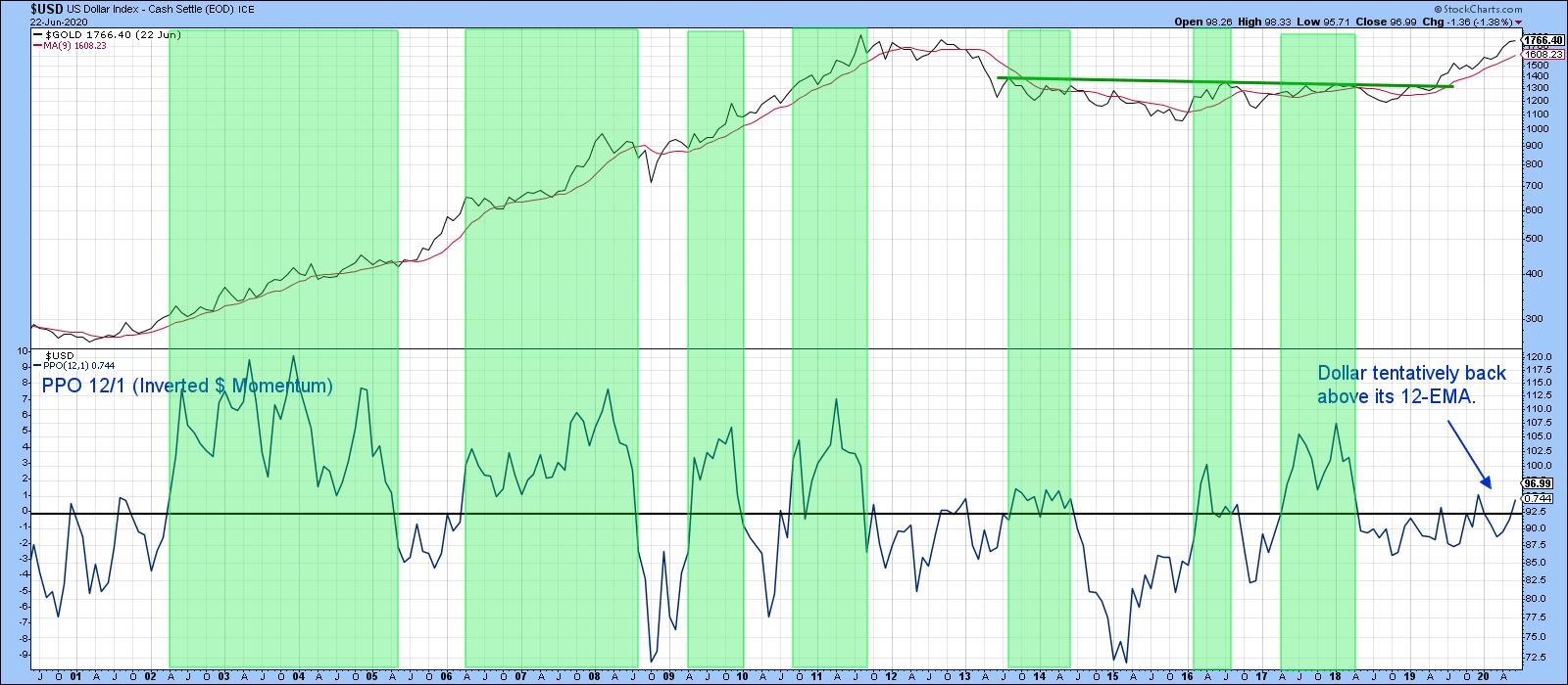 Chart 3
I would feel a lot more confident if the 24-month EMA version (See Chart 4), which is less prone to whipsaws, went bullish for gold. That would require a decisive month-end close in the Index below 97.
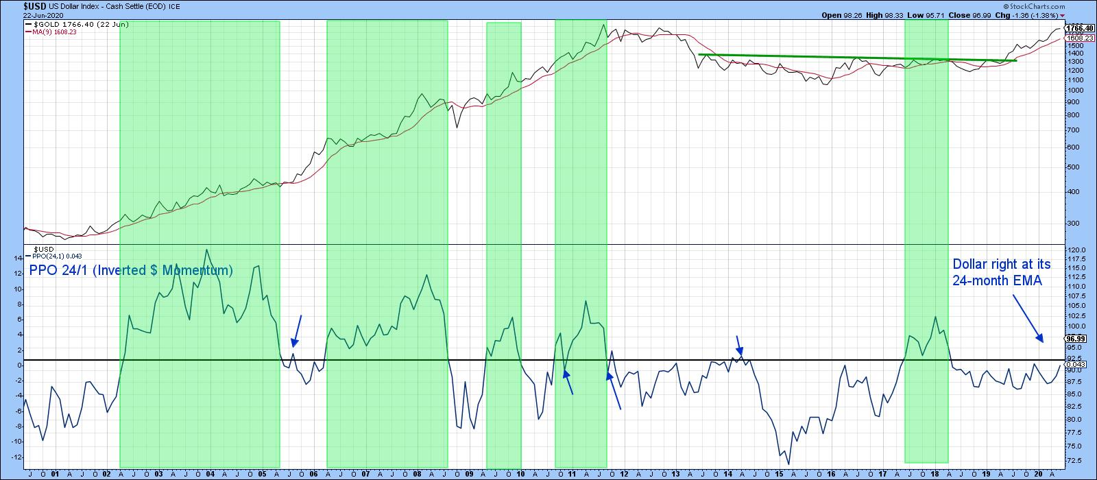 Chart 4
Gold vs. Gold Shares
Gold shares are probably more correlated with the price of the yellow metal than any other resource sector, so, in any technical situation it's nice to see them in gear. The Gold Bugs Index ($HUI) is characterized by the fact that its components do not generally hedge the price of gold in the futures market. Consequently, they represent a "purer" play than gold mining companies that have already sold most of their immediate future production. Just as the stock market discounts the economy, so too does the Gold Bugs Index have a strong tendency to lead the price of the metal. Chart 5 features the ratio between the $HUI and gold in the center window. The red and green arrows indicate that it leads the metal most (but certainly not all) of the time. The ratio recently broke above the green trendline, but has not followed through on the upside. This failure to confirm or lead the gold price itself is a bit of a worry, but certainly does not negate the bullish case for gold. It just clouds it a bit. One bullish note lies in the fact that the KST for the ratio is above its MA. The green shading shows that this kind of positive momentum on the ratio's part is typically a bullish omen for the gold price.
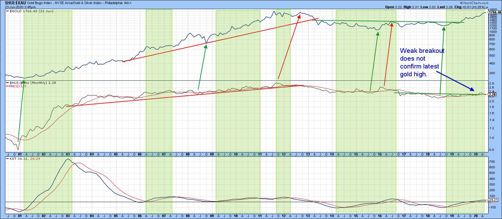 Chart 5
Chart 6 shows the critical nature of the ratio's current technical position, as it is trying to nudge through the green breakout trendline. A breakout is important because the short-term KST is on the threshold of a buy signal and could well join its intermediate counterpart in the bullish camp.
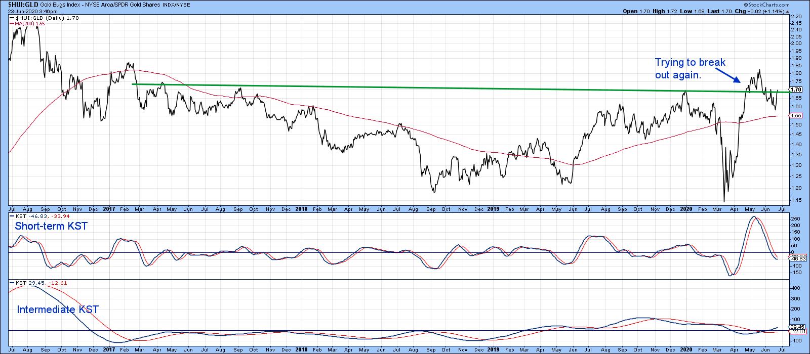 Chart 6
Chart 7 focuses on the Gold Miners ETF, the GDX. It recently broke out from a large base and looks headed higher. One of the things I like about the chart is that the gold shares bullish percentage, in the lower window, has been able to maintain a high reading as it has advanced. This is a clear-cut bull market characteristic. Compare that to the two bear markets, where the indicator was unable to move and hold above the 60% level. Note how the white areas flagging primary bull markets did not experience much in the way of corrections following overbought readings. In a similar but opposite vein, pink bear market areas were not able to generate much in the way of a rally from the oversold readings.
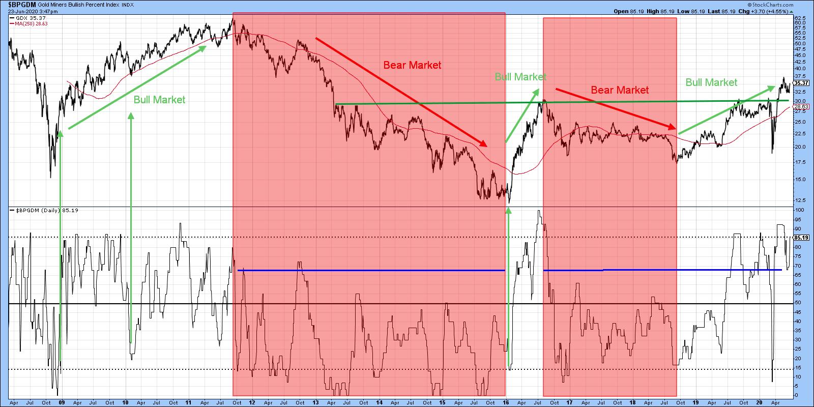 Chart 7
Editor's Note: This is an excerpt of an article that was originally published in Martin Pring's Market Roundup on Tuesday, June 23rd at 4:32pm ET. Click here to read the full article, which includes Chart 8 and a discussion of the short-term Gold position.
Good luck and good charting,
Martin J. Pring
The views expressed in this article are those of the author and do not necessarily reflect the position or opinion of Pring Turner Capital Group of Walnut Creek or its affiliates.
