On today's DecisionPoint show, we looked at some of the intermediate-term analysis charts and found some disturbing negative divergences. Below are the charts you need to see.
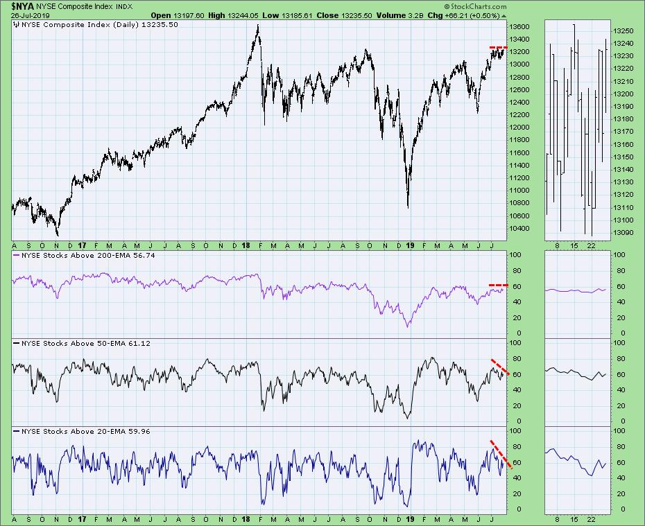
Starting off with the NYSE Composite, price has been flat, which explains the flat reading for percent above 200-EMA. However, there are sharp differences in the short-to-intermediate-term timeframe. Under the surface, we can see that more and more stocks are losing support at their 20- and 50-EMAs.

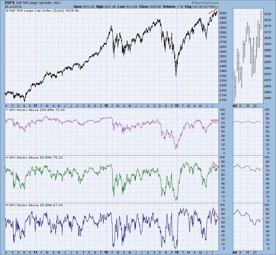
The negative divergences are quite clear in those same timeframes on the SPX. Notice how price continues to make new all-time price highs(!), all while fewer stocks are holding support at their 20/50-EMAs.

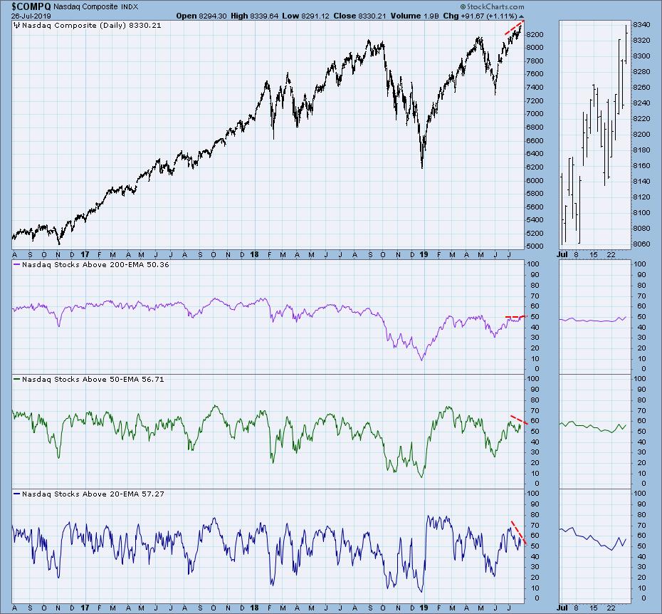
I was somewhat surprised that the technology-heavy Nasdaq was showing the same negative divergences. This is a sector of the market that has been enjoying quite a rally and has been relatively stronger than most of the other sectors. In spite of all that, here it is. Support continues to be lost at the 20/50-EMAs while price continues to set new all-time highs.

Conclusion: Imagine looking at a stock's price chart and seeing price fall below its 20-EMA -- then support doesn't hold at the 50-EMA, suggesting further decline. Once you see that, it's time to bail. It's been great at the all-time highs, but these indexes need to see full participation if we are to expect this rally to continue on.
Watch the latest episode of DecisionPoint with Carl & Erin Swenlin LIVE on Fridays 4:30p EST or on the StockCharts TV YouTube channel here!
Technical Analysis is a windsock, not a crystal ball.
Happy Charting! - Erin
erinh@stockcharts.com
Helpful DecisionPoint Links:
DecisionPoint Shared ChartList and DecisionPoint Chart Gallery
Price Momentum Oscillator (PMO)
Swenlin Trading Oscillators (STO-B and STO-V)
**Don't miss DecisionPoint Commentary! Add your email below to be notified of new updates"**
