 The NYSE and Nasdaq are fine as exchanges, but their AD Lines do not tell the entire story when it comes to breadth. The major stock indexes, such as the S&P 500 and S&P Small-cap 600, contain stocks from both exchanges. As such, robust breadth indicators should include stocks from both exchanges and represent the market as a whole, not just one of the two exchanges. Today we will dive into the AD Lines for the NYSE and Nasdaq, and then chart index specific AD Lines, which I consider more robust.
Breadth indicators are important because they measure the degree of participation. Advance-Decline Lines are cumulative measures of net advances (advances less declines). These lines rise when advances outpace declines and fall when declines outnumber advances. An AD Line that is rising and making new highs reflects strong upside participation and this is bullish overall.
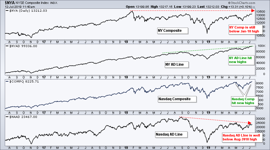
I am also not a fan of NYSE and Nasdaq breadth indicators because there are quite a few "suspect" listings. According to Nasdaq.com, and our own symbols ($NYTOT and $NATOT), both the NYSE and Nasdaq have over 3000 listings. The NYSE has over 700 non-stock listings, such as funds, preferreds and trusts, while the Nasdaq has over 600 stock listings with a market cap less than $50 million. Talk about tiny! These non-stock listings and low market caps can distort the AD Lines.
The chart above shows the NY Composite, the NYSE AD Line, the Nasdaq and the Nasdaq AD Line. The NY Composite has yet to exceed its January 2018 high, but the NYSE AD Line recorded new highs in the third quarter of 2018 and throughout 2019. The Nasdaq also moved to new highs over the last few months, but the Nasdaq AD Line remains well below its 2018 highs. Some may call it divergence, but clearly these AD Lines are not in sync with their underlying indexes.
Thursday's On Trend show covers the topics
in this commentary and more on breadth.
Click here to watch on Youtube.
Nasdaq and NYSE breadth indicators are not representative of the indexes we follow and the ETFs we actually trade (SPY, MDY, IJR). Consider the following: The S&P 500 has 370 NYSE stocks (74%) and 130 Nasdaq stocks (26%), the S&P Mid-Cap 400 has 268 NYSE stocks (67%) and 132 Nasdaq stocks (33%), and the S&P Small-Cap 600 has 281 NYSE stocks (47%) and 319 Nasdaq stocks (53%). The S&P 500 and S&P Mid-Cap 400 are more weighted toward NYSE stocks, while the S&P Small-Cap 600 is more weighted towards Nasdaq stocks.
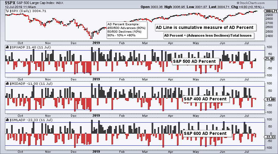
StockCharts calculates and publishes advance-decline indicators that are representative of the stock indexes we follow and ETFs we trade. The chart below shows AD Percent for the S&P 500, S&P Mid-Cap 400 and S&P Small-Cap 600. AD Percent is net advances divided by total issues. Showing net advances as a percentage of total issues allows us to compare the values.
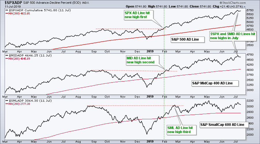
The next chart chart uses AD Percent to create the AD Lines. The S&P 500 AD Line hit a new high first in late January as large-cap breadth showed upside leadership. The S&P Mid-Cap 400 AD Line followed suit in early February with a new high and the S&P Small-Cap 600 AD Line hit a new high on February 20th.
The S&P 500 and S&P Mid-Cap 400 AD Line hit new highs again in July, but the S&P Small-Cap 600 AD Percent remains below its May high. Even though small-cap breadth is lagging, I would not be concerned because the other two hit new highs. Thus, two of the three are strong and this means the weight of the evidence is clearly bullish.
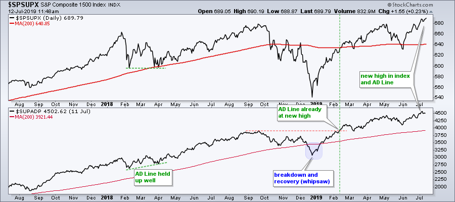
We can take these indicators one step further by combining the S&P 500, S&P Mid-Cap 400 and S&P Small-Cap 600 to create on broad index. Taken together, the S&P 1500 represents a broad array of common stocks and is ideally suited for breadth indicators. This index includes large-caps, mid-caps, small-caps, NYSE stocks (61%) and Nasdaq stocks (39%). The chart below shows the S&P 1500 AD Line hitting a new high in July and confirming the new high in the S&P 1500 ($SPSUPX).
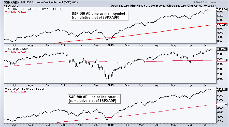
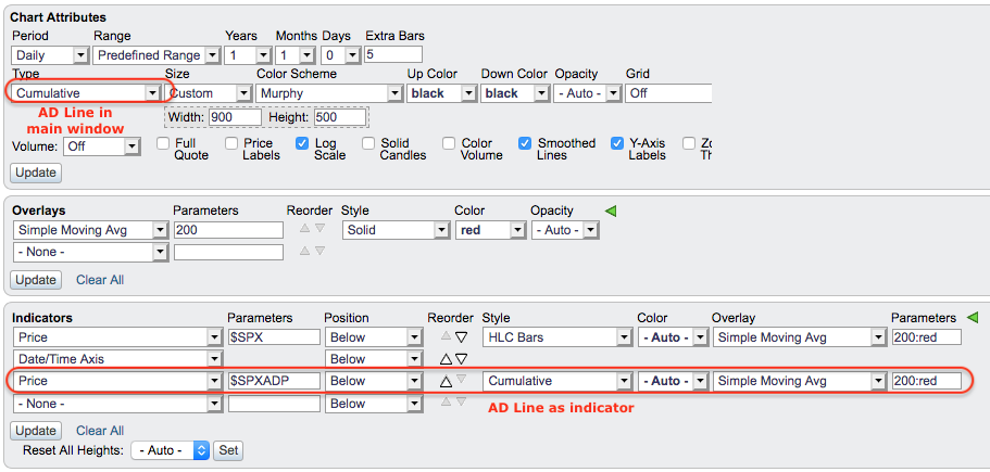
StockCharts members can chart the AD Lines for the major stock indexes and the eleven sector SPDRs. Click here for the symbols. After entering the AD Percent symbol, choose cumulative as the chart "type" when plotted as the the main symbol or "style" when plotted as an indicator. The chart below shows an example of the $SPX AD Line as the main symbol and as an indicator. The image below the chart shows the SharpChart settings. Remember, StockCharts members can click on the chart to open it and save it to their favorites list. Yes, a StockCharts membership has its advantages.
On Trend on YouTube (Thursday, July 11th)
- NYSE is Not Representative of the Market
- Charting Up/Down Pairs and AD Lines
- NYSE and Nasdaq AD Lines Diverge
- Plotting Breadth Indicators that Represent the Market
- Click here to Watch
Arthur Hill, CMT
Senior Technical Analyst, StockCharts.com
Book: Define the Trend and Trade the Trend
Paper: RSI for Trend-Following and Momentum Strategies
Want to stay up to date with the latest market insights from Arthur?
– Follow @ArthurHill on Twitter
– Subscribe to Art's Charts
– Watch On Trend on StockCharts TV (Tuesdays / Thursdays at 10:30am ET)

