 A lot of eyeballs are watching the USD these days. Not surprisingly, as a lot (or most) people pay attention to the chart of the USD index ($USD), which compares the USD to a basket of other currencies. That chart now seems to be breaking out - to the UPside, that is.
The reason for watching the "Dollar Index" is that there is no such thing as the price of "the USD," just like there is no price for the British Pound or the Euro. Currencies are always expressed "in another currency," meaning the price of the USD expressed in Pounds is different than the price of the USD expressed in EUR. To make it even more complicated, both of these USD "prices" are impacted by the relationship (price) of Euro vs. Pound.
It's Complicated
Another issue with currency prices is that they are often inverted. The street convention for the price of the USD against EUR, for example, is EUR/USD - the amount of USD for one EUR. The way I think about it in my head is "the amount of EUR expressed in USD," which is currently around 1.12 USD for one EUR.
Because of this, you can get comments like "The USD went UP from 1.15 to 1.10 against the EUR," which is super confusing if it's not your daily bread and butter.
What's also very nice is that "the street" over the years came up with different conventions. Before the introduction of the Euro, the price of Deutsch Marks would be expressed as USD/DEM, while French Francs was USD/FRF. After the introduction of the Euro, it became EUR/USD (much like GBP/USD) while Norwegian and Swedish Krone are still USD/NOK and USD/SEK. Meanwhile, the JPY is quoted as USD/JPY and the Australian Dollar is AUD/USD.
All in all, currencies are a pretty complicated bunch.
RRG Can Help You Get A High Level Overview On FX Markets
From a technical point of view, currencies are heaven because they are super-liquid, traded 24 hours per day and almost perfectly represent supply and demand, not to mention that they are all related to each other one way or another.
However, because one currency can have so many "different" prices in various other currencies, it's difficult to keep a high-level overview of general trends in these markets. This is where Relative Rotation Graphs come in handy, as they can help you to get a high-level overview of a lot of securities (in this case currencies) that are related to each other.
As you know, RRGs need a benchmark, a security or an index that serves as the center of the chart - an anchor, so to say. For US stock sectors, for example, we often use the S&P 500 index as this anchor. For currencies, it's a little different.
Currency pairs are already a relative relationship in and of themselves, so the denominator for the pair is its benchmark. To get a proper RRG, we need to create a universe of currency pairs that are all denominated in the same currency. For a US Dollar-based investor, it makes sense to set up a universe of currencies all denominated in USD.
Be careful, however, as this goes against street convention in some cases!
The $ONE Benchmark
But if the "benchmark" for the RRG is already set through the tickers on the list, what are we going to set as the benchmark ticker on the RRG? The answer is simple: something that is always the same! At StockCharts.com there is a ticker symbol, $ONE, which serves that role perfectly. That ticker presents a straight horizontal line, which is always ONE. Using that as the benchmark for the RRG will make sure that the relationships between the currencies remain correct and are not distorted by another comparison of some sort.
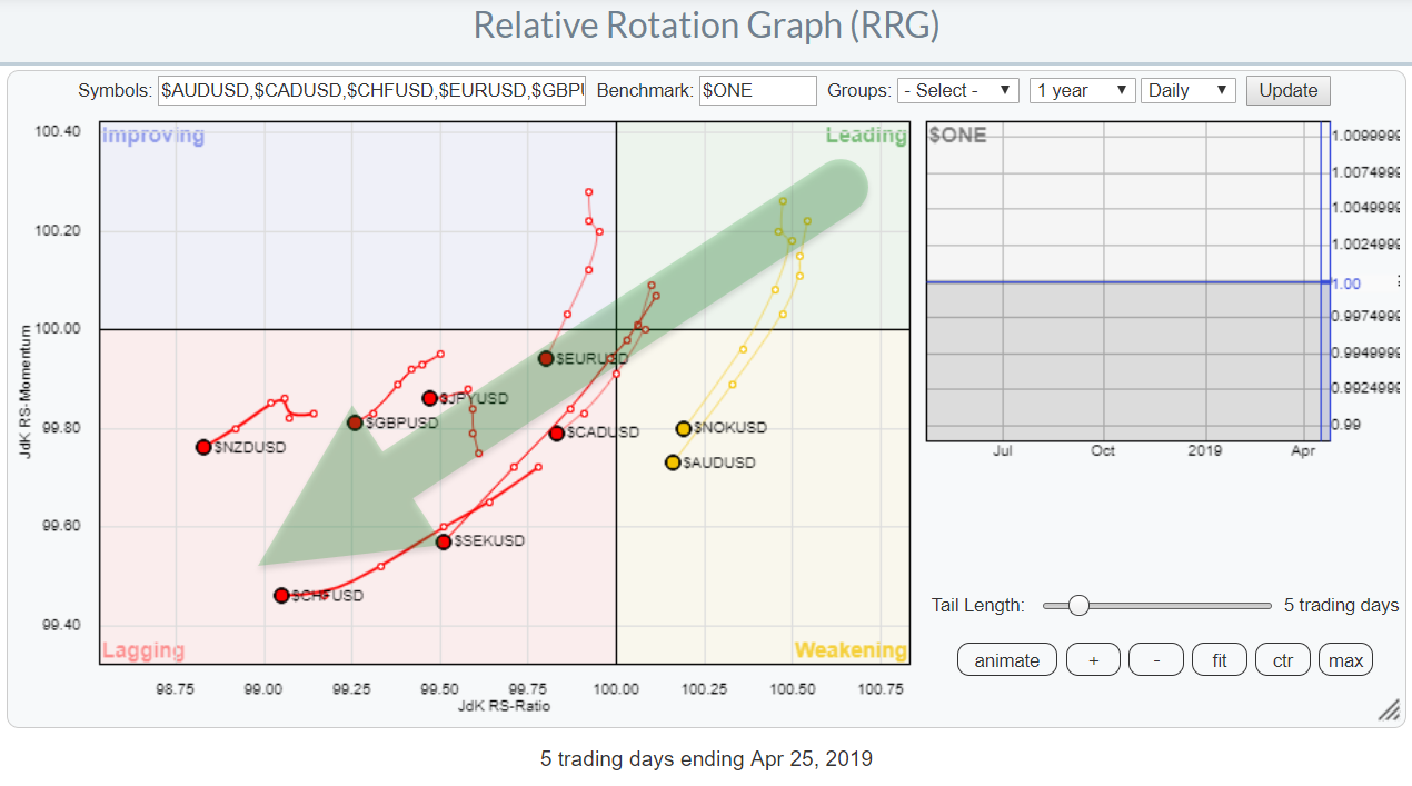
The result of such a setup is the RRG at the top of this article. This is a pre-defined group on the RRG page, showing the G10 currencies (or rather, 9 currencies) against the USD, which is now the center of the chart.
This is a daily RRG with a 5-day tail on each currency. As you can see, all these tails are heading in a South-West direction with an RRG-Heading between 90-270 degrees (losing on both axes).
When you open up the live version of the RRG chart and hit the animation button, you will see that it is not always the case that all these currencies move in the same direction against the USD. The fact that this is happening now shows that the US Dollar is improving against all these currencies at the same time, which is pretty significant.
EUR/USD
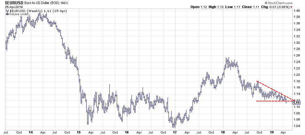
 Taking this knowledge to the EUR/USD weekly chart above puts the current attempt to break below the 1.12 support zone into a bigger perspective and, IMHO, makes it more reliable. We still have a few more hours left before this weekly bar closes, which is an eternity in currency-land. But, if we get a weekly close at 1.11, I'll take that as a good thing for the USD, as well as a sign for further weakening of the Euro and other currencies against the mighty greenback.
My regular blog is the RRG Charts blog. If you would like to receive a notification when a new article is published, simply Subscribe using your email address.
Julius de Kempenaer
Senior Technical Analyst, StockCharts.com
Creator, Relative Rotation Graphs
Founder, RRG Research
Want to stay up to date with the latest market insights from Julius?
– Follow @RRGResearch on Twitter
– Like RRG Research on Facebook
– Follow RRG Research on LinkedIn
– Subscribe to the RRG Charts blog on StockCharts
Feedback, comments or questions are welcome at Juliusdk@stockcharts.com. I cannot promise to respond to each and every message, but I will certainly read them and, where reasonably possible, use the feedback and comments or answer questions.
To discuss RRG with me on S.C.A.N., tag me using the handle Julius_RRG.
RRG, Relative Rotation Graphs, JdK RS-Ratio, and JdK RS-Momentum are registered trademarks of RRG Research.
