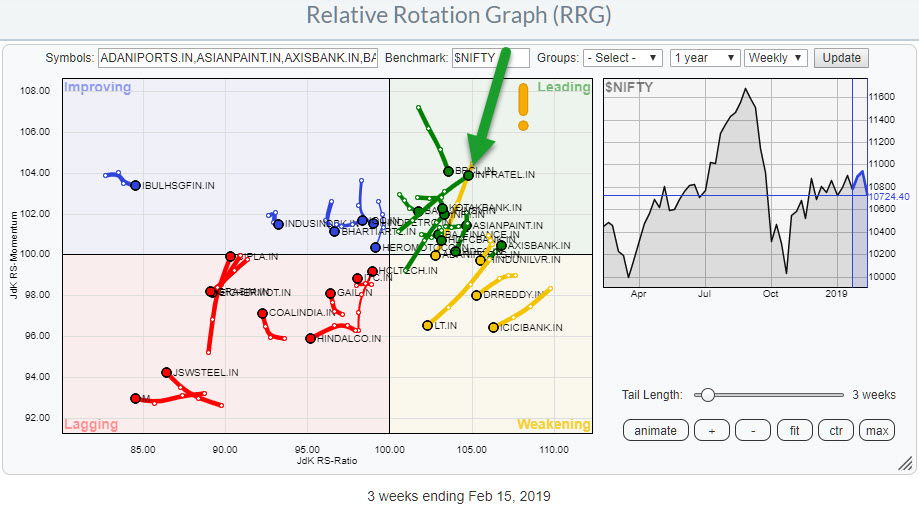
 With more and more eyeballs looking at the Indian stock market and data for individual stocks and sectors becoming available on Stockcharts.com I started to keep an eye on developments in that market via Relative Rotation Graphs.
To make it easier (for you but also myself), the NIFTY 50 Index is added as a group to the drop-down selection box. This universe holds all the members of the NIFTY 50 index and uses that index, $NIFTY, as the benchmark.
Going forward we are planning to add pre-defined groups for Indian sectors as well as groups holding the components for each sector just like we have it for the US market.
Because this RRG is quite crowded with 50 (the max at Stockcharts.com) stocks on the canvas, use the highlight functionality and then browse/toggle through the universe of stocks for inspection of the tails and the rotational patterns.
You simply select one stock in the table below the RRG, this will highlight that stock on the canvas and dim all others. Then press the Control (Windows) or Command (Mac) keys and use the up-down arrow keys to walk through the universe of stocks.
The added advantage is that you can increase the tail length to inspect longer rotations.
Picking From The RRG
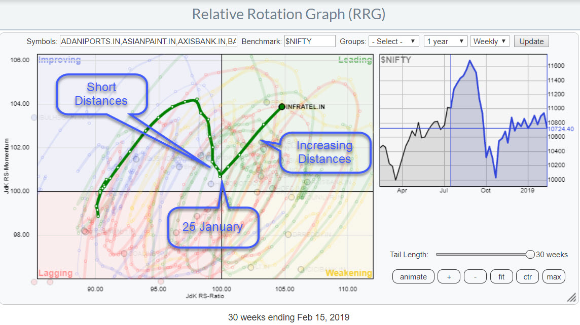
 While browsing the RRG with NIFTY stocks, I noticed the strong RRG-heading of Infratel inside the leading quadrant. Additionally, the distances between the observations are increasing which indicates that the power behind the move (ROC) is strong.
The tail also reveals a few interesting observations.
First, the shortening of the distances between the observations just prior to the upward "hook" that occurred in the week of 25 January. This shortening of the distances is something that is often seen prior to a turn of the tail.
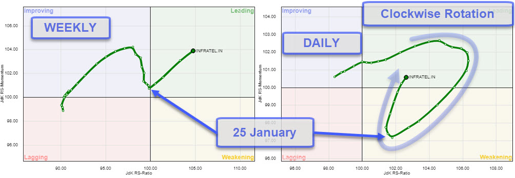
These upward hooks often confuse people as the expect a perfect clockwise rotational pattern to complete. unfortunately real-life does not always follow our models nor our thoughts. However, the markets always follow that clockwise rotation, but sometimes it is not visible on the time-frame that we are analyzing.
In the RRG above which is based on weekly data, we see a sharp upward hook with the pivot on 25 January. To better understand what is happening in such cases it helps to bring up the RRG on a lower time-frame.
Weekly vs. Daily
 The image above shows the weekly and the daily rotation side by side with the arrows pointing to the pivot point on 25th January. On the daily RRG, the next lower time-frame from weekly, the rotational character is once again clearly visible.
The proof is in the pudding
Relative Rotation Graphs are great for filtering and selecting or monitoring the rotational aspects of various securities within a group against a common benchmark and against each other. They will greatly benefit you to get a situational awareness of what's going on around you. They provide the big picture in one picture.
However, IMHO, Relative Rotation Graphs provide only a piece of the puzzle and therefore I highly recommend using them in combination with other tools in your workflow.
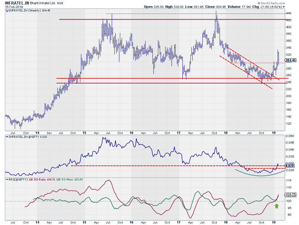
For me, the final check is always the price chart in combination with relative strength. I typically use a weekly price chart in combination with the "raw" relative strength line and the RRG-Lines (JdK RS Ratio and Jdk RS-Momentum).
Bharti Infratel Ltd - INFRATEL.IN
The price chart of INFRATEL.IN shows a very wide range, INR 240- 420, over a very long period starting late 2014 and still ongoing.
The most recent, major, low against the lower boundary of that range was set in October last year. The rally that emerged out of that low, broke out of the falling channel that characterized the chart since the start of 2018. Since that break, the start of a new series of higher highs and higher lows started to become visible and the first support level is marked near INR 300 which should now act as support after breaking that level as resistance a week ago.
The long-term trend in the RS-Line is still down, since early 2016. But just like the price trend, the swings are so wide that they are meaningful enough to pay attention to.
The most recent acceleration lower in RS started in October 2017 and came to rest in Q4-2018. Out of that plateau in relative strength, a new uptrend is emerging now. This up-move is confirmed by the RS-Line breaking above its own recent highs.
The RRG-Lines have now started to move higher in tandem and a continuation of this move seems likely.
In price terms, INR 340 is an intermediate resistance level on the way up but after that, the INR 420-440 area comes within reach again.
My regular blog is the RRG blog If you would like to receive a notification when a new article is published there, simply "Subscribe" with your email address using the form below.
Julius de Kempenaer | RRG Research
RRG, Relative Rotation Graphs, JdK RS-Ratio, and JdK RS-Momentum are registered TradeMarks ®; of RRG Research
Follow RRG Research on social media:
Feedback, comments or questions are welcome at Juliusdk@stockcharts.com. I cannot promise to respond to each and every message but I will certainly read them and where reasonably possible use the feedback and comments or answer questions.
If you want to discuss RRG with me on SCAN, please use my handle Julius_RRG so that I will get a notification.

