We all know what a trend line is, but does a trend line actually dictate the trend? In other words, does a trend line break actually signal a trend reversal? Or, is a trend line break telling us something else? We cannot use a tool unless we fully understand it and this article will shed some light on the humble trend line. At the very least, I hope to stimulate the analysis process by challenging you to think hard about an indicator and its message.
At its most basic, a trend line is a line that connects a series of rising troughs or falling peaks. A rising trend line slopes up and reflects the rate-of-ascent based on the higher troughs. Thinking back to junior high math, this is simply the rise over the run. The steeper the upward slope, the faster the advance. A falling trend line slopes down and reflects the rate-of-descent based on the lower peaks. The steeper the downward slope, the faster the decline.
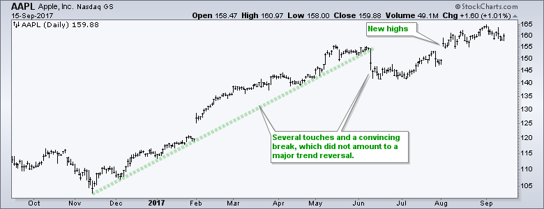
It takes a least two points to draw a trend line. Traditional technical analysis teaches us that validity increases along with the number of touches. As with all technical tools, trend lines are sometimes great at identifying trend changes, and sometimes not. The chart below shows Apple breaking a trend line that was touched at least four times. The sharp break certainly looked convincing at the time, but the stock bottomed soon after the break and moved to new highs.
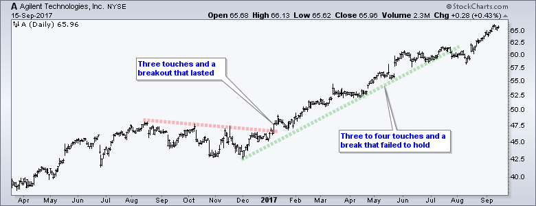
The next example shows Agilent with a bullish trend line break that held and signaled the start of an extended advance. After a 40+ percent advance, the stock broke the green trend line in late July. This break, however, did not last long as the stock quickly recovered and move to a new high.
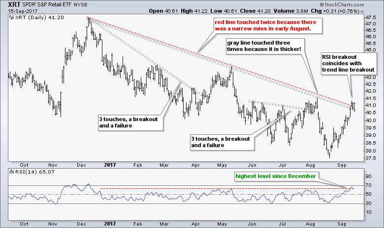
When drawing trend lines, chartists can choose between thin trend lines that are exact or thick trend lines that are "less exact". The chart below shows the Retail SPDR (XRT) with a trend line (red) that touches the December and April highs, but just misses the early August high. The gray trend line, which is thicker, touches the April high, which means there are three touches. The lesson here: use a thicker line if you want more touches. Personally, I have no problem with thick trend lines because they are basically momentum indicators (think slope).
The indicator window shows 14-day RSI breaking to its highest level of the year this past week. Notice that this breakout coincides with a trend line break. The slope of this trend line measures the rate-of-descent, which is a form of momentum. RSI also measures momentum and the advance over the last four weeks achieved a momentum breakout. Notice that RSI hit its highest level of the year. This is also true for XLE and XES. A momentum breakout and trend line break, however, are not the same as a trend reversal. In other words, XRT has not moved from downtrend to uptrend. All we have seen is a change in downward momentum based on the lower highs that make up the trend line. The trend is still down because XRT hit a new low in August and has yet to take out the early August high. An uptrend requires a higher low AND a higher high so XRT has more work to do.
Follow me on Twitter @arthurhill - Keep up with my 140 character commentaries.
****************************************
Thanks for tuning in and have a good day!
--Arthur Hill CMT
Plan your Trade and Trade your Plan
*****************************************


