In many cases, we all spend a lot of time looking at daily charts and varying indicators. The Price Momentum Oscillator (PMO) using daily, weekly and monthly data to create a unique value for the chart you're looking at. The daily PMO may be reacting quite differently in comparison to the weekly PMO and both can be very different from the weekly PMO.
I spent some time today looking at the weekly charts for many of the indexes, sectors and ETFs that we cover on the DecisionPoint Alert Daily Report. Some of these charts show the PMO either just crossing over or changing directions, which doesn't happen that often on a weekly chart.
Here are few interesting charts.
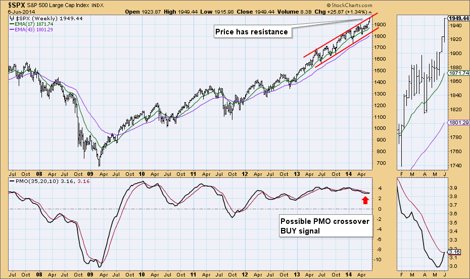
Price just resistance on the weekly chart for the SPX and we have the PMO on its EMA. There probably was a crossover, but we don't have the ability to look at thousandths of a point.
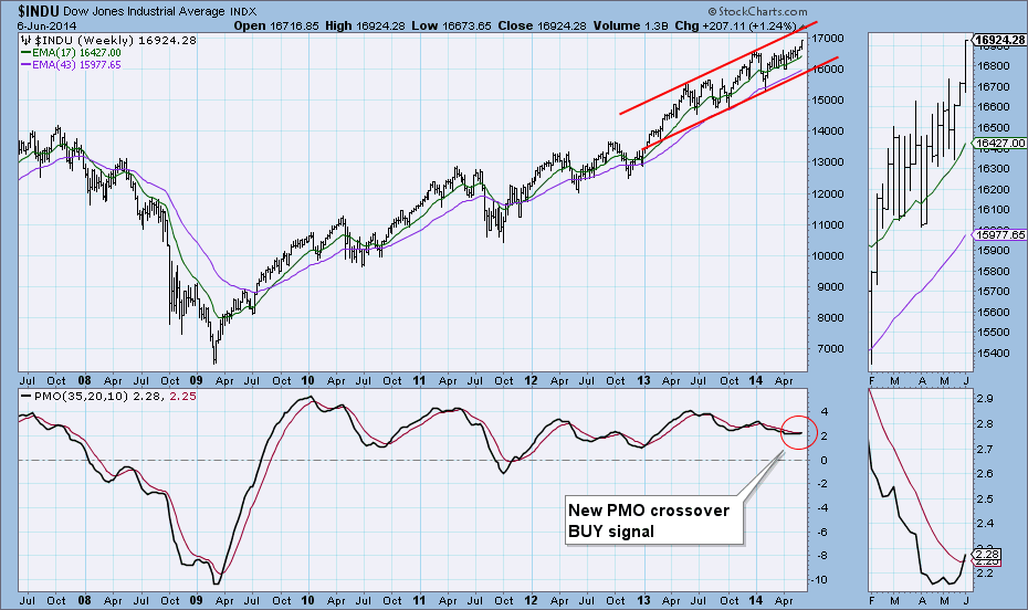
The Dow has room before price hits resistance at the top of the rising trend channel and Friday there was a new PMO crossover BUY signal.
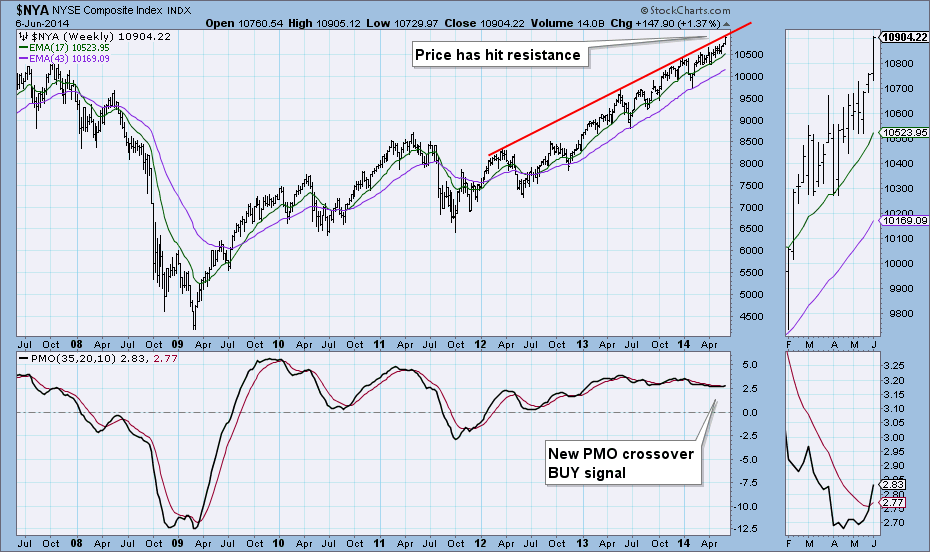
The NYSE Composite weekly chart is similar but price has hit overhead resistance. The weekly PMO generated a BUY signal on Friday.
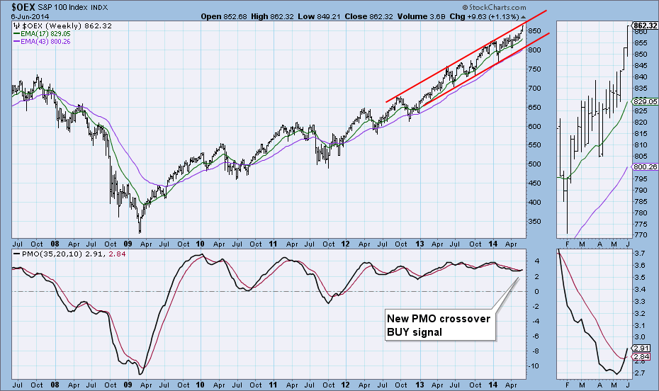
The S&P 100 had a new PMO crossover BUY signal appear on the weekly chart Friday as well. Price is in a rising trend channel, but it has hit resistance at the top of the channel.
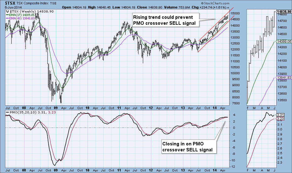
The TSX is in a steep rising trend channel, but with price staying rather 'neutral' in the middle, momentum has been shifting back and forth. The PMO has been caught in that but does look like it is leaning toward a negative crossover its EMA. It could be prevented if price starts to make a move toward the top of the channel.
Happy Charting!
Erin

