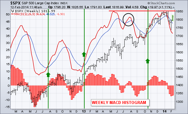
The daily MACD for QQQ, SPY and DIA have turned positive. Weekly MACD lines, however, are still negative. That's not unusual since weekly lines are slower to turn. Weekly lines, however, measure the stock market's longer trend. A strong stock market rally requires the weekly lines to turn positive as well. Chart 7 overlays weekly MACD lines on the S&P 500 over the last two years. The red bars along the bottom are MACD histogram bars which measure the spread between the red and blue lines. The histogram bars revolve above and below a zero line, and show us whether the two MACD lines are positive or negative. At the moment, they're negative. The chart shows the performance of the MACD lines (and histogram) during three previous market corrections. [I'm not counting the minor MACD upturn last July (circle) since the lines resumed falling]. In all three instances, positive turns in the MACD lines (and histogram) confirmed resumption of the market uptrend. The green lines showed that it usually took several weeks for that to happen. But that positive turn confirmed that the stock rally had staying power. One other thing. The yearend top in the two MACD lines ended at the same level as last May (while prices kept rising). That "double top" in the MACD line represents a possible "negative divergence" with the S&P 500. That makes me suspicious of the staying power of the stock market rally from here. It also reinforces my view that the market may run into bigger trouble as we approach the spring months.
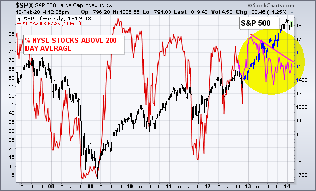
% NYSE STOCK OVER 200-DAY AVERAGE ISN'T KEEPING PACE ... Here's another reason why I'm suspicious of the strength of any market upturn from here. Although the stock market is within a few percentage points of a record high, only two-thirds of stocks on the NYSE are trading above their 200-day averages. The red line in Chart 8 plots the % of NYSE stocks over their 200-day averages ($NYA200R) relative to the S&P 500 since 2007. [The percentage scale is on the left side of the chart]. The two lines generally trend in the same direction, but not at the same pace. During the upsurge in 2009, the red line went from below 20% at the start of the year to 90% by the end. That reflected a dramatic turn in the market for the better. Readings in the red line over 80% generally reflect an overbought market. Subsequent drops below 70% have usually coincided with downturns in the SPX (2010, 2011, and twice in 2012). Which brings us to the present situation. At the start of 2013, 83% of NYSE stocks were trading over their 200-day averages. At the moment, only 67% are in that bullish position. While the S&P 500 rose 27% over the last year, the participation rate of NYSE stocks in that uptrend dropped by 16%. The falling trendline over the past year shows that bull market participation by individual NYSE stocks has lagged behind the rising market index by a noticeable amount. In my view, that suggests that any stock market rally between now and the spring will be on shaky technical grounds.


