Hello Fellow ChartWatchers!
The last two days of last week caused everyone to pause and re-evaluate their market opinions. That includes our stable of ChartWatchers analysts. Glancing over the headlines for their articles below, you'll see lots of use of the "B"-word... "Bearish." Clearly if the market continues to drop like it did on Thursday and Friday, more and more technicians will be taking their profits and moving to the sidelines.
But before we get to all the potential gloom and doom, here is the low-down on two new features we've just added to SharpCharts...
"Legendary" and "Eventful" New Features
Pardon the puns, but we've just added more control over the information displayed in the legends of our charts as well as a new "Overlay" that displays when and where we have adjusted the data on our charts. Let's start with that second item first.
As you may be aware, we adjust our historical data to remove the "artificial" effects of splits, dividends and distributions from our charts. If we didn't do that, there would be big vertical gaps on our charts whenever a stock underwent a split (for example). Those gaps would cause misleading technical signals to appear.
For example when a stock has a 2-for-1 split, the price suddenly drops 50% on the chart. Technical indicators like the MACD would immediately turn bearish because "momentum" has dropped suddenly - but are traders really bearish on the stock because of a split? No. If anything, they might be slightly more bullish. So that big downward gap on the chart can't remain there.
To get rid of it, we divide all of the price data from prior to the split by 2 and multiply all of the corresponding volume data by 2. That eliminates the gap and gives a true picture of people's opinion of the stock.
The same thing needs to happen for all types of non-market-related adjustments including dividends and distributions. While not usually as flashy as splits, those adjustments can still cause misleading signals if their effects are not factored out.
(By the way, if you still want to see the un-adjusted data for a stock, just add an underscore to the front of the ticker symbol - e.g., "_IBM")
So all of that is just background for today's new feature - Event markers!
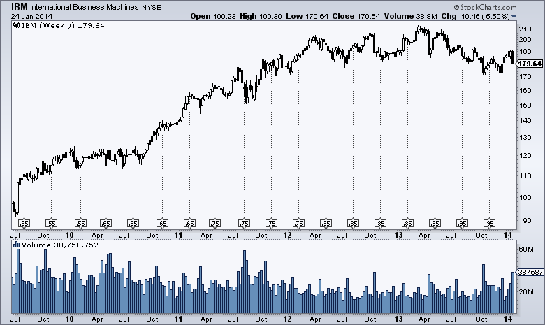
Event markers show you exactly on your chart where and when we made any data adjustments. To see them, just select "Events" from the "Overlays" dropdown and then "Update" your chart. Here's an example:

(Click the chart for a live version.)
See the small boxes at the bottom of the price area with the lines rising up? Those are the event markers that show you where splits/dividends/distributions happened and how big they were.
Note that the "Events" overlay takes one parameter which can either be "Splits", "Dividends" or "All". That controls the number of event markers that you see on your chart. Splits will have two numbers separated by a colon in the box - e.g., "2:1" or "1:3" - while dividends/distributions will show the actual amount of the event in dollars.
In addition to that addition we also have an additional addition for people that want additional control over the legends that appear on their charts. You'll now see a new dropdown labeled "Legends" on the right side of the "Chart Attributes" area on the SharpCharts workbench. It replaces the "Show Legends" checkbox and gives you two additional options - "Off" which means "completely, totally, 100% off" and "Verbose" which will show you the complete name of every ticker symbol you add to your chart.
While more control over the Legend display may not seem like a huge deal right now, it is actually the very first hint of a HUGE set of new features that is coming to StockCharts in February. Yes, they will be very useful. No, you won't need to pay extra for them. No, the website won't change in big, confusing ways. Yes, these new features are way cooler than the "Legends" dropdown. No, I can't tell you yet what these new feature will be - but I will be able to very soon!
Stay tuned...
- Chip
