It's quite easy to look at the S&P 500 and see if it's rallying or not. But not every rally is created equal. Many rallies carry significant warning signs that should have you running for cover. Others simply invite you to jump on the train.
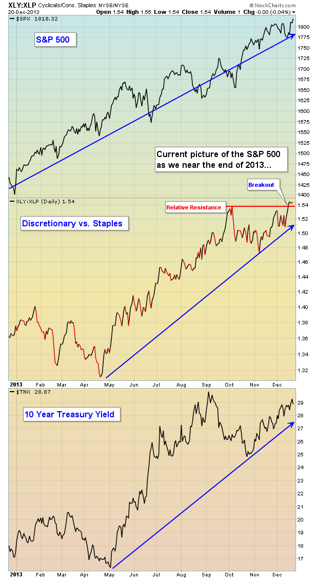
Consumer stocks are telling us to jump on the train and ride this thing out. As the S&P 500 closed at yet another record high on Friday, most "under the surface" signs remain quite bullish and suggest to me that this bull market still has legs. Check out the following chart comparing the S&P 500, the XLY vs. the XLP and the 10 year treasury yield and then I'll explain it below:

The consumer discretionary sector (XLY) is considered the more aggressive component of consumer stocks, while consumer staples (XLP) represent the safer side. Generally speaking, rallies should be accompanied by relative strength in "risk on" types of stocks such as consumer discretionary stocks. So it stands to reason that as the S&P 500 rises, we want to see the XLY vs. XLP ratio rising with it. On Friday, the S&P 500 closed at an all-time high on the heels of the XLY vs. XLP ratio breaking out to a new relative high.
Chalk one up for the bulls.
At the bottom of this chart, I've also shown the trend in treasury yields, namely the 10 year treasury yield ($TNX). When equities rise, treasuries normally fall. Falling treasuries send the yield lower as yields move inversely to treasury prices. This makes complete sense as traders have options as to which asset class they want to invest. During bull markets in equities, the proceeds from treasuries being sold generally find their way into equities. If our economy is expanding, safety is usually the last choice for traders. In a normal market environment, we should see the TNX rising to confirm the rally in equities. That's exactly what we've seen as reflected on the chart above.
Chalk another one up for the bulls.
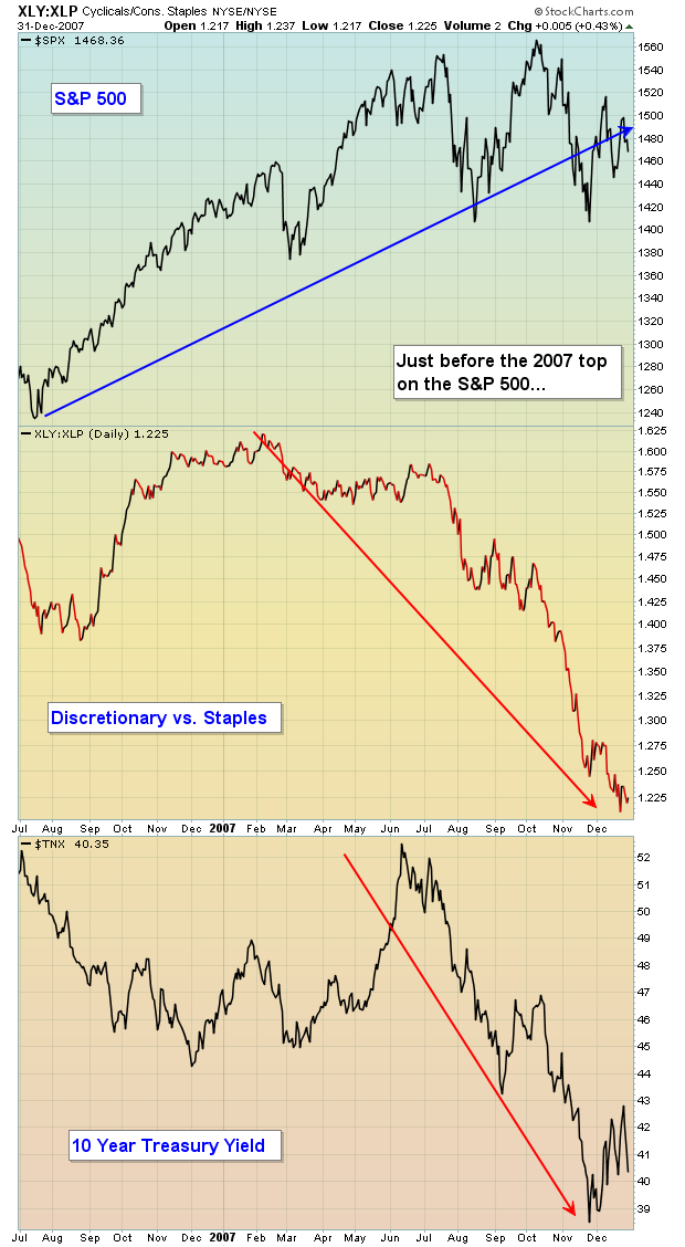
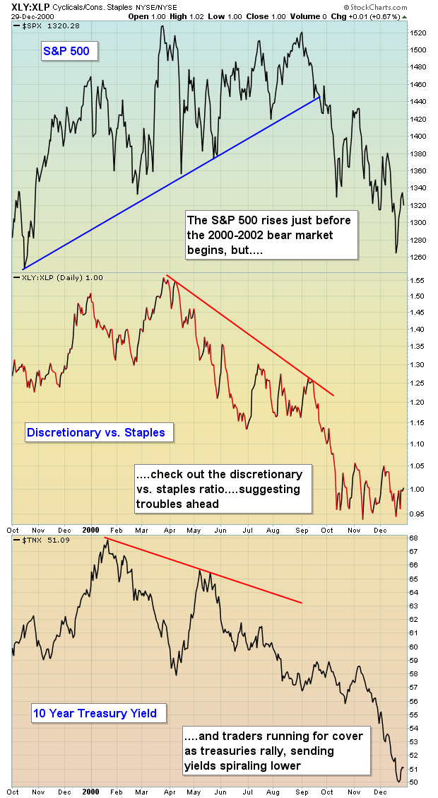
Now I want to take you down memory lane, just prior to the last two bear markets. Let's take a look at what we DO NOT want to see. The charts below are identical to the one we just reviewed - well, with one minor exception. I think the difference in the charts below will be obvious. Have a look:


The action on these charts was VERY bearish. Yields were falling precipitously while the S&P 500 tried to push higher. In my opinion, the bond market gets it right more often than the stock market. It certainly did in these two cases. Falling yields mean rising treasuries. With the S&P 500 breaking to fresh highs, why would traders begin flocking to bonds? There's one primary reason - economic weakness ahead. The same holds true for the relationship among consumer stocks. With the S&P 500 surging, why would traders begin to take the cautious approach and move into the higher-yielding, safe consumer staples stocks?
This is when you chalk one up for the bears.
Currently, I'm just not seeing the signs of an impending top in the stock market. Believe me, I'm looking at various intermarket signs every day and every week. But you can't force a bear market, nor do I want to. Let's see where this train takes us.
I am featuring a consumer discretionary stock as my Chart of the Day for Monday, December 23rd. It's poised technically to benefit from further upside in equities. CLICK HERE for details.
It's been a great year for the stock market. Thank you for your support, have a safe and happy holiday season and HAPPY NEW YEAR!!! Let's make 2014 the best year yet!
Happy trading!
Tom Bowley
Chief Market Strategist/Chief Equity Strategist
Invested Central/EarningsBeats.com
