Hello Fellow ChartWatchers!
Almost everything is at record highs right now. Dow is above 16,000. S&P is above 1800. All of the S&P Sectors are higher year-to-date with Health Care being the strongest (+40.3%) and Utilities being the weakest (+13.9%). Is it exuberance? It is a bubble? As technical investors, we shouldn't care. We identify and ride trends - and the current trend is up.
Check out John, Arthur, Greg, Carl, Tom and Richard's articles below for more on the current state of the market. I, on the other hand, want to tell you about our latest new feature!
Tis the Season... for Seasonality Charts!
Some stocks work like clockwork. At a certain point each year, their business picks up and their stock perks up. Many of these stocks are tied to the retail holiday season. Others are tied to people's heating/cooling needs. Others are tied to the planting cycle. Etc. etc. etc.
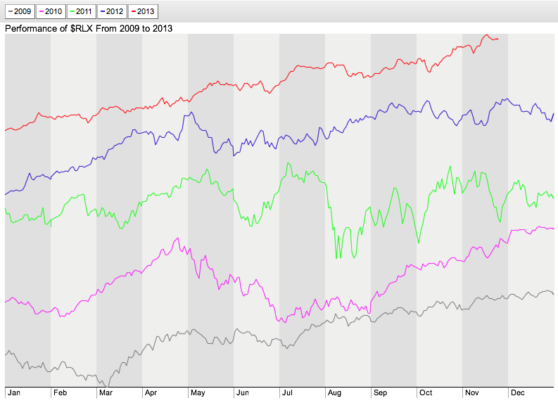
Finding and analyzing these seasonal situations requires a new kind of chart - one that overlays each year's performance for a stock so that monthly up/down patterns can be seen. A chart like this:
This is a snapshot from our new Interactive Seasonality Charting tool. Each line represents a different year of $RLX's values. The grey background shading shows you the divisions for each month of the year. Do you notice any months where things are moving higher/lower consistantly? Check out March and April.
Did you know that every year for the past five years, the Retail Index has moved higher in March and April? That's pretty useful to know!
The Seasonality Charting tool lets you look at this kind of data in three different ways:
- "Separate" Line Mode - Each year is represented by a different colored line and the lines are separated vertically on the chart. This is the default mode for the tool.
- "Same Scale" Line Mode - Each year is represented by a different colored line but the lines are start at the same point and use the same vertical scale.
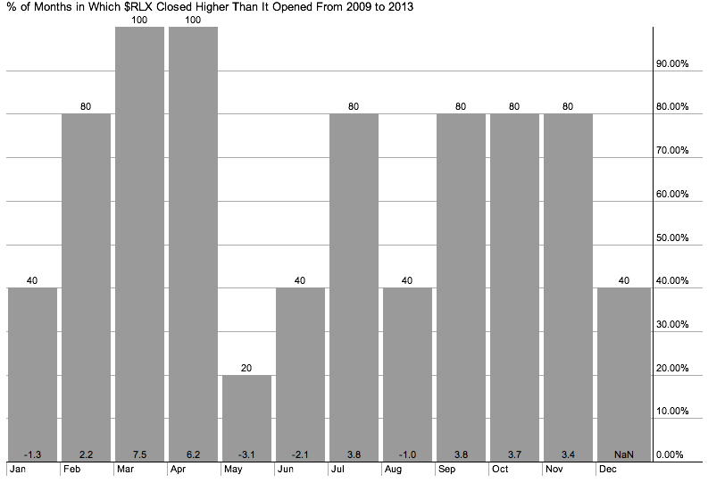
- "Histogram" Mode - Each month is represented by a histogram bar that shows the percentage of times the stock moved higher (and the average move).
You can use the buttons in the lower left corner of the chart to switch between those three modes. Here is an example of Histogram Mode for $RLX:
Boy, March and April really stand out. (So does May, but for a different reason. Interesting...)
Histogram mode also allows you to enter a second, optional "Comparison" ticker symbol so that you can see how your main ticker symbol did compared to that second symbol. Much of the time, that second symbol will be an index like $SPX (the S&P 500).
There's also a slider at the bottom of the charts that works just like the slider in our popular PerfCharts tool. You can use it to select the number of years you'd like to compare. You can also click on the "Year" buttons at the top of the chart to turn off a year that might be skewing your analysis.
For now, you'll find a links to our Seasonality Charts on our homepage in the "What's New" area and on the "Free Charts" page. Soon, we'll also have it linked in to the "Create a Chart" dropdown at the top of every page.
So now you have the gift of Seasonality for this upcoming Holiday Season. Enjoy!
- Chip


