Hello Fellow ChartWatchers!
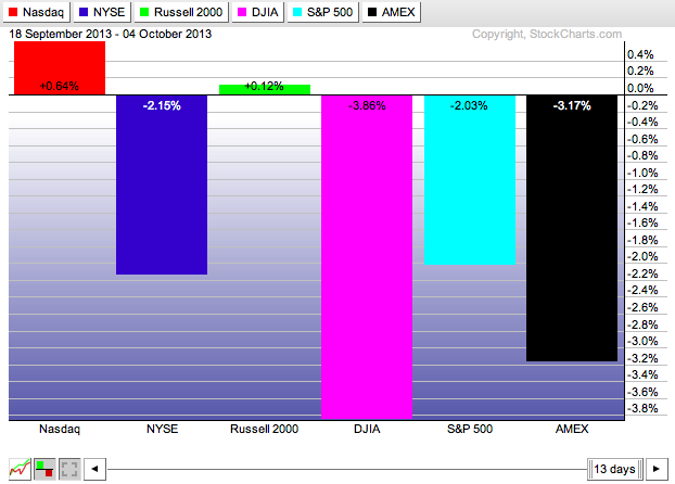
We have several bearish-sounding articles for you this week as several of the major markets continue moving lower. The Dow has been down 9 of the past 12 trading days and its chart reflects that decline. However all is not lost. There are still some positive developments if you know where to look. Check out this PerfChart of the major markets for that same period of time:
The Nasdaq and the Russell 2000 are bucking that large-cap downtrend in a very significant way. Will that trend continue? If so, for how long? Keep checking our "Blogs" page throughout the week for the latest technical charting news as things continue to develop.
Don't Fall for "Visual Coincidences" on Overlaid Charts
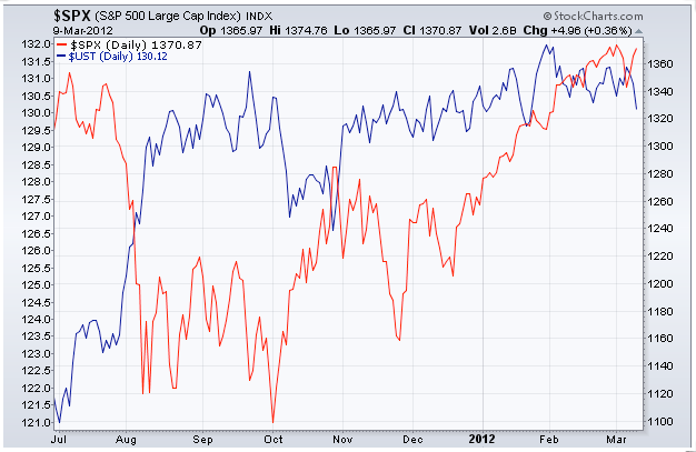
Everytime I present our SCU 101 seminar, I pull out the following slide and I ask a question:
"What is the significance of the red line crossing the blue line on this chart?"
Think about that question for a second and answer the question in your own head before reading on.
Invariably, several people throw out some very good possibilities: "It's a bullish crossover." "Bonds are going to continue rising." "Its a support level for stocks." etc.
Other people suspect, rightly, that I'm trying to trick them. Just like I'm doing now. ;-)
The real answer is... "Nothing!" It is a visual coincidence that those two line cross where the do on that overlaid chart. They are on two different scales - $SPX uses the scale on the right and $UST uses the scale on the left - and we have programmed our system to make sure that each scale causes the line to "fill up" the vertical space on the chart. If we had programmed things differently, the lines would cross in different locations.
(Click here to learn how to create an Overlaid chart like the one above.)
So this is a big warning for everyone who is using the "Behind Price" position setting for their indicators - if two datasets use different scales, you cannot attach any significance to any crossing signals that you see.
So, given that, why overlay things at all?
You overlay things because you can still draw very valid conclusions from the "shape" of the two lines. Divergences in particular are very significant and they are often easier to spot on overlaid charts. Is the trend of one line different from the trend of the other line? If so, you've found a divergence and you have used an overlaid chart correctly.
Take care everyone!
- Chip
P.S. If you want to learn about all the tools on our site, all the pitfalls to avoid, all the controls on our SharpCharts workbench, and all the ways you can improve your results on your way to becoming a successful, disciplined technical investor - why not join myself, Greg Schnell, and Gatis Roze in Dallas next month for our live SCU 101, 102 and 310 seminars? We'd love to see you there. Click here for more details (and be sure to watch the testimonial video)


