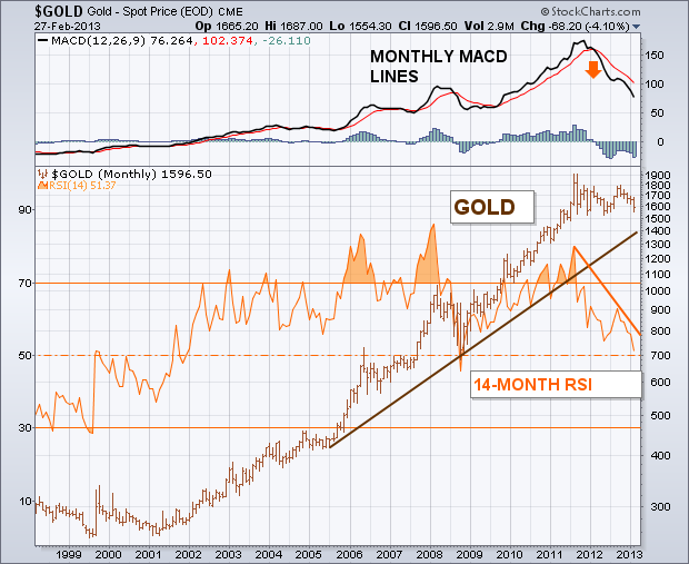
A lot of traders and investors are waiting for the bull market in gold to resume. They may have a very long wait. That's because a lot of traditional chart, technical, and intermarket signs are now working against gold. Let's start with a long-term look. The monthly bars in Chart 1 show the major bull move in gold that lasted from 2001 to 2011. The rising trendline drawn on the log chart is still intact. [A log price scale measures percentage price changes and is better for long-term trendline analysis]. But the two indicators shown on the chart aren't. The orange line overlaid on the gold price is the 14-month RSI line which measures long-term market momentum. The last major peak in the RSI took place during 2011. The fact that it fell short of its 2008 peak formed a "negative divergence" with gold. Even worse, the RSI line has been dropping since 2011 (orange trendline). The RSI line is now approaching an important test of its 2008 low (dashed line). It it doesn't hold there, the long-term trend of gold should weaken further. The monthly MACD lines (top of chart) look even worse. The two lines turned negative at the start of 2012 (red arrow) and have fallen to the lowest level in three years. That's the worst downturn by the MACD lines since the bull market began in 2001.

