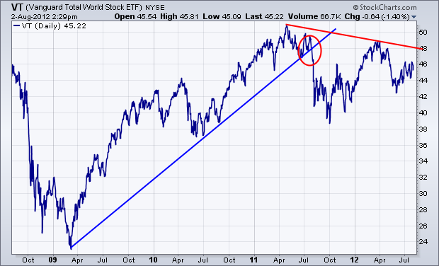
One of my previous messages showed a rotation out of small cap stocks into mega-caps in the middle of 2011 which continues to this day. That suggests that investors have been growing increasingly defensive over the last year. The chart below provides graphic evidence that global stocks may have actually peaked last year as well. It shows the Vanguard Total World Index (VT) since 2009. [The VT includes stocks from all over the world in both developed and emerging markets. It has a surprisingly large weight to North America (51%). Europe accounts for 22%, emerging markets 13%, and the Pacific region 12%. The chart shows a major uptrend line being broken last summer (red circle). The VT has since formed a pattern of lower peaks (red trendline). Although the U.S. stock market has held up better than other global stocks, it too is influenced by global trends. This chart isn't encouraging.

