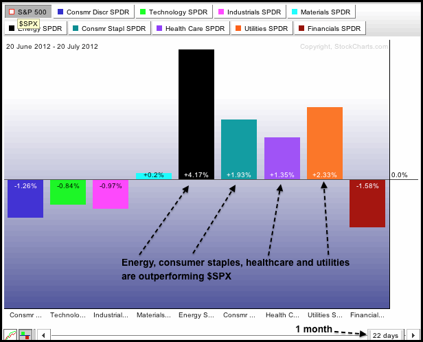
The first chart shows the S&P Sector PerfChart for the one month time frame (22 trading days) and the second chart shows the three month timeframe (64 trading days). Note that these PerfCharts show relative performance, which is the amount the SPDR is outperforming or underperforming the S&P 500. SPDRs in positive territory are leading and outperforming, while SPDRs in negative territory are lagging and underperforming. Both PerfCharts show the same picture: the offensive sectors are underperforming and the defensive sectors are outperforming. The offensive sectors include consumer discretionary, finance, industrials and technology. The defensive sectors are consumer staples, healthcare and utilities. Also note that energy is a leading sector. Relative strength in the defensive sectors indicates risk aversion and a preference for safety. Such risk aversion is negative for the broader market and could foreshadow an summer peak in the S&P 500.


Click this image for a live chart.
Good day and good trading,
--Arthur Hill CMT
