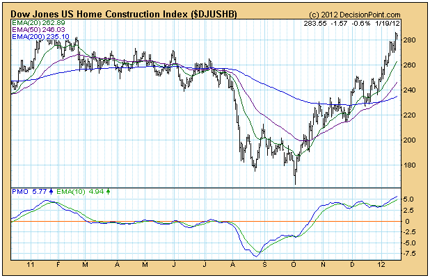
The market rally on Wednesday was driven in part by a surge in housing stocks, which was triggered by a favorable housing report. Since the fundamentals of the housing market are not too thrilling, regardless of short-term gains, my curiosity was piqued and I pulled up some charts.
The daily chart of the Dow Jones US Home Construction Index, which is one of a set of 100 Dow Jones US sector indexes we track, shows that Wednesday's rally was a small extension of a +78% up move that began after the Index hit rock bottom in October 2011. This is good but how does this rally present in a larger perspective?
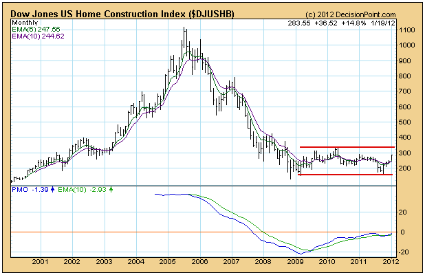
I would normally zoom back to a weekly bar chart, but in this case the monthly bar chart is much more helpful, and the current rally looks rather insignificant compared with what has gone before. First, between 2000 and 2005 there was a parabolic advance of about 1,000%, perfectly depicting the frenzy of the housing bubble. Then between 2005 and 2008 we can see all the air coming out of the bubble. Since the bottom in 2008, the Index has entered what is called a basing pattern, and it typically becomes a "long base" because it can go on for many years.
Bottom Line: The purpose of the base pattern is to work out the excesses of the parabolic rise and collapse that preceeded it, a process that normally takes many years to complete. The range annotated on the chart probably represents the range of movement for the Home Construction Index for the next decade or more. There is money to be made playing the range, but I don't expect the top of range to be significantly exceeded any time soon.


