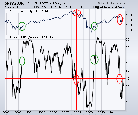
I'm going to focus on some longer term indicators today. And, right now, the ones I'm looking at still warrant a lot of caution. Chart 1, for example, shows the % NYSE stocks trading above their 200-day moving average ($NYA200R). Generally speaking, the line has to be above 50% to be in an uptrend. In other words, more than half of NYSE stocks need to be above their 200-day averages. But I prefer to use the 60% and 40% lines. During market corrections, it's not unusual for the black line to drop to 40% before turning back up again. Drops below 40% usual signal a bear market. Moves back above 60% reinstate the major uptrend. That's especially true after a bear market. The green circles show that happening in spring 2003 and 2009. The red circles show the last two drops below 40% to be in late 2007 and this summer. The value of the indicator is only 30%. That's nowhere near bull market territory.
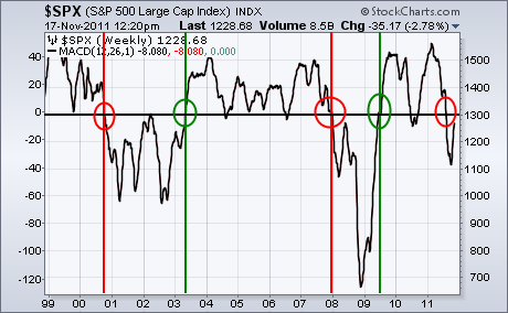
WEEKLY MACD LINE STILL BELOW ZERO LINE... When studying MACD lines, we generally plot two lines. When the faster MACD line crosses above the slower signal line, the trend is up. Those two weekly lines have turned positive for the S&P 500. Another way to use that indicator is to plot the MACD line by itself in order to see whether or not it's above or below its zero line. Chart 2 plots the MACD line by itself. The horizontal line is its zero line. The red circles show prior bear signals during 2000 and the end of 2007 when the zero line was broken to the downside. Bullish upside crossings took place in 2003 and 2009 (green circles). At the moment, the weekly MACD line is below the zero line. It has to cross back above to give a bullish signal.


