Hello Fellow ChartWatchers!
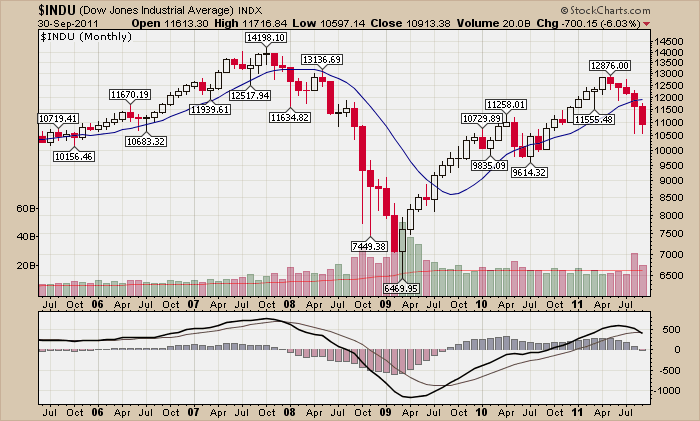
Simpler is usually better and that is definitely true when you are looking for a chart to put the month of September into perspective. Voila!

Members can click the chart to see a live version.
The Dow finished September over 6% lower than the previous month. That's the 5th straight month $INDU has moved down - and it did so on above average volume. MACD momentum is still headed down having just crossed its signal line. Don't get fooled by all the over-analysis going on these days in the main stream financial press, the technical picture is simply not that good right now.
OUR THREE MOST COMMON SUPPORT QUESTIONS
1.) Why am I seeing filled red and filled black candlesticks on your charts?
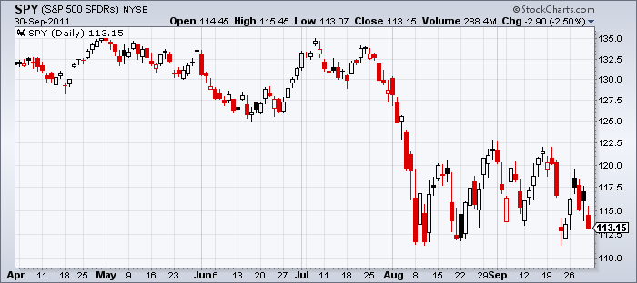
Usually with our default candlestick settings, filled candles will be colored red. Filled black candles appear when the a stock gaps up overnight (opening mich higher than yesterday's close) but then falls during the day but still manages to close higher than it did yesterday. In that case, the stock moved higher when comparing the close to yesterday's close HOWEVER it moved lower when comparing the close to the open. The candle is filled because the close is lower than the open, but it is colored black because the close is higher than yesterday's close. The chart above shows several examples.
By the way, the opposite situation leads to hollow red candlesticks - but we don't get many questions about them because they are not as noticeable. There are at least 8 on the chart above.
These "contradictory candles" often happen when the market is unsure about the stock in question and can indicate an upcoming change in direction. Recent market indecision has made them plentiful on the chart above.
2.) Why is your historic data different from the data on some other website?
We adjust our historic data to eliminate the artificial, misleading effects of splits, dividends and distributions on our charts. For more information, check out this video explanation I gave at our recent ChartCon conference in Seattle.
3.) How can I overlay things on your charts?
To overlay things, you need to use the "Position" dropdown that's associated with each indicator on our charts. Normally, "Position" is set to either "Above" or "Below" which means that the indicator will appear either above or below the price bars in its own separate area. Notice however that there are two additional settings for "Position" - "Behind Price" and "Behind Ind."
"Behind Price" means that the indicator will appear in the price panel area as an overlay. "Behind Ind." means that the indicator will appear in the same panel that previous indicator is using.
I urge you to experiement with those two settings - they are the keys to creating some really powerful charts.
- Chip

