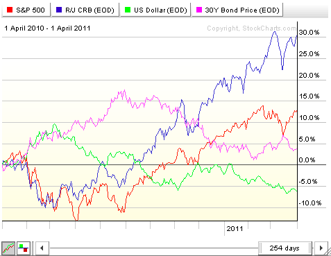
John Murphy has written extensively about Intermarket Analysis - the study of the key relationships between the four major financial markets and how those markets affect each other in the long run. To study Intermarket relationships we use our Intermarket PerfChart that displays the percent performance of the major index for each of the four markets - $SPX for stocks, $CRB for commodities, $USB for bonds, and $USD for the US Dollar.
According to John's book, the "Normal" relationships between the four financial markets are:
Stocks vs. Bonds: POSITIVE
Stocks vs. Commodities: INVERSE
Stocks vs. US Dollar: POSITIVE
Bonds vs. Commodities: INVERSE
Bonds vs. US Dollar: POSITIVE
Commodities vs. US Dollar: INVERSE
In other words, when the markets are "working correctly", you should see (for example) Stocks and Bonds rising (or falling) together on the PerfChart. You should also see Commodities moving in the opposite direction as Stocks. etc.
If you see those relationships occurring then the likelihood of the current market trends continuing is pretty good. It's when those relationships break down that a change in the market's direction becomes more likely.
Flipping the relationships around, we can judge the "health" of the four financial markets by looking at the current relationships:
Stocks and Bonds moving together? HEALTHY
Stocks and Commodities moving together? UNHEALTHY
Stocks and US Dollar moving together? HEALTHY
Bonds and Commodities moving together? UNHEALTHY
Bonds and US Dollar moving together? HEALTHY
Commodities and US Dollar moving together? UNHEALTHY
So where are things currently? Here's a snapshot of our Intermarket PerfChart:

Click here for a live version of this chart.
So, as we look at the chart, which lines have been moving together over the past couple of months? To my eye, it looks like the red line (Stocks) and the blue line (Commodities) have been moving in the same general direction for most of the past year. That is categorized as an UNHEALTHY relationship.
The relationship between the pink line (Bonds) and the green line (US Dollar) is more complex. Clearly, between the start of the chart and June of 2010, these two lines were moving in the same direction. Between June and September they moved in opposite (inverse) directions. From September thru November they both moved lower but then the US Dollar recovered some while Bonds continued to slide. Since February of this year, Bonds have been creeping higher while the US Dollar has been moving lower again. So, at the moment, these two are moving in opposite directions and can be categorized as an UNHEALTHY relationship (subject to change however!).
So, is anything on the chart HEALTHY at the moment? Well, Bonds have been creeping higher which would mean they are in a HEALTHY relationship with Stocks right now however that relationship could change in the next week or two as bonds test their current uptrend.
Where does that leave us? Basically this analysis indicates that changes in the directions of these markets are needed in order to return things to a healthier technical situation. Will that change happen tomorrow? This analysis doesn't say. Which markets will change direction? Again, the analysis doesn't say. Regardless, caution is clearly advised.
- Chip
