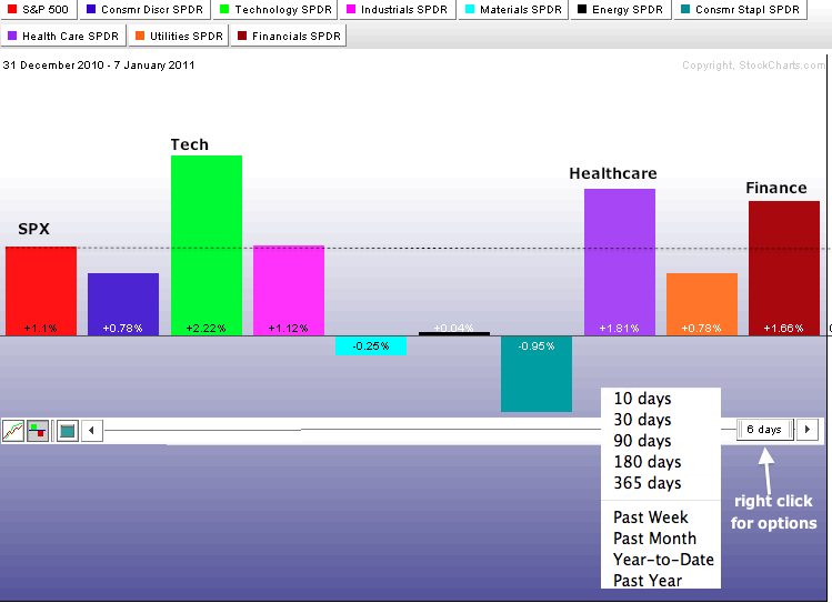
Even though 2011 has just begun, there are clear leaders and laggards among the nine sectors. In particular, the technology sector is getting off to a great start. The Sector PerfChart shows the nine sector SPDRs and the S&P 500. The black dotted line marks the performance for the S&P 500 at 1.1%. Sectors extending above this line are outperforming. Those falling short are underperforming. Technology, healthcare and finance are outperforming so far in 2011. Consumer discretionary is up for the year, but underperforming the S&P 500. While it is quite positive to see relative strength in technology, it is negative to see relative weakness in the consumer discretionary sector, which is dominated by retailers. Charting Note: users can change the time scale by hovering over the date tab, clicking the right mouse button and choosing a preset selection. The icons on the bottom left can be used to change the PerfChart from line to histogram format.

Click this image for a live chart.
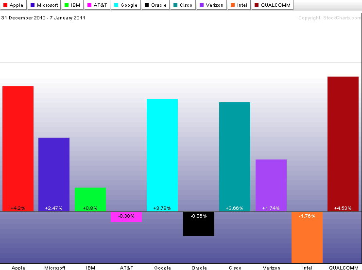
A look at the top 10 components for the Technology ETF (XLK) shows Apple (AAPL), Microsoft (MSFT), Google (GOOG), Cisco (CSCO), Verizon (VZ) and QualComm (QCOM) up more than the S&P 500. Except for Verizon, all are up more than XLK as well. These are the early leaders in 2011. On the negative side, Intel (INTC) is showing both relative weakness and absolute weakness with a 1.76% year-to-date decline. The Semiconductor HOLDRS (SMH) is also underperforming with a .91% gain year-to-date. Click here for a CandleGlance chart showing these 10 stocks.

Click this image for a live chart.
