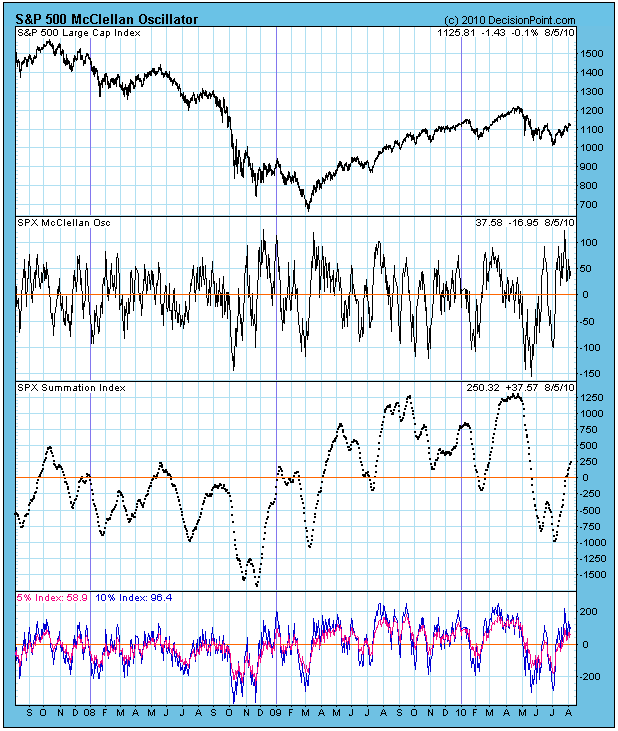
The McClellan Oscillator chart could be voted one of the most likely charts to cause the glazing over of multitudes of eyeballs; however, with a little effort you can understand it and appreciate the wealth of information it conveys. Take a moment and read and let the following paragraph sink in.
The McClellan Oscillator (displayed just below the S&P 500 chart) is the difference between the 5% and 10% Indexes, which are a 19-EMA and 39-EMA of daily advances minus declines. (They are in the bottom panel of the chart below.) The Oscillator reflects the short-term strength and direction of market liquidity. A longer-term view is provided by the Summation Index (the dotted line), which is the cumulative total of the daily McClellan Oscillator values. These indicators move within a trading range and also help us determine the overbought/oversold condition of the market.
The Oscillator has been above the zero line since just after the July price low. You can see that, historically, this situation will not be sustained too much longer -- the oscillator will drop below the zero line, indicating that breadth has turned negative. This is not necessarily something to worry about because you can see that it happens frequently, even when prices are in a rising trend.
I do become concerned with below zero Oscillator readings when the 5% and 10% indexes are themselves below the zero line. As you can see, they are currently both above the zero line, and have been since the correction low. On the next pullback they may dip below the zero line, but that won't be a problem as long as the condition doesn't persist.
Bottom Line: The McClellan Oscillator is an excellent tool for examining the internal condition of market breadth. In my opinion, observing the configuration of the 5% and 10% indexes is an essential part of interpreting the Oscillator and Summation Index. For more information, check out Tom McClellan's website at mcoscillator.com.

