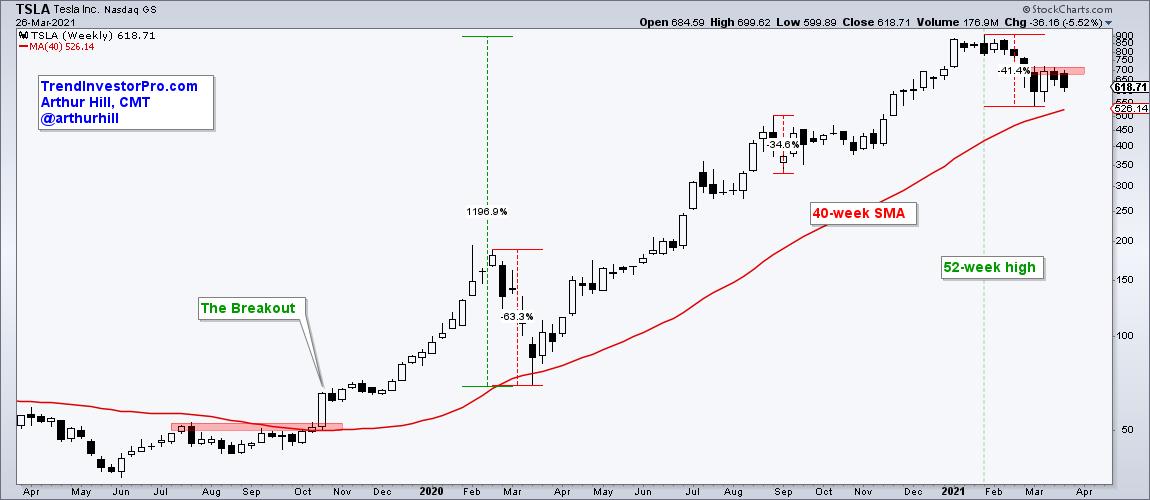
Dozens of high flying stocks and ETFs are down double digits from their February highs, but chartists should put these declines into perspective when analyzing the charts. The ARK Innovation ETF (ARKK), the Clean Energy ETF (PBW) and the Solar Energy ETF (TAN) declined over 30% from their February highs to their March lows, but these three were up over 300% prior to these declines. Tesla (TSLA) fell around 40% from late January to early March, but this decline comes after a 1000+ percent advance. Tesla is entitled to a pullback after such a move and this decline still looks like a correction within a bigger uptrend. Let's investigate.
The Tesla chart below shows weekly candlesticks over the last two years. The stock broke out in October 2019 with a 27% gain and then embarked on a historic run. During this run, the stock fell over 60% in early 2020, dropped 35% in early September and fell some 40% here in early 2021. These are indeed harrowing declines, but still within the realm of a bigger uptrend. TSLA held the rising 40-week SMA in March, did not come close to this SMA in November and remains above it now.

The working assumption is that Tesla is in a long-term uptrend right now. Price hit a new 52-week high just nine weeks ago and price remains above the rising 40-week. Working with this assumption, declines are viewed as corrections within the bigger uptrend and these declines are opportunities.
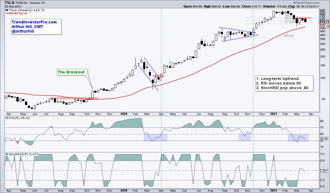
Corrections come in all sorts of sizes and shapes. These include sharp pullbacks that retrace around half to two thirds of the prior advance, falling wedges, falling channals and triangle consolidations. I do not see a clear pattern now, but the current decline retraced around 2/3 of the prior advance, which is still normal for a pullback within a bigger uptrend. Think two steps forward and one step backward. TSLA recently firmed and a break above the red resistance zone would be bullish.

Chartists can also use indicators to identify pullbacks and possible breakouts. RSI(5) alerts us to a short-term oversold condition when it dips below 50 (blue shading). Once this occurs, StochRSI(5) signals a momentum pop when it surges above .80 (green lines). Also notice that there were breakouts on the price chart with the last two pops. This strategy is by no means foolproof, but it gives us an analytical framework to define the bigger trend, find pullbacks within this trend and identify potential breakouts.
TrendInvestorPro uses a similar version of this strategy with daily price charts for ETFs. We need an objective manner to identify the long-term trend, detect medium-term bullish setups and pinpoint short-term bullish signals. This report and much more are available to subscribers. Click here for immediate access.
---------------------------------------------------
Choose a Strategy, Develop a Plan and Follow a Process
Arthur Hill, CMT
Chief Technical Strategist, TrendInvestorPro.com
Author, Define the Trend and Trade the Trend
Want to stay up to date with Arthur's latest market insights?
– Follow @ArthurHill on Twitter
