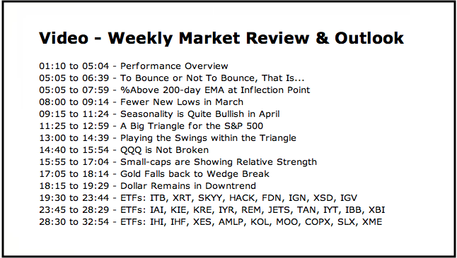
- To Bounce or Not To Bounce.
- %Above 200-day EMA at Inflection Point.
- Fewer New Lows in March.
- Seasonality is Quite Bullish in April.
- A Big Triangle for the S&P 500.
- Playing the Swings within the Triangle.
- QQQ is Not Broken.
- Small-caps are Showing Relative Strength.
- Gold Falls back to Wedge Break.
- Dollar Remains in Downtrend.
- Weekend Video Links.
- Notes from the Art's Charts ChartList.
 The price charts showed several rising wedge breakdowns last week and stocks became oversold after a sharp decline last Friday (23-March). A number of studies point to an oversold bounce sooner rather than later and this prompted me to review my overall outlook.
A System Trader article on Monday noted that the S&P 500 remains in a long-term uptrend and RSI was oversold for the major index ETFs. This means there was a mean-reversion setup.
A second System Trader article noted that the Put-Call Ratio reached extremes and prior instances gave way to bounces. I also referred to another System Trader article that showed a bullish bias at the turn of the month (from the third to the last day of the month to the third day of the next month).
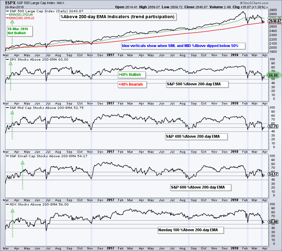
The %Above 200-day EMA indicators are also pointing to a possible bounce and seasonality is bullish in April. The medium-term outlook, which captures the 2018 correction, could change should a bounce take place in the next week or two. With the S&P 500 still in a long-term uptrend, I am going to lean bullish heading into April.
%Above 200-day EMA at Inflection Point
The chart below shows the Percentage of Stocks Above the 200-day EMA for the S&P 500, S&P Mid-Cap 400, S&P Small-Cap 600 and Nasdaq 100. The blue vertical lines show when this indicator dipped below 50% for $SML and $MID. These bounces coincided with lows in the S&P 500. Currently, all four dipped below 50% and bounced this week.
Fewer New Lows in March
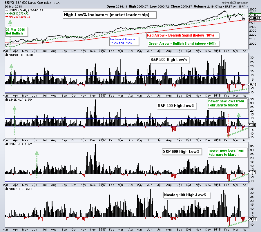
The next chart shows High-Low Percent for the same indexes. Notice that there were fewer new lows from February to March (green lines). The S&P 500 is testing its February low, but High-Low Percent did dip as far as its February low. The S&P Mid-Cap 400 and S&P Small-Cap 600 are above their February lows and holding up better. Notice that their High-Low Percent indicators held the -5% level in March.
Seasonality is Quite Bullish in April
Tom Bowley does a lot of work with seasonality and he highlighted some strong groups and stocks as we head into April. See this MarketWatchers Live post.
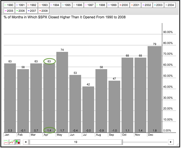
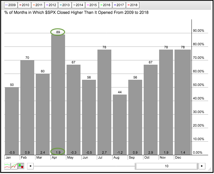
I would like to expand on this by showing the seasonality chart for the S&P 500 over two periods (1990 to 2008 and 2009 to 2018). The first period includes two bear markets, while the second period focuses on the current bull run.
April closed higher 63% of the time from 1990 to 2008 and the average gain was around 1.4%, which is tied for the third highest. In an interesting twist, May was the second strongest month with gains 74% of the time and an average gain of 1.7%. So much for sell in May and go away!
The second chart shows April closing higher 89% of the time during the current bull run and the average gain is 1.9%. April 2012 was the only downer from 2009 to 2017. Thus, April has been one of the best months during the bull market.
A Big Triangle for the S&P 500
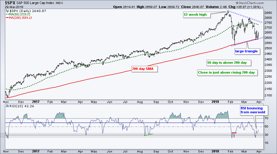
The S&P 500 hit a new high in January and then tested the rising 200-day SMA in February and March. The long-term trend is up because the 50-day SMA is above the 200-day SMA and price is above the 200-day SMA.
The March low remains above the February low and this means a higher low is possible. Should the index bounce in early April, a higher low would form and the pattern at work would become a triangle, which is a bullish continuation pattern.
The indicator window shows RSI(10) becoming oversold last Friday and moving above 30 on Monday. Thus, RSI became oversold within a long-term uptrend and this sets up the mean-reversion trade.
Playing the Swings within the Triangle
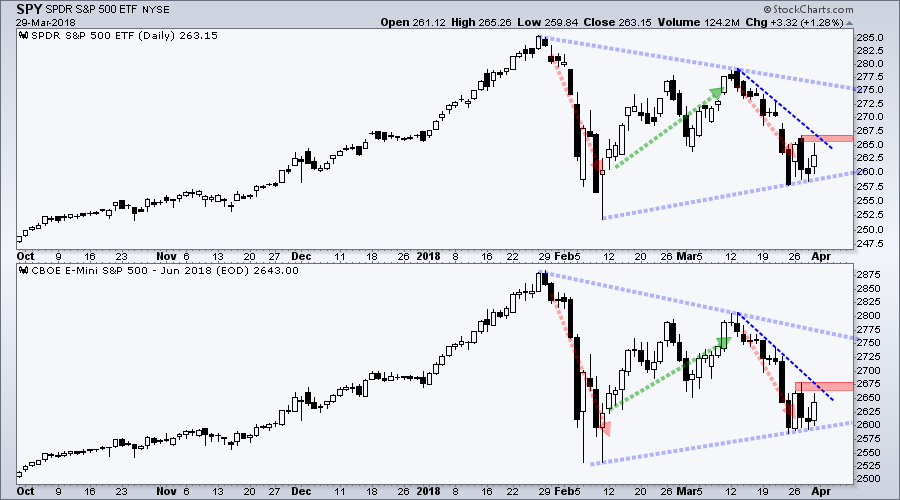
The next chart shows SPY and the June E-mini to focus on the swings within a possible triangle. The red lines show the downswings in early February and late March, while the green lines show the upswings from mid-February to mid-March.
At this point, I am asking myself at what point would I turn bullish. I could wait for a break above the upper line of the triangle or a break above the mid March high. Such breakouts, however, seem risky because the overall market remains volatile and these breakout levels are four to six percent above current levels.
I would prefer to watch the swings within the triangle and use a break above this week's high (red zone) to turn bullish. I often use this technique when a bullish continuation pattern forms (sideways consolidation, falling channel, falling wedge or triangle). I am leaning for a breakout because of the evidence mentioned above.
QQQ is Not Broken
QQQ still has the strongest chart of the major index ETFs. First and foremost, the ETF was the only one to hit a new high in mid March. SPY, MDY, IJR and IWM fell short of their January highs. Second, QQQ remains above the February low. SPY is testing this low, while MDY, IJR and IWM are well this low.
The long-term trend is undeniably up and the ETF could be poised for an oversold bounce. Notice that RSI dipped below 30 and formed a mini divergence over the last five days. This mini divergence is not a major development, but adds to the thesis for a bounce.
Small-caps are Showing Relative Strength
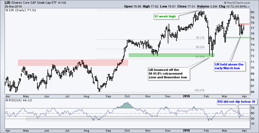
The S&P SmallCap iShares (IJR) held up better than QQQ and SPY during the last three weeks because it did not break its early March low. Also notice that RSI did not dip below 30. Less weakness on the downside can sometimes foreshadow upside leadership. The red zone marks downswing resistance to watch for a short-term breakout.
Gold Falls back to Wedge Break
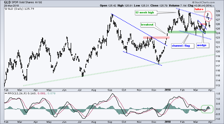
The Gold SPDR (GLD) shows an example of playing the swings within a bullish continuation pattern. The falling channel is the bullish continuation pattern, while the falling wedge defined the downswing within this pattern. The breakout at 126 reversed the downswing within the channel and this was the first signal (as noted on March 21st)
As this GLD chart shows, acting on the break within the pattern can reduce some heartache later. GLD broke above the channel trend line on Monday, but quickly gave this up as the Dollar surged. Traders playing the channel breakout are feeling it more than traders playing the wedge breakout.
The failed breakout is not encouraging for gold, but all is not lost because support in the 124 area is near. A break below 124 and bearish signal line cross in MACD would call for a reassessment of gold.
Dollar Remains in Downtrend
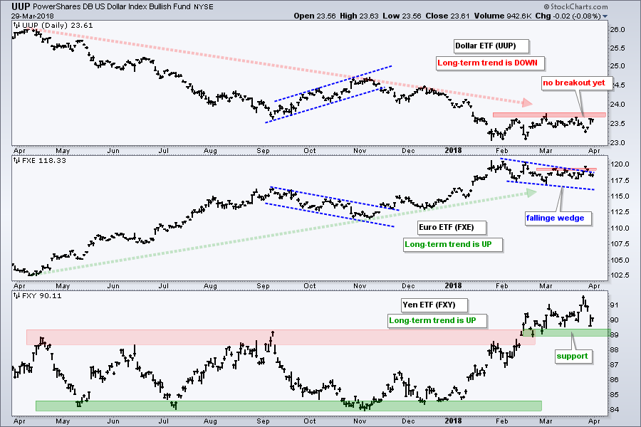
The Dollar is the main driver for gold and a plunging Yen pushed the Dollar higher. Nevertheless, I am not ready to turn bullish on the Dollar or bearish on the Yen.
The chart shows the US Dollar ETF (UUP) still below first resistance and still in a long-term downtrend. The Euro ETF (FXE) broke above the wedge line on Monday, but fell back the last three days. Nevertheless, the long-term trend is up and this favors a bullish resolution to the wedge.
The Yen ETF (FXY) broke out of a big consolidation in late February and then worked its way higher the last few weeks. This week's plunge put FXY back near the breakout zone and near first support. A break below 89 would reverse the upswing that began in January.
Weekend Video Links
A growing oversupply in government bonds will make waves in the Treasury market this year, says Wells Fargo's Michael Schumacher.
Chris Verrone, Strategas Research Partners, discusses the put-call ratio, short-term breadth, financials, the 2-10 yield spread and Libor.
Jonathan Krinsky, MKM Partners chief market technician, discusses what's impacting the market rebound and reasons to be skeptical about chasing market strength here.
Notes from the Art's Charts ChartList
The charts have been updated with a bigger size and thicker bars. I have also updated the annotations and provided some detail on the patterns developing. The bullet points below highlight some of the chart comments.
- The Home Construction iShares (ITB) is still battling the 61.8% retracement zone and showing a little strength in March. Watch 40.5 for a breakout.
- The Retail SPDR (XRT) is finding support near the Dec-Feb low and in the 50-62% retracement zone. Watch for a short-term breakout at 44.50.
- The tech-related ETFs (SKYY, FDN, SOXX, IGN, HACK and IGV) hit new highs in March and retraced 50 to 60 percent of their February-March surges. RSI is also near oversold levels and this is a good spot for a bounce. Long-term trends are up.
- The Broker-Dealer iShares (IAI) fell sharply the last 3 weeks, but the uptrend is not broken. In fact, IAI is near support and RSI is bouncing from 30.
- The big trend is up and the Regional Bank SPDR (KRE) is testing the February closing low. RSI dipped below 30 and bounced. 58-59 is the make-or-break zone for the uptrend. Watch 61.5 for a short-term breakout.
- The iShares Aerospace & Defense ETF (ITA) corrected the last few weeks, but the overall trend is up and I would expect a bullish resolution to the falling wedge.
- The Transport iShares (IYT) is finding support from the Feb-Mar lows and near the 62% retracement. A triangle could be taking shape and this is a large bullish continuation pattern.
- Even though the Medical Devices ETF (IHI) did not exceed its January high, the long-term trend is up. Short-term, the ETF retraced 50-62% of the Feb-Mar bounce and held above the early March low. This shows some relative strength in March. Watch 187 for a short-term breakout.
- The Agribusiness ETF (MOO) could be forming a large triangle and the March downswing reversed with a break above Tuesday's high. RSI is also bouncing from oversold levels.
Plan Your Trade and Trade Your Plan.
- Arthur Hill, CMT
Senior Technical Analyst, StockCharts.com
Book: Define the Trend and Trade the Trend
Twitter: Follow @ArthurHill

